
Understanding What Makes Books Look Professional
A professionally formatted book has a distinct appeal. It captivates readers not through flashy design, but through subtle elegance and a polished presentation. This polished look is no accident; it's a result of careful attention to key formatting elements. Drawing from insights shared by seasoned publishers and successful independent authors, we can pinpoint the elements that distinguish a bookstore-ready book from an amateur effort.
The Impact of Typography and Spacing
Typography is more than just selecting a font; it's the art of arranging type to create a smooth, enjoyable reading experience. Much like setting the mood in a film, different fonts evoke different emotions. A serif font like Times New Roman projects tradition and formality, while a sans-serif font like Arial feels modern and clean. Choosing the right font depends heavily on your genre and target audience.
Spacing is equally crucial for reader engagement. Too much text crammed together can feel overwhelming, like navigating a crowded room. Too much white space, however, can make the text feel disjointed. The key is to find a balance that creates visual harmony and encourages readers to continue turning the pages.
Layout Principles for Reader Engagement
Effective layout guides the reader’s eye, creating a seamless flow of information. Chapter breaks, headings, and subheadings act like signposts, directing the reader and breaking up large blocks of text into digestible portions. A well-laid-out book, much like a well-organized store, makes it easy to find and absorb information.
It’s important to note that formatting standards differ significantly between genres. A cookbook, for instance, will have a drastically different layout than a fantasy novel. Understanding these genre-specific conventions and your readers' expectations is vital for a book's success. Effective book formatting requires researching reader expectations within your chosen genre.
Formatting and Industry Trends
Focusing on formatting is even more critical considering recent industry trends. The publishing industry experienced a slight revenue dip at the beginning of 2025. According to the AAP January 2025 StatShot report, total revenue decreased by 0.7% compared to the previous year, reaching $1.2 billion. Trade book revenues specifically declined by 0.3%. Interestingly, certain formats saw significant growth, with digital audio increasing by 6.1% and special bindings by 18.8%. For more detailed information, refer to the AAP – January 2025 StatShot Report.
These shifts highlight the changing reader preferences and the need for publishers and authors to adapt their formatting strategies. Digital platforms are gaining traction, and neglecting them could mean losing a significant portion of the market. Understanding these dynamics is crucial for effective book formatting and distribution strategies, both in print and digital formats.
Getting Print Formatting Right the First Time
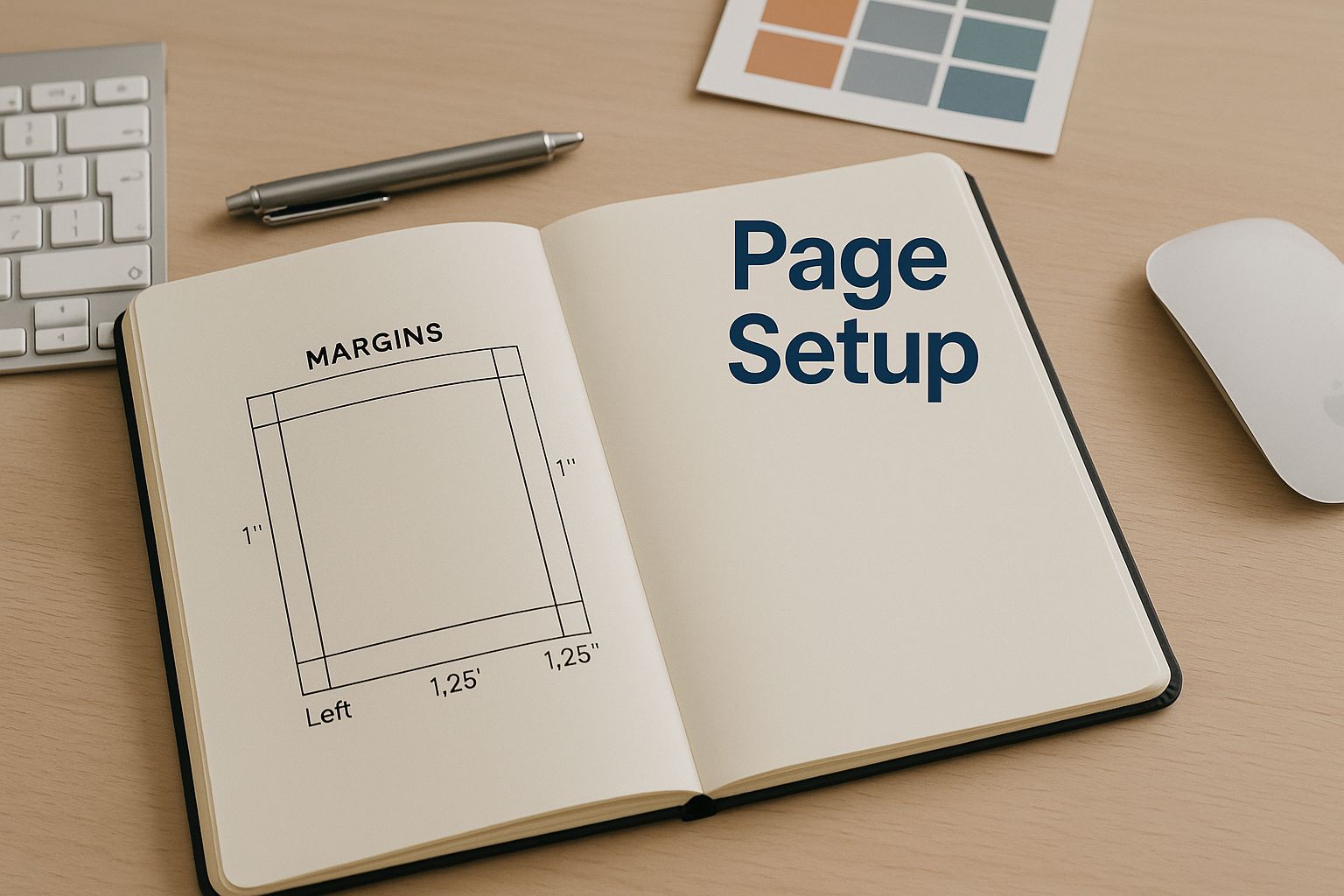
This infographic showcases a designer's workspace, complete with an open notebook displaying margin guidelines and a prominent "Page Setup" notation. It emphasizes the vital role of meticulous planning in print formatting. Margins, gutters, and other spatial elements are crucial. A well-defined page setup guarantees correct text placement, preventing it from disappearing into the binding—a frequent issue with less experienced formatting.
Proper page setup is the bedrock of professional book formatting. It involves careful consideration of all spatial elements on the page. Getting these elements right ensures a polished and readable final product.
A deep understanding of print's technical aspects is essential for professional book formatting. This includes everything from margin calculations to typography choices suitable for various lighting conditions. Overlooking these details can result in costly reprints, a concern for both self-published authors and established publishing houses. For a deeper dive into publishing costs, check out this helpful resource: How much does it cost to publish a book?
Mastering Page Setup and Layout
A professional-looking book starts with the page setup. This involves careful consideration of margins, gutter spacing, headers, and footers. Narrow margins can make a book feel cramped, while overly wide margins waste space and increase printing costs.
Incorrect gutter spacing can cause text to disappear into the binding, rendering sections unreadable. Finding the right balance is key to a comfortable reading experience.
Handling Chapter Breaks and Special Elements
Chapter breaks provide visual pauses, signaling transitions to new sections. Skillful formatting enhances these transitions, creating a smoother reading experience. Incorporating images, tables, and other elements requires careful planning.
Poorly placed images or tables can disrupt the page layout. This creates a visually jarring experience for the reader. Strategic placement is crucial for maintaining visual harmony.
Common Formatting Mistakes to Avoid
Several formatting missteps often mark an amateur publication. These include inconsistent font usage, improper paragraph indentation, and neglecting widows and orphans (single lines at the top or bottom of pages).
Addressing these seemingly small details shows attention to quality. This elevates the book's overall presentation and professionalism.
Let’s explore common book trim sizes and their formatting specifications:
To help illustrate optimal formatting for different book genres and sizes, the following table provides a general guideline. Keep in mind that these are recommendations and can be adjusted based on specific project needs.
Standard Book Trim Sizes and Formatting Specifications
| Trim Size | Genre | Margins | Font Size | Lines Per Page |
|---|---|---|---|---|
| 5×8 in | Fiction, Non-Fiction | 0.75 in | 11-12 pt | 25-30 |
| 6×9 in | Non-Fiction, Textbooks | 1 in | 12-14 pt | 25-30 |
| 8.5×11 in | Textbooks, Academic | 1.25 in | 12-14 pt | 30-35 |
This table highlights the relationship between trim size, genre, and recommended formatting. Notice how larger trim sizes generally accommodate larger font sizes and wider margins.
The book printing industry is constantly changing. Print-on-Demand (POD) technology allows for personalized learning materials and quick updates. However, external factors like tariffs on imported materials can affect production costs. Staying current with book printing trends is essential for efficient and cost-effective book production. These factors contribute to a professional look, commanding respect on bookstore shelves.
Mastering Digital Formatting Across All Devices
This image shows several devices displaying the same ebook. It highlights how important it is to make sure your book's formatting looks good on different screens. Digital formatting requires a different approach than formatting for print. Printed pages are static. Digital content, on the other hand, needs to adapt to many different devices, from smartphones and tablets to e-readers.
Responsive Design For Optimal Viewing
Responsive design is key for a consistent reading experience. It’s like pouring water into different containers: the content adapts to the shape of the container while keeping its basic structure. This way, your ebook will look great whether a reader is using a smartphone on the train or relaxing with a tablet at home.
This adaptability depends on understanding the technical requirements of platforms like Kindle, Apple Books, and Google Play. Each platform has its own guidelines, including preferred file formats and image resolutions. Following these guidelines is essential for the best display.
Reflowable Text and Interactive Elements
Reflowable text is a core element of digital formatting. It lets text adjust to different screen sizes and orientations. This ensures readability and avoids awkward line breaks or tiny, hard-to-read fonts. When working with digital formatting, you might need to share your formatted book efficiently. This guide on how to send PDF files can be helpful.
Images and interactive elements add another layer of complexity. Images must be optimized for different screen resolutions to keep them sharp and clear. Interactive elements, such as hyperlinks and embedded videos, need to work smoothly across devices for a better reader experience.
Testing and Accessibility
Thorough testing is crucial for catching formatting errors before your readers do. By testing on various devices and operating systems, you can be sure your ebook displays correctly in different digital environments. This includes checking for compatibility problems, broken links, and other visual issues.
Making your ebook accessible to all readers is also vital. This means thinking about readers with visual impairments or other disabilities. Features like alternative text for images and adjustable font sizes can make a big difference for these readers. Understanding reader preferences and how formatting affects sales is also key. You can learn more about current publishing trends. Successful authors focus on both visual appeal and accessibility when formatting their ebooks.
Optimizing For Digital Success
Optimizing your digital format is a significant factor in a book's success. This includes understanding the formatting requirements for ebooks, audiobooks, and other digital platforms. Metadata optimization is another important aspect, as it can significantly impact visibility and discoverability. This meticulous approach to digital formatting leads to a positive reader experience, boosting sales and enhancing your book's overall impact.
Choosing Tools That Actually Work for Your Situation
Selecting the right book formatting software can feel overwhelming. The sheer number of options available, each with its own marketing jargon, makes the process confusing. However, the best choice depends on your specific needs, technical skills, and the complexity of your book. This section provides clear guidance on selecting the right tools, covering everything from the readily available Microsoft Word to the industry-standard Adobe InDesign.
Free vs. Paid: Making Informed Decisions
Many new authors wonder if free software can produce professional results. The answer is: it depends. Free options like Google Docs or LibreOffice Writer can work for simple novels with basic formatting. These tools offer standard features: text formatting, paragraph styling, and page setup. However, for more complex projects, investing in professional software may be necessary.
For instance, consider formatting a cookbook with multiple images and specific layout requirements. While achievable with free tools, using dedicated software like Adobe InDesign or Affinity Publisher simplifies the process significantly. These programs offer advanced features, such as precise image control and detailed typography options, crucial for a professional-looking cookbook.
Therefore, understanding your book's specific needs is the first step. A simple novel may require basic formatting, while a textbook or a visually rich book demands more advanced tools.
Software Options: A Detailed Comparison
To help you choose the right tool, let's explore some popular book formatting software options:
To help you choose the right tool, we’ve compiled a comparison of popular book formatting software:
Book Formatting Software Comparison: This table compares popular book formatting tools, including cost, ease of use, and output quality.
| Software | Cost | Difficulty Level | Best For | Output Formats |
|---|---|---|---|---|
| Microsoft Word | Paid | Beginner | Simple Novels, Short Stories | DOCX, PDF |
| Google Docs | Free | Beginner | Simple Novels, Collaborative Projects | DOCX, PDF |
| LibreOffice Writer | Free | Beginner | Simple Novels, Basic Formatting | ODT, PDF |
| Adobe InDesign | Paid | Advanced | Complex Layouts, Professional Publishing | INDD, PDF, EPUB |
| Affinity Publisher | Paid | Intermediate | Magazines, Illustrated Books, Graphic Novels | AFPUB, PDF, EPUB |
| Vellum | Paid | Beginner | Mac Users, Ebook Creation | EPUB, MOBI |
This table provides a concise overview of each software, its cost, complexity, and ideal use cases. As you can see, the difficulty level increases with the software's capabilities. Free options are excellent for simple projects, while paid options offer more power and flexibility for complex layouts.
Evaluating Tools for Your Publishing Goals
When choosing software, consider the learning curve. While InDesign is powerful, it’s more complex than Word. If you're on a tight deadline or new to formatting, a simpler program might be better. Also, think about your publishing goals. If you're self-publishing on platforms like Amazon KDP, software with direct EPUB export, like Vellum, can simplify the process. At BarkerBooks, we help authors navigate these decisions, offering guidance and software recommendations tailored to their projects and budgets. Learn more about our self-publishing services and discover how we can help you achieve your publishing dreams.
Choosing the right tools is essential for a polished, professional book. By carefully assessing your needs and the available software, you can streamline the formatting process and bring your vision to life.
Handling Complex Elements Like a Pro
This video offers a practical demonstration of how to manage complex layouts. It shows how to smoothly integrate elements like footnotes and indexes, ensuring they complement, rather than disrupt, the overall flow and readability of your book. Mastering these techniques is essential for achieving a professional and polished final product.
Formatting a book extends beyond simply setting margins and selecting fonts. It involves skillfully handling intricate elements that truly elevate a professionally formatted book. These often-overlooked details can significantly influence the reader's experience and foster confidence in your work. Let's delve into the finer points of formatting elements like footnotes, indexes, and bibliographies.
Footnotes, Indexes, and Bibliographies: The Finishing Touches
Footnotes offer a way to provide supplementary information or citations without interrupting the main text. Well-formatted footnotes seamlessly integrate with the page, allowing readers to access additional context without losing their place. Think of them as subtle enhancements that provide deeper insights.
Indexes, particularly crucial for non-fiction, are invaluable navigational aids. A thoughtfully crafted index empowers readers to quickly pinpoint specific information within the book, enhancing its overall usability. It's akin to a map, guiding readers to precisely what they seek.
Bibliographies serve as a showcase of your research, adding credibility to your work. A consistently formatted bibliography, adhering to a specific style guide (like the Chicago Manual of Style), demonstrates professionalism and meticulous attention to detail. It reinforces the depth of your research and provides readers with valuable resources for further exploration. For a more comprehensive guide to preparing your book for publication, take a look at this Self-Publishing Checklist.
Advanced Typography and Style Management
Beyond the basic font choice, advanced typography techniques can greatly enhance a book's aesthetics and readability. This includes understanding style management, which involves using stylesheets (in applications like Microsoft Word or Adobe InDesign) to ensure consistent formatting throughout the entire manuscript. Stylesheets guarantee uniformity across elements like headings, paragraphs, and captions, creating a cohesive and visually appealing reading experience.
One important aspect of typography is addressing widows and orphans. These single lines of text, stranded at the top or bottom of a page, disrupt the visual flow. Eliminating them contributes to a more polished and professional appearance.
Formatting for Specialized Content: Poetry, Technical Manuals, and Children’s Books
Different genres require unique formatting approaches. Poetry relies heavily on visual presentation, using line breaks and stanza structures to convey meaning. Technical manuals often incorporate diagrams, charts, and specialized numbering systems. Children’s books require a carefully balanced interplay of text and illustrations to engage young readers. Choosing the appropriate tools, including specialized software or templates, is essential for effective formatting. For video content creation and formatting tips, resources like AI Video Generators can be helpful. Each genre demands a tailored approach that adheres to industry standards and meets reader expectations.
Troubleshooting Common Advanced Formatting Problems
Alignment issues, font embedding problems, and complex layouts can present formatting challenges. Alignment inconsistencies create an unprofessional look. Font embedding problems can result in unexpected substitutions, altering the intended appearance. Complex layouts, especially those involving numerous images and tables, require careful planning to ensure a coherent presentation.
By understanding the underlying causes of these common formatting problems and implementing the appropriate solutions, you can maintain control over your book’s final appearance. This ensures a high-quality product that reflects professional standards.
Your Pre-Publication Formatting Checklist
After meticulously formatting your book, a thorough review is essential. Catching errors before publication saves both your reputation and your budget. This checklist will guide you through a comprehensive review process, ensuring your book is ready for the world.
Micro-Level Checks: Consistency Is Key
Start with the micro-level details. These seemingly small elements can significantly impact your book's overall professionalism. This stage involves checking for:
-
Consistent spacing: Ensure uniform spacing between lines, paragraphs, and around images. Inconsistent spacing can make your book look amateurish.
-
Font consistency: Verify the same font is used throughout, except where variations are intentionally used for headings or other design elements.
-
Proper punctuation and capitalization: Errors in punctuation and capitalization undermine credibility. A thorough check is crucial.
-
Correct page numbering: Check that page numbers are sequential and correctly positioned. This may seem basic, but it’s a detail that shouldn’t be overlooked.
These micro-level checks are like polishing a gem; they bring out the shine and enhance the overall quality of your book. You might be interested in: How to get an ISBN for my book.
Macro-Level Checks: Structure and Flow
Once the micro-level details are addressed, move to the macro level. This focuses on the bigger picture:
-
Page breaks and section flow: Ensure chapters begin on new pages and that sections flow logically. Imagine reading a book where chapters abruptly end mid-page; this disrupts the reading flow and can be frustrating for readers.
-
Table of contents accuracy: Verify the table of contents accurately reflects the book's structure and page numbers. A correct table of contents is essential for reader navigation.
-
Image and table placement: Check that all images and tables are correctly positioned and captioned. Poorly placed images or tables can disrupt the flow and confuse readers.
Gathering Feedback: The Beta Reader Stage
Before finalizing your formatting, consider gathering feedback from beta readers. Beta readers are test readers who provide feedback on various aspects of your book, including formatting. They can spot errors you may have missed, offering valuable insights.
-
Targeted feedback: Ask beta readers to specifically look for formatting inconsistencies or issues that affect readability.
-
Diverse devices: If you’re publishing digitally, have beta readers test your book on various devices (smartphones, tablets, e-readers) to ensure cross-platform compatibility.
Professional Formatting Services
For complex projects or if you're unsure about any formatting aspect, hiring a professional formatter is a worthwhile investment. Professionals have the expertise and experience to handle even the most intricate layouts, ensuring a polished, industry-standard product.
Final Adjustments and Launch Preparation
After incorporating feedback and making final adjustments, ensure these changes don’t disrupt your layout. This final review confirms your book is ready for launch. By following these steps, you can avoid last-minute formatting emergencies that can delay your publishing timeline.
Platform Requirements That Actually Matter

This image showcases a variety of digital reading platforms, each with its unique interface. This highlights the importance of tailoring your book's formatting to meet each platform's specific requirements. Overlooking these details can lead to rejection, compromised quality, or even lost sales. Each platform, from Amazon KDP to IngramSpark and Apple Books, has its own set of formatting guidelines. Understanding these nuances is essential for maximizing your book's reach and maintaining a professional presentation.
Navigating the Nuances of Amazon KDP
Amazon KDP plays a dominant role in the self-publishing landscape. Its specific formatting requirements, especially for ebooks, are critical for success. Understanding how to format for both Kindle ebooks (using formats like .mobi or .epub) and print-on-demand paperbacks is essential for maximizing your reach on this platform. Properly utilizing KDP’s tools will help you avoid common pitfalls such as distorted images, misplaced text, and even rejection.
IngramSpark and Print Distribution
IngramSpark, a leading print-on-demand distributor, maintains its own formatting standards, often stricter than those of KDP. These standards are designed for widespread print distribution, enabling your book to reach bookstores and libraries. This broader reach necessitates high-resolution images and adherence to specific file formats (like PDF/X-1a) for optimal print quality and error minimization.
Apple Books and Other Digital Retailers
Apple Books represents a significant portion of the ebook market, particularly for those using Apple devices. Formatting correctly for Apple Books, using the .epub format, is essential for tapping into this substantial audience. Beyond Apple Books, other digital retailers like Google Play Books and Barnes & Noble Nook also have specific formatting guidelines that contribute to a polished presentation and optimal reader experience.
Optimizing Formatting for Print-on-Demand
Print-on-demand services, including IngramSpark and KDP Print, offer considerable advantages but demand meticulous formatting. Understanding factors like bleed (the extension of images beyond the page edge) and trim size is crucial for a professional finished product. Neglecting bleed can lead to unwanted white borders, while an incorrect trim size can negatively impact readability and book spine design.
Consistency Across Platforms
Maintaining consistent formatting across multiple platforms can be a challenge. However, using tools like stylesheets in word processors or dedicated formatting software can greatly simplify the process. Imagine a book that changes font or spacing mid-chapter, or where headings suddenly shift style. Such inconsistencies disrupt the reading experience. Stylesheets ensure a uniform and professional appearance regardless of where your book is sold.
Metadata and Your Book’s Discoverability
Beyond visual formatting, metadata is fundamental to discoverability. Metadata comprises your book’s key information—title, author, description, and keywords—and helps readers find your work. Accurate and complete metadata, tailored to each platform, drastically improves visibility in online stores, increasing the likelihood of discovery by potential readers. Think of it as effective signage in a bookstore – clear and concise metadata guides readers to your book.
Ready to publish your masterpiece? BarkerBooks, a full-service publishing house, can guide you through every stage, from manuscript formatting to global distribution. Visit BarkerBooks today to learn more and transform your writing dream into a published reality.