
Think of a book layout format as the architectural plan for your manuscript. It's the set of invisible rules—from the margins on the page to the font you choose—that transforms a simple text document into a polished, professional book. This blueprint dictates how your words are presented, making sure the final product is both beautiful and easy to read.
Why Your Book Layout Format Matters
A great book layout is like a silent tour guide for your reader. When it's done well, it disappears completely, letting the reader sink into the story without any jarring distractions.
But when it's done poorly? It's like trying to read with a constant, annoying buzzing in your ear. Crowded text, clumsy fonts, or weird spacing can instantly pull someone out of the world you’ve created. It screams "amateur," and that's not the first impression you want to make.
More than anything, a professional layout builds trust. Readers are savvy; they instinctively connect high-quality design with high-quality writing. That first glance at the page, whether in a bookstore or a "Look Inside" preview online, can be the make-or-break moment.
Core Components of a Professional Layout
Every great layout is built on a few key pillars. These aren't just random design choices; they're time-tested principles that all work together to create a comfortable, engaging reading experience. We’ll dive deeper into each of these soon, but here’s a quick rundown of what they do:
- Margins and Page Geometry: This is the frame around your text. It ensures words don’t get swallowed by the book's spine (the "gutter") or crowd the edges of the paper.
- Typography: Your font choice, its size, and the spacing between lines have a massive impact on readability. The right typography feels like a clear, effortless voice speaking directly to the reader.
- Structural Consistency: This covers everything from the design of your chapter titles to where the page numbers and running headers are placed. Consistency builds a predictable, professional rhythm that keeps the reader grounded.
Before we get into the nitty-gritty of each component, let's summarize their roles.
Key Elements of a Professional Book Layout
This table breaks down the core components of interior book design and explains why each one is so crucial for creating a seamless reading experience.
| Element | Primary Function | Impact on Reader |
|---|---|---|
| Page Geometry & Margins | Frames the text and protects it from the book's physical structure. | Prevents eye strain and ensures no words are lost in the spine. Creates a sense of balance and breathing room. |
| Typography & Fonts | Sets the tone and ensures text is legible and comfortable to read. | A good font is invisible and easy on the eyes. A bad one causes fatigue and distraction. |
| Headers, Footers, & Folios | Provides navigational cues like book title, author name, and page numbers. | Helps the reader orient themselves within the book without being intrusive. |
| Chapter Openings | Signals a new section and sets the visual rhythm of the book. | Creates a moment of pause and visual interest, making the book feel well-paced and organized. |
| Front & Back Matter | Houses essential information like the title page, copyright, and author bio. | Establishes the book's credibility and provides important context for the reader. |
Each of these elements plays a vital part in the reader's journey.
A thoughtful layout doesn't just present your words; it honors them. By investing in a solid book layout format, you're showing respect for your own work and, just as importantly, for your reader's time. This guide will give you the blueprint to make smart, professional decisions for your book.
Mastering Trim Size and Page Geometry
Before you even think about typesetting, you have to make two fundamental decisions: your book's trim size and its page geometry. Think of the trim size—the final physical dimensions of your printed book—as choosing the canvas for your masterpiece. It’s a choice that directly impacts the reader's experience, the book's feel in their hands, and even your printing costs.
A sprawling fantasy epic, for example, feels much more at home in a larger format that gives maps and world-building details room to breathe. On the other hand, a slim volume of poetry or a mass-market thriller is all about portability and intimacy. These aren't just random choices; they're conventions baked into reader expectations. For a deeper dive, our guide on how to choose the right standard book size is a great resource.
Understanding Page Geometry: The Frame for Your Words
Once you’ve picked your canvas, it's time to frame the art. This is page geometry, and it’s all about the strategic use of white space—specifically, your margins. Margins aren't just empty borders; they are a critical part of a professional book layout that makes your text readable and aesthetically pleasing.
They each have a specific job to do:
- Top Margin: This is where the header usually lives, often showing the book title or author's name.
- Bottom Margin: Home to the footer, where you'll almost always find the page numbers (also called folios).
- Outside Margin: This gives readers a place to hold the book comfortably without their thumbs covering up the words.
- Inside Margin (Gutter): This one is arguably the most important. The gutter is the extra space added to the inside edge of each page, ensuring your text doesn't get sucked into the book’s spine when it's bound.
A classic rookie mistake is making all four margins the same size. Because of the binding, that inside gutter margin absolutely must be wider than the outside margin. If it isn't, the open book won't look balanced, and reading it will feel like a chore.
This concept map gives you a quick visual of how all these core layout elements work together.
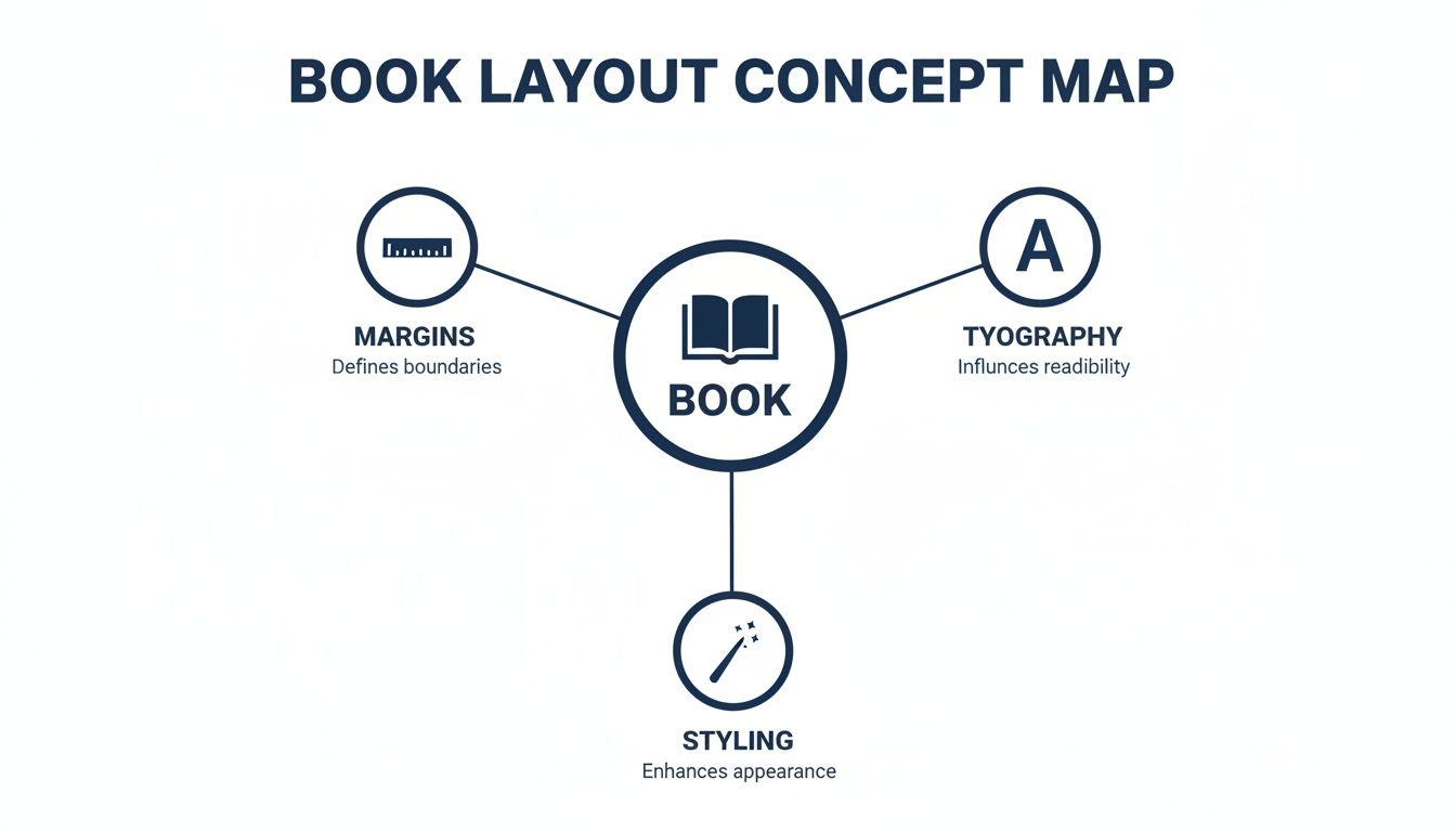
As you can see, great book design is a balancing act between margins, typography, and styling. They all have to work in harmony to support the content.
Finding the "Divine Proportion" in Page Layout
The search for the perfect page proportions is centuries old. It was the Renaissance discovery of the golden ratio that really changed the game, setting a standard that still influences 90% of modern printing formats used by major publishers today.
The 15th-century mathematician Luca Pacioli called this the 'divine proportion'—an approximate ratio of 1:1.618—and it's the hidden blueprint behind the standard 5.25×8.5-inch trade paperback you see everywhere. It’s not just about looking good, either. Eye-tracking studies have shown that books using these harmonious proportions report 15-20% higher reader satisfaction, largely because they reduce visual fatigue.
Getting your page geometry right is non-negotiable for print. Printers will flat-out reject a file with an insufficient gutter margin. Even worse, if it somehow gets printed, you'll end up with an unreadable book where the first and last words of every line disappear into the binding.
Common Trim Sizes by Genre
While you can technically choose any size you want, you’ll notice that certain trim sizes have become the standard for specific genres. Sticking to these conventions helps your book look like it belongs on the shelf and aligns with what readers expect to pay.
Here’s a quick-reference table for some of the most common trim sizes you'll find in the U.S. market.
Standard Trim Sizes by Genre
| Genre | Common Trim Size (Inches) | Best For |
|---|---|---|
| Mass-Market Paperback | 4.25 x 6.87 | Genre fiction like romance, sci-fi, and thrillers sold in high volumes. Designed for portability and affordability. |
| Trade Paperback | 5.5 x 8.5 or 6 x 9 | The most common size for fiction and non-fiction. Offers a great balance between readability and cost-effectiveness. |
| Hardcover | 6 x 9 to 8.5 x 11 | New releases, literary fiction, non-fiction, textbooks, and coffee table books. Conveys premium quality. |
| Memoir / Novella | 5 x 8 or 5.25 x 8 | A slightly smaller, more intimate size that suits personal stories and shorter fiction works perfectly. |
Ultimately, choosing a trim size is more than a technical step—it’s a creative decision that shapes how a reader will physically interact with your story. By mastering these fundamentals of your book's layout, you're building a professional and welcoming container for the words within.
The Art of Typography and Readability
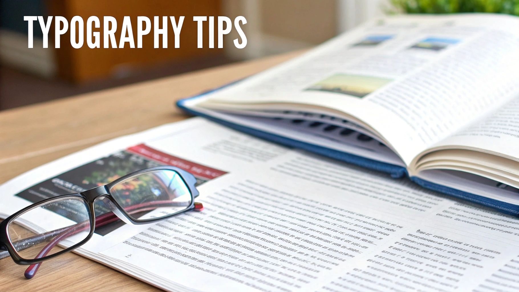
If your page layout is the skeleton of your book, then typography is its soul. The fonts you choose are far more than just letters on a page—they're the voice of your story. They set the tone, create the mood, and can make or break a reader's journey through your world.
Good typography is invisible. When it's done right, the reader sinks into the story without ever noticing the typeface itself. Think about it: a gritty crime noir shouldn't be set in a whimsical, curly font. The typography has to serve the story, not distract from it. This is a cornerstone of a professional book layout format.
Your very first, and most important, typographic decision comes down to a classic rivalry: serif versus sans-serif.
Serif vs. Sans-Serif: The Great Debate
Choosing between a serif and a sans-serif font is a fundamental part of a book's interior design, and the right answer often depends on whether you're designing for a printed page or a digital screen.
A serif font is one with the little "feet" or decorative strokes at the ends of the letters. These aren't just for decoration; those tiny flourishes help guide the eye along the line of text, making long passages much easier to read. This is precisely why serif fonts have been the gold standard in printed books for centuries.
On the other hand, a sans-serif font (from the French sans, meaning "without") lacks these little feet, giving it a cleaner, more modern look. While you'll rarely see a novel's body text set in sans-serif, these fonts are perfect for titles, headings, and digital formats where high screen resolutions keep the letters crisp and clear.
For the vast majority of printed books, especially fiction and long-form non-fiction, a classic serif font for the body text is the professional standard. Its proven readability over hundreds of pages is a time-tested convention that readers expect.
Key Typographic Elements to Master
Beyond just picking a font, several other controls fine-tune the reading experience. Getting these right is what separates an amateur layout from a professional one.
- Font Size: For the main text in a printed book, you'll almost always want to be between 10pt and 12pt. Go any smaller, and you risk eye strain. Any larger, and it starts to look like a children's book.
- Leading (Line Spacing): This is the vertical space between lines of text, and it’s critical for readability. A good rule of thumb is to set your leading to 120% to 145% of your font size. Too tight, and the page feels like a dense, uninviting wall of text; too loose, and the lines feel disconnected from each other.
- Kerning and Tracking: Kerning is the fine-tuning of space between specific pairs of letters (like "AV"), while tracking adjusts the spacing across an entire word or sentence. While modern software does a decent job automatically, paying attention to these details in headlines can prevent awkward gaps and give your page a polished look.
- Consistency: This is the iron-clad rule of book typography. Once you’ve chosen your fonts—one for the body, perhaps another for chapter titles—stick with them. Changing fonts mid-book is jarring for the reader and screams amateur.
Reliable Fonts for a Professional Look
You don't need to reinvent the wheel here. The publishing industry has relied on a handful of elegant, highly readable typefaces for decades because they simply work.
Classic Serif Choices for Body Text:
- Garamond
- Caslon
- Minion Pro
- Baskerville
Clean Sans-Serif Choices for Headings:
- Helvetica
- Myriad Pro
- Lato
- Open Sans
By carefully choosing and consistently applying your typography, you create an effortless experience that invites the reader in. This level of detail shows respect for your work and your audience, turning a simple manuscript into a beautifully realized book.
Structuring Your Book From Front to Back

A professionally published book has a rhythm, a familiar flow that readers have come to expect, even if they don't consciously realize it. It’s a lot like the three-act structure in a movie—it provides a comfortable framework that makes the entire experience feel right. This conventional book layout is broken down into three main parts: the front matter, the body, and the back matter.
Each of these sections has a specific job to do, first welcoming the reader into your world and then gently guiding them out at the end. Getting this order right isn't just a suggestion; it’s a fundamental part of making your book feel polished and credible. After all, Mastering the Art of Structure in Writing is about more than just your narrative; it's about the physical architecture of the book itself.
The Front Matter: Your Book's First Impression
Think of the front matter as everything the reader encounters before your story actually begins. It’s the formal introduction, the place where you set the stage and present your book's credentials. While you might not need every single element, a standard sequence signals professionalism.
The order is absolutely key here. Readers have been trained by centuries of publishing tradition to find these elements in a specific sequence.
- Half Title Page: This is usually the very first thing you see, featuring nothing but the book’s title. It's a clean, quiet opening.
- Title Page: This one is more comprehensive, listing the full title, subtitle, author’s name, and often the publisher's details.
- Copyright Page: Tucked away on the back of the title page, this is your book’s legal center. It contains the copyright notice (©), publication year, publisher info, your ISBN, and any necessary disclaimers or credits.
- Dedication: A personal, heartfelt note from you, the author, dedicating the work to someone important.
- Table of Contents: This is an essential roadmap for non-fiction and a helpful guide for fiction, showing chapter titles and the page numbers where they start.
Your front matter isn't just a collection of preliminary pages; it's the gateway to your book. A well-organized front matter signals to the reader that they are in the hands of a professional who understands the conventions of publishing.
The Body: The Heart of Your Story
The body is the main event—it's your manuscript, the story you’ve poured your heart into. This is where the bulk of your interior design work will shine, creating a consistent and enjoyable reading experience from chapter one all the way to "The End."
A critical element of a professional book layout format is the chapter opening. This is your chance to create a recurring visual motif that gives the book a cohesive, polished feel. A strong, consistent chapter opening makes a book feel intentionally and thoughtfully designed.
Designing Compelling Chapter Openings
How you kick off each chapter sets a visual tone that repeats throughout the book. You don’t need anything over-the-top, but consistency is king.
- New Page Start: Chapters should almost always start on a fresh page. For a classic, traditional look, they begin on the right-hand side (a recto page).
- Chapter Titles: Use a clear, consistent style for your chapter numbers and titles. This is the perfect place to showcase your chosen heading font.
- Drop Caps: A large, decorative first letter of the opening paragraph is a timeless design choice that elegantly signals a new beginning.
- Subtle Graphics: A small, thematic icon or a simple horizontal line (known as a "rule") can add a touch of class without being distracting.
The goal is to give the reader a clear visual cue that says, "Okay, a new part of the journey starts here."
The Back Matter: Tying Up Loose Ends
Once the main content is finished, the back matter is where you put all the supplementary material. It’s your space to thank people, provide extra resources, or tell your readers a little more about yourself.
- Acknowledgments: This is where you thank the editors, agents, family, and friends who supported you on your writing journey.
- Appendix or Glossary: For non-fiction, this is invaluable. You can include extra data, charts, or a list of definitions for key terms used in the book.
- Bibliography or References: An absolute must for academic or heavily researched books, this is where you cite all your sources.
- About the Author: A short author bio, often paired with a professional photo. It's the perfect spot to connect with your readers and point them toward your website or social media channels.
This deep-rooted attention to format is nothing new. Between 1500 and 1800 in the early European book trade, the "octavo" format became wildly popular because its smaller size cut paper costs by up to 75% compared to larger books. That practical shift is why today's most common trim sizes, like 5.5×8.5 inches, still prioritize layouts that are both reader-friendly and economical. By structuring your book properly, you’re taking part in a long and thoughtful tradition of bookmaking.
Navigating Print and Ebook Formatting Differences
One of the biggest hurdles authors face is getting their heads around a simple fact: print books and ebooks are two completely different animals. It helps to think of it this way: your print book layout is a painting. Its dimensions are fixed, the composition is set in stone, and what you see is precisely what the reader gets. It’s a static, controlled environment.
An ebook, on the other hand, is more like a stream of water—it has to be fluid and adaptable. This is a concept called reflowable text, and it’s the single most important idea in digital book design. The text has to flow and wrap perfectly on any device, from a tiny phone screen to a big tablet, all while letting the reader choose their own font size and style.
This one core difference sends ripples through your entire approach to formatting for each medium.
The Fixed World of Print Formatting
With a print layout, you're the architect. You have total control over the visual experience, which is both a blessing and a curse. It gives you incredible creative freedom, but it also means you’re responsible for every last detail. Once that ink hits the paper, there are no do-overs.
Here are the kinds of things you have to nail down for a print book:
- Page Spreads: You're not just designing single pages; you have to think about how left and right pages look together as a two-page spread. They need to feel balanced and cohesive.
- Widows and Orphans: These are those distracting single words or short lines left dangling at the top or bottom of a page. A good typesetter will spend a ton of time tweaking spacing and line breaks to hunt them down and eliminate them.
- Headers, Footers, and Page Numbers: These are your reader’s signposts. They have to be placed consistently and precisely within the margins on every single page.
- Complex Design Elements: This is where print really shines. You can create intricate chapter headings, wrap text beautifully around images, and even use multi-column layouts because you know the format is completely fixed.
The Fluid Nature of Ebook Formatting
When you switch gears to an ebook, you have to let go of all that control. The reader is in the driver's seat now. They pick the font, the text size, even the background color. Your job is to give them a clean, flexible file that won’t fall apart when they start customizing things.
This completely changes how you approach the design.
The goal of an ebook format isn't to dictate the reader's experience, but to enable it. Simplicity and function trump fancy visual styling every time. Your layout has to be tough enough to look good on any device, under any setting.
Because of this, many of the elements that are essential in print become serious problems in an ebook:
- Page Numbers are Obsolete: Since the text is constantly reflowing, a static page number is meaningless. Ereaders handle progress with percentages or location markers instead.
- Headers and Footers Disappear: They’re gone. On a small screen, they’d just get in the way and break up the flow of the text.
- Complex Layouts Must Be Simplified: Forget about text wrapping around images or using columns. These things just don't work reliably in a reflowable format and often look like a mess. Images need to be placed "in-line," sitting on their own line between paragraphs of text.
This tension between fixed print and fluid digital formats isn't new. Big shifts in technology have always changed how we read. Back in England, the book market went from producing under 500 titles a year before 1640 to over 2,000 during the pamphlet-crazed Civil War era (1640-1660). That explosion forced printers to move away from huge, expensive folios toward smaller, more portable books people could actually carry and afford.
Today, while print still accounts for a huge slice of the $26 billion U.S. book market, the move toward clean, user-focused e-reader layouts feels a lot like that same historical shift. Whether you're getting your files ready for Amazon or other stores, you have to respect the differences. For a deeper dive into Amazon's requirements, you can check out our guide on Kindle Direct Publishing formatting. The bottom line is this: a truly professional book requires two separate, purpose-built files. One for print, and one for digital.
Getting Your Manuscript Ready for a Flawless Layout
The secret to a beautiful, professional book layout doesn't start in some fancy design software. It begins right where you are now—with your manuscript.
Think of your manuscript as the high-quality ingredients for a gourmet meal. If you hand your chef (the book designer) clean, perfectly prepped components, they can create a masterpiece. But if you give them a jumbled mess, the final dish is bound to suffer.
A "clean" manuscript is one that's been stripped of any manual formatting. So many authors, with the best of intentions, will hit the spacebar five times for an indent or press "Enter" repeatedly to start a new chapter. These little manual tweaks create a hidden chaos of formatting codes that a designer has to painstakingly strip out before they can even start their real work. That adds a lot of time and money to your project.
Before we even get into the nitty-gritty of layout, it's also crucial to understand the difference between copy editing vs proofreading. A properly edited and proofed manuscript is the real foundation for any professional layout.
Your Pre-Layout Checklist
To save yourself a ton of headaches (and potential costs), run through this simple checklist. Following these steps turns your file into a perfect blank slate, ready for professional typesetting. For an even more detailed guide, check out our full manuscript formatting guidelines.
- Scrub All Manual Formatting: Go through your document and get rid of any double spaces after periods, extra line breaks between your paragraphs, and any indents you made with the spacebar or tab key. Your word processor’s "Find and Replace" tool is your best friend here—it can automate most of this cleanup.
- Use Styles for Headings: Instead of manually making your chapter titles bold and bigger, use your software’s built-in styles, like "Heading 1" or "Heading 2." This creates a clean, logical structure that professional layout software can recognize and style in an instant.
- Mark Scene Breaks Clearly: When you have a scene break inside a chapter, don't just add a few blank lines. Pick a simple, consistent symbol—like three asterisks (***) or a single hash mark (#)—and center it on its own line. This gives your designer a clear, searchable marker they can easily replace with a proper ornamental break.
- Standardize the Document: Make sure the entire manuscript is in one standard font (like Times New Roman, 12pt), is double-spaced, and has standard one-inch margins. This consistent baseline makes it incredibly easy for a designer to import your text without fighting a bunch of conflicting instructions.
By prepping your manuscript this way, you’re doing more than just saving your designer some time. You're actively helping create a higher-quality book. A clean file is the single most important thing you can provide to guarantee a smooth, error-free journey from your written words to a polished, final product.
Questions We Hear All the Time About Book Layout
Diving into the world of book design always brings up a few key questions. If you’re wondering about software, costs, or file types, you're not alone. Here are the answers we give authors every day.
What's the Best Software for Laying Out a Book?
For a truly professional, custom-designed print book, the industry heavyweight is Adobe InDesign. It gives a designer absolute control over every single element on the page, but honestly, it’s a beast to learn if you’re new to it.
If you’re looking for something much more intuitive, many authors swear by Vellum. It’s a Mac-only program, but it’s famous for creating gorgeous, professional-looking print and ebook files with a ridiculously simple interface. Other tools like Scrivener also have decent formatting features built-in.
Regardless of your final choice, the single best thing you can do is start with a clean manuscript in Microsoft Word that’s properly formatted with Styles. It makes everything that comes next so much easier.
The right software really comes down to your needs. If you're writing a straightforward novel, Vellum is a fantastic and powerful shortcut. But for a complex, image-heavy coffee table book? InDesign is the only way to go.
What Should I Expect to Pay for Professional Formatting?
This is a classic "it depends" situation, but I can give you a realistic ballpark. The final price tag for professional formatting hinges on a few things:
- How long is your book? A 100,000-word manuscript is simply more work than a 40,000-word novella.
- How complex is it? A simple fiction layout is one thing. A non-fiction book packed with photos, tables, custom callouts, and footnotes is a completely different project.
- What formats do you need? You'll need a print-ready PDF for physical copies and a separate, reflowable file for ebooks.
With that in mind, you can expect the cost to range anywhere from $300 to over $1,500. A simple novel will land on the lower end, while a complex, design-intensive book will push toward that higher figure.
Can't I Just Use the Same File for My Paperback and Ebook?
In a word: no. Please don't do this! Think of it like this: a print book is a static, unchanging photograph, while an ebook is a flexible webpage. They’re built on entirely different principles.
Your print book needs a fixed-format PDF, where every margin, header, footer, and page number is locked into a precise position. It’s designed for one specific trim size.
On the other hand, an ebook needs a reflowable file (usually an EPUB). This file is designed to let the reader control the experience—they can change the font size, line spacing, and even the background color. The text has to "reflow" to fit any screen, from a tiny phone to a large tablet. A professional designer will always deliver two distinct, individually optimized files to make sure your book looks great everywhere.
Ready to see your manuscript transformed into a book that looks as good as it reads? At BarkerBooks, our team of design experts meticulously handles the layout for both print and digital versions, ensuring your work shines.
Check out our all-inclusive publishing packages to get started: https://barkerbooks.com