
Book layout design is where the art of storytelling meets the science of typography. It’s the craft of arranging all the elements on a page—text, images, and even the empty space—to create a seamless and enjoyable reading experience. Think of it as the invisible architecture that turns your manuscript into a polished, professional book.
Why Great Book Layout Design Matters
The difference between a self-published book that looks amateurish and one that feels captivating often boils down to its interior design. A well-executed layout does more than just display your words; it guides the reader's eye, sets the pacing of the narrative, and builds a sense of authority that boosts your author brand. It’s the silent narrator working behind the scenes.
Every choice, from the font to the margins, directly shapes the reader's journey. Bad typography can literally cause eye strain, pulling someone right out of the world you’ve worked so hard to build. Cramped margins can make a book feel cheap and overwhelming, whereas thoughtful spacing can create a sense of calm and clarity.
The Foundation of Professionalism
At the end of the day, a polished interior tells the reader you care. When someone cracks open your book for the first time, the layout makes an immediate impression about the quality of your work. It's your first, best chance to establish credibility.
- Improved Readability: The right leading (the space between lines) and font choices make your text easy to read for hours on end, keeping your audience hooked.
- Enhanced Comprehension: A clear visual hierarchy, created with well-defined headings and chapter breaks, helps readers navigate your content and retain information.
- Increased Perceived Value: A professionally designed book simply feels more substantial and authoritative, which can easily be the deciding factor for a potential buyer browsing in a bookstore or online.
A great book layout is an act of service to the reader. It removes friction, making the experience of reading your words as seamless and enjoyable as possible. This silent partnership between design and prose is what creates a truly memorable book.
A Tradition of Deliberate Design
This focus on crafting reader-friendly pages is anything but new. The design of books has been a deliberate practice since the dawn of printing in the 15th century. Back then, the mechanics of the printing press itself heavily influenced layouts.
As the craft evolved, printers began applying mathematical principles like the golden rectangle to create harmonious and visually pleasing page proportions. If you're curious, you can dive deeper into the history of page proportions and see how these classical ideals still shape book design today.
Choosing Your Trim Size and Setting Margins
Before your story can truly take shape on the page, you have to decide on its physical home. The very first decisions you'll make in your book's interior design are choosing a trim size—the final dimensions of your printed book—and setting your margins. These choices are the foundation for everything else, impacting everything from how the book feels in a reader's hands to how much it costs to print each copy.
Think about the books on your shelf. A standard 6×9" trade paperback feels substantial, which is why it's a popular choice for non-fiction and literary fiction. In contrast, a more compact 5×8" size is common for mass-market novels because it feels lighter and more portable. Your trim size sends a subtle signal about your book's genre and target audience before a single word is even read.
A great way to get a feel for this is to just go to a bookstore. Pick up different books. See what feels right for the kind of story you've written.
Finding the Right Dimensions
Your trim size directly influences your final page count, which is a crucial factor for your budget. A smaller trim size naturally leads to more pages, and with print-on-demand services, more pages mean higher printing costs. It’s a constant balancing act between meeting genre expectations, ensuring reader comfort, and keeping production costs in check.
Here's a quick look at some of the most common trim sizes you'll encounter:
- 5" x 8" (12.7 x 20.32 cm): A go-to for novels and memoirs, this size is comfortable to hold and read for extended periods.
- 5.5" x 8.5" (13.97 x 21.59 cm): Often called "digest" size, it's another trade paperback standard that's versatile enough for a wide range of genres.
- 6" x 9" (15.24 x 22.86 cm): The workhorse for non-fiction, academic books, and many hardcover editions, thanks to its generous page space.
To give you a better idea of where your book might fit, I've put together a quick reference table. It's a great starting point for seeing what readers in your category typically expect.
Common Trim Sizes by Book Genre
| Genre | Common Trim Size (Inches) | Best For |
|---|---|---|
| Fiction (Mass-Market Paperback) | 4.25" x 6.87" | Portable, low-cost novels for wide distribution. |
| Fiction (Trade Paperback) | 5" x 8" or 5.5" x 8.5" | Standard novels, memoirs, and literary fiction. |
| Non-Fiction | 6" x 9" | In-depth topics, business books, and academic texts. |
| Young Adult (YA) | 5.5" x 8.25" | A slightly taller format that stands out in the YA market. |
| Children's Picture Book | 8.5" x 8.5" or 8.5" x 11" | Square or landscape formats to showcase illustrations. |
| Photography/Art Book | 10" x 8" or 12" x 12" | Larger sizes needed for high-impact visual content. |
Remember, these are just common conventions, not rigid rules. But knowing them helps you make an informed decision that aligns with your readers' expectations. For a much deeper dive into how different dimensions are used across genres, check out our detailed guide on standard book sizes.
Setting Margins for Readability
Once you’ve locked in your page size, it’s time to frame your text by setting the margins. Margins aren't just empty space on the page; they are absolutely critical for preventing reader fatigue and making sure your words don't get swallowed by the book's binding.
Margins are the breathing room for your words. Generous, well-balanced margins signal quality and make the text appear more inviting and less intimidating to the reader.
I always think of margins in four distinct parts:
- Inside (Gutter): This is the most important one to get right. It's the space right next to the book's spine. If your gutter margin is too narrow, your readers will literally have to pry the book open to see the words closest to the binding.
- Outside: This is the margin at the outer edge of the page—the one their thumbs will be resting on.
- Top: The space above the first line of text, which might also include a running header.
- Bottom: The space below the last line of text, where you’ll typically find the page number.
It’s interesting to think about how this all came to be. Before the 19th century, book design was closely tied to the craft of binding, and many books were actually sold unbound for the buyer to have finished themselves. This history reminds us that book layout isn't just a digital exercise; it’s part of a long tradition of creating a physical object.
Mastering Typography for Readability and Style
Think of typography as your book's voice. Long before a reader dives into the first chapter, the fonts you choose are setting the tone. Get it right, and the reading experience is seamless, almost invisible. Get it wrong, and even the most compelling story can feel like a slog.
Your mission isn't just to pick a "pretty" font. It's about creating a cohesive typographic system that guides the reader, makes the text easy on the eyes, and perfectly matches your book's personality.
Choosing Your Core Typefaces
The first big decision is picking the fonts for your body text and your headings. When it comes to printed books, there's a strong consensus: serif fonts are king for the main text. Those little strokes at the ends of the letters—the serifs—are believed to help guide the eye across the page, which makes a huge difference during long reading sessions.
There's a reason the classics are still around. They’re incredibly legible and have proven themselves over centuries.
- Garamond: An elegant, timeless choice that's a go-to for literary fiction and memoirs.
- Caslon: Known for its friendly and highly readable character, Caslon is a versatile workhorse for both fiction and non-fiction.
- Minion Pro: A more modern serif, Minion is clean, balanced, and just works beautifully in print.
For headings and chapter titles, you can let your creativity show a bit more. A fantastic and common practice is to pair your serif body font with a clean sans-serif font. The contrast is both beautiful and functional. Using something like Helvetica Neue or Futura creates a clear visual break from the main text, which helps build a strong hierarchy on the page.
The secret to good font pairing is contrast, not conflict. You want fonts that complement each other. Try pairing a serif with a sans-serif, or a modern font with a traditional one, but make sure their basic shapes and moods don't fight for attention.
This infographic gives a great visual breakdown of how a book's genre and trim size can influence your typographic decisions.
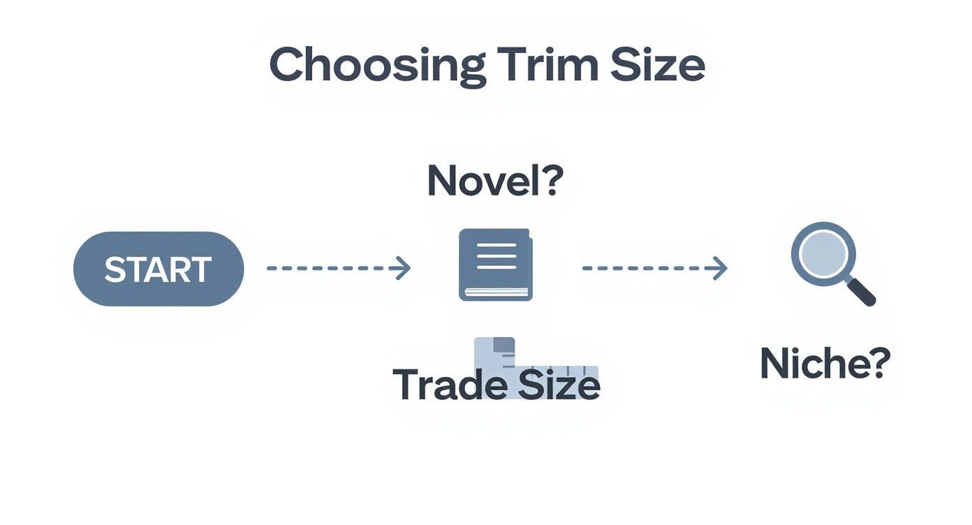
As you can see, a standard novel often uses a trade paperback size, which is a natural fit for classic serif fonts. Niche books or art books might opt for unconventional sizes and more experimental typography to match their content.
Fine-Tuning Spacing for Comfort
The font you choose is only half the battle. The space between the letters and lines is arguably even more critical for a comfortable read. Two terms you'll need to get familiar with are leading and tracking.
Leading (pronounced "ledding," a throwback to the days of lead type) is simply the vertical space between lines of text. Too tight, and the page becomes an intimidating wall of words. Too loose, and the lines feel disconnected from each other. A solid rule of thumb is to set your leading to 120% to 145% of your font size. So, for a 10 pt font, you'd be looking at a leading between 12 pt and 14.5 pt.
Tracking, on the other hand, adjusts the overall horizontal space between characters. You generally don't want to mess with this too much for body text, as font designers have already optimized it. However, adding a tiny amount of positive tracking (say, +5 or +10) can sometimes open up the text just enough to improve legibility, especially at smaller font sizes.
Getting these settings just right can feel a bit technical, which is why many authors turn to the best book formatting software to streamline the process. These tools often include professionally designed templates with ideal leading and tracking already dialed in, ensuring you get a polished result without needing a degree in design. After all, your book's layout is too important to leave to chance.
Structuring Your Content for Easy Navigation
https://www.youtube.com/embed/PwWHL3RyQgk
A truly great book interior does more than just look pretty—it acts as a roadmap for your reader. The way you structure everything, from the very first page to the final index, is what creates a professional and intuitive reading experience. This internal architecture guides readers, tells them what's important, and makes your book a breeze to get through.
The reader's journey starts long before Chapter 1. The front matter is all the stuff that comes before your main text, and it's your first chance to set a professional tone. This is where you'll find the title page, the all-important copyright page, and often a table of contents, dedication, or foreword. Getting these pages right signals to the reader that they're in good hands.
In the same way, the back matter provides a satisfying conclusion to the experience. This section can house anything from an appendix or bibliography to a compelling author bio or even a sneak peek of your next book. Think of the front and back matter as the sturdy bookends that hold your core story together.
Building a Strong Visual Hierarchy
Nothing makes a reader put a book down faster than a dense, confusing wall of text. You need to create a clear visual hierarchy to guide their eyes, and that’s where headings are your best friend. By using different font sizes, weights, and spacing for your chapter titles, main subheadings, and smaller section breaks, you create a visual language that instantly communicates importance.
Here's a simple, field-tested approach I often recommend:
- Chapter Titles (H1): These need to be the biggest, boldest element on the page. Use a much larger font size, a heavier weight, or even a completely different typeface to make them impossible to miss.
- Subheadings (H2): These break up your chapters into major sections. They should stand out from the body text but clearly be secondary to the main chapter title. Often, just making them a point or two larger and bolding them is all you need.
- Lower-Level Headings (H3): For smaller breaks within a section, these are perfect. A simple bold or italic treatment usually does the trick without disrupting the reader's flow.
This kind of structure makes your text instantly scannable, which is a massive plus for non-fiction, where readers often jump around to find specific information.
Keeping the Reader Grounded
Once someone is deep into a chapter, you need to give them subtle signposts to keep them oriented. That’s the job of running heads and page numbers. Running heads are those little lines of text you see at the top of a page, usually showing the book title on one side and the author's name or current chapter on the other.
The key here is to make them functional but unobtrusive. Set them in a smaller font size and place them well inside the top margin so they don't distract from the main story.
Page numbers, or folios, are an absolute must. Whether you place them at the bottom center or on the outside corners of each page, the most important thing is consistency. A rookie mistake I see all the time is leaving page numbers on blank pages or full-bleed images. It’s a small detail, but removing them is one of those tiny professional touches that makes a world of difference.
Integrating Visuals and Finalizing Your Files

Images, charts, and illustrations can take a good book and make it great, but they come with a strict set of technical rules. I’ve seen it happen too many times: a beautiful photo that looks stunning on-screen turns into a pixelated, discolored mess in print because the files weren't handled correctly. This is the final technical hurdle in book layout, and precision is everything.
The most important rule for print is image resolution. Your images must be 300 DPI (dots per inch) at the exact size they will appear in the book. A 72 DPI image you grabbed from a website might look fine on your monitor, but it will look blurry and unprofessional on a printed page. Trust me, there’s no way around this. It’s a non-negotiable standard for quality printing.
Color Spaces and File Formats
Another area where authors often get tripped up is color space. Your computer screen and digital camera use RGB (Red, Green, Blue) light to display images. Professional printers, on the other hand, use CMYK (Cyan, Magenta, Yellow, Black) ink. To make sure the colors in your book match what you intended, you have to convert all your images from RGB to CMYK before sending them to the printer.
When it comes to the right file formats, here’s a quick breakdown of what I recommend:
- JPEG: This is your go-to for photographs. It uses compression to keep file sizes manageable, but always save it at the highest possible quality setting to avoid any weird-looking compression artifacts.
- TIFF: Ideal for high-quality graphics and illustrations, especially anything with sharp lines or text. TIFF uses lossless compression, which means no quality is lost in the process.
- PNG: Use this format for graphics that require a transparent background. A word of caution, though: some older printing workflows can struggle with PNGs, so TIFF is often a safer bet if you're unsure.
The golden rule here is to give your printer the best possible source material. You can always downsample a 300 DPI image, but you can never magically add detail back into a low-resolution file.
Exporting Your Final Files
Once your text is polished and your visuals are perfectly placed, it’s time to create the final files for distribution. This isn’t a one-and-done export; you’ll need two distinct files—one for print and one for digital.
For your print edition, you'll export a print-ready PDF. This is more than just a standard PDF from Word. Your design software will have specific options to include crucial printer marks:
- Bleed: If any image or color block touches the edge of the page, it must actually extend about 0.125 inches beyond the final trim line. This "bleed" gives the printer a small margin of error, ensuring no ugly white slivers appear after the pages are cut.
- Crop Marks: These are tiny lines in the corners of the PDF that show the printer exactly where to trim the paper to your book's final size.
For your ebook, you’ll be exporting a reflowable EPUB file. The key word here is reflowable. Unlike a static PDF, an EPUB allows your text and images to automatically adjust to different screen sizes and reader preferences, like font size. If you want to really dig into creating clean, adaptable files, our guide on https://barkerbooks.com/how-to-format-a-book/ is an excellent place to start.
Of course, the digital files are only half the story. The physical production of your book involves a whole other set of decisions, from paper stock to choosing the right binding method. These choices have a long and fascinating history. It's amazing to think that around half a million printed books from the 15th century still exist today, giving us a rich look at how early book design and distribution evolved.
Your Top Book Layout Questions, Answered
Jumping into book design can feel like learning a new language, with a ton of technical jargon and conflicting advice floating around. I get it. To cut through the noise, let's walk through some of the most common questions I hear from authors. The goal is to give you the confidence to make smart, informed decisions for your book's interior.
Think of it this way: the right tools can make or break your project. While you can technically get a book finished with basic software, your choice directly affects how professional the final product looks and feels.
What’s the Best Software for Book Layout?
If you're aiming for a book that looks like it belongs in a bookstore, the industry gold standard is, without a doubt, Adobe InDesign. It’s what the pros use, and for good reason. InDesign gives you pinpoint control over every tiny detail—from the spacing between letters (kerning) to complex image layouts.
However, not everyone wants or needs a subscription. A fantastic and more budget-friendly alternative is Affinity Publisher. It packs nearly all the same professional-grade features as InDesign into a one-time purchase, which has made it a huge hit with indie authors.
For a straightforward, text-only novel, you can make something like Scrivener or even Microsoft Word work. Just know that you'll sacrifice the fine-tuned control needed for more complex designs involving images, pull quotes, or unique chapter headings.
How Do I Choose the Right Font for My Book?
When it comes to the main body text of your book, there's one golden rule: readability trumps everything. You want a font that’s invisible, one that lets the reader sink into the story without being distracted.
For print, a classic serif font is almost always the right call. Those little "feet" on the letters, the serifs, actually help guide the eye along the line, which makes a big difference during long reading sessions.
Here are a few of my go-to workhorses:
- Garamond: Elegant, classic, and perfect for literary fiction or a thoughtful memoir.
- Caslon: A bit warmer and friendlier, making it incredibly versatile for both fiction and non-fiction.
- Minion Pro: A modern and highly legible serif that just works beautifully on the printed page.
For your chapter titles and other headings, you can create a nice visual contrast by pairing your serif body font with a clean sans-serif like Helvetica Neue or Futura. My biggest piece of advice? Always, always print out a test page. A font can look completely different on paper than it does on your screen.
What's the Difference Between a Print Layout and an Ebook Layout?
This is a big one, and it’s a mistake I see a lot of new authors make. The core difference is simple: a print layout is static. You decide exactly where every word, image, and page number sits on a fixed-size page, and it will never change.
An ebook layout, on the other hand, is reflowable.
A reflowable layout means the text and images have to flow and adapt to fit countless screen sizes and reader preferences—like when someone decides to triple the font size on their Kindle. You’re designing for flexibility, not a fixed canvas.
Because of this fundamental difference, you absolutely need two separate files. One is meticulously designed for print, and the other is optimized for a seamless digital experience.
At BarkerBooks, we live and breathe this stuff. Our team handles every detail of professional interior design and file conversion to make sure your book is stunning in every format. Learn how we can bring your manuscript to life.