
You've shared a link to your book, promoted a consultation, or invited readers to join your newsletter. People click, but then they arrive at a website full of menus, services, and competing invitations. You're left wondering whether the problem is the offer, the audience, or the page.
For authors who want landing pages explained plainly, the starting point isn't button colors or clever headlines. It's the promise someone clicked to explore. A useful landing page helps that person recognize they're in the right place, understand the offer, and take a meaningful next step.
What an Author Landing Page Is and How It Differs
An author landing page is a standalone page built around a specific promise from an ad, newsletter, social post, or other entry point. It asks visitors to complete a focused action, such as requesting an editing quote, downloading a sample chapter, or booking a consultation.
Think of your homepage as the whole bookshop. Your landing page is the display table near the entrance, arranged for the people who stopped because a particular book caught their attention. The distinction is purpose, not necessarily where the page is hosted.
The Omniconvert history of landing pages connects their development to paid search and the growing importance of the post-click experience. The practical lesson remains useful: the destination should continue the message that brought someone there.
Author landing page compared with other author pages
| Page type | Main job | Typical visitor | Navigation |
|---|---|---|---|
| Author landing page | Deliver one promise and one action | Arrives from a specific ad, email or post | Minimal, often none beyond the call to action |
| Homepage | Explain the whole business or author brand | Arrives from brand search or a direct link | Full menu to every section |
| Author website | Present the author's whole body of work | Returning readers, press and event organisers | Books, blog, events and contact pages |
| Book sales page | Sell one title | Readers who already want that book | Buy button with reviews and an excerpt |
A book sales page can also function as a landing page when it serves a focused campaign. Meanwhile, author website design addresses the broader home for your books, biography, events, and reader relationships.
Match the destination to the invitation
Say a poet promotes a ghostwriting consultation through a Facebook ad. The destination should explain whom the consultation suits, what the conversation covers, and how to request it, rather than opening with unrelated publishing packages.
Practical test: Can someone arriving from a specific link complete the promised action without being pulled into a different task?
The Core Elements of an Author Landing Page
Start with the headline because visitors need to recognize their situation before they can evaluate your offer. A service label such as Editorial Support names a category. A question such as Finished your manuscript and ready for readers? connects that category to a decision the visitor is already considering.
The supporting elements should answer the questions that follow: Is this for me? What will I receive? Why should I trust the person offering it? What happens when I click?
Core elements of an author landing page
| Element | Job | Author example |
|---|---|---|
| Headline | State the reader's situation and promise in one line | Finished your manuscript and ready for readers? |
| Subheadline | Name who the service is for and what happens next | For debut novelists with a finished draft, start with a manuscript assessment |
| Hero visual | Show the book or author beside the promise | Cover mockup beside the headline, or author portrait on a bio-led page |
| Author bio | Give credibility and a reason to trust | A memoir writer explains their relevant background and connection to the reader |
| Book excerpt | Let readers sample the voice before committing | An opening scene with permission to publish and a clear route to continue reading |
| Lead magnet | Capture interest from visitors not ready to act | A chapter-planning checklist or a concise ISBN and copyright guide |
| Primary call to action | Name one next action and its outcome | Request my manuscript assessment, repeated after the excerpt and at the page end |
Choose evidence that fits the offer
These elements aren't a checklist of things every page must display. A newsletter signup page may need a short bio and sample issue, while a ghostwriting consultation page needs an explanation of the working process. Adding a book excerpt to an unrelated service page would create distraction rather than reassurance.
For a reader-facing book page, choose an excerpt that demonstrates the experience you're selling. Preserve readable formatting, confirm you have permission to publish the material, and make the route to the complete book obvious. Don't force visitors to download a file merely to discover whether they like the writing.
A bio should establish relevant credibility, not reproduce your entire professional history. A historian promoting historical fiction might explain their connection to the period. A business author might describe the work that informed the book, without adding unrelated credentials.
Make the next step unmistakable
A call to action, often shortened to CTA, is the instruction that tells someone what to do next. Request my manuscript assessment is more informative than Submit because it identifies the outcome, not just the mechanics of sending a form.
For a practical review of layout and CTA placement, MD TECH TEAM's landing page advice offers a useful companion when checking your draft. Apply design guidance to the visitor's actual task rather than treating a template as a formula.
A lead magnet deserves particular care. If downloading a planning checklist is the campaign's purpose, make that the primary action. If a consultation is the goal, keep any download quieter, or offer it after the main interaction, so visitors aren't asked to choose between equally prominent paths.
Form Fields and Trust Signals Authors Should Use
A form is a request for effort and trust. Before completing it, an author may wonder whether a phone number will trigger unwanted calls, whether an unfinished manuscript is acceptable, or who will read an uploaded file. Asking for more information doesn't resolve those concerns.
For initial contact, collect name, email, manuscript status, and primary service need. Manuscript status can use plain choices such as not started, drafting, and finished. Collect genre, word count, language, phone number, and budget later, when each answer helps determine the next step.
Baymard's checkout usability benchmark found that the average U.S. checkout displayed 23.48 form elements, while testing identified an effective flow with as few as 12 elements. Checkout isn't the same as an author enquiry, but the comparison gives a useful reason to question every field rather than copy a long intake questionnaire.
Remove avoidable form friction
Use these implementation rules when building the form:
- Keep labels visible. Placeholder text disappears during typing and shouldn't be the only explanation of a field.
- Explain the request. Mark required and optional fields explicitly, and explain why potentially sensitive information is needed.
- Use appropriate inputs. Set email fields to the email input type, enable relevant autocomplete, and provide suitable mobile keyboards.
- Validate beside the problem. Explain how to fix an error without clearing the answers someone already entered.
- Test the full interaction. Check keyboard focus, selection controls, confirmation messages, and submission failures.
For contact-specific implementation guidance, Blu Dragonfly LLC explains how to make contact forms accessible. Test with a keyboard as well as a mouse, including whether someone can reach and activate the submit button.
Answer the manuscript questions before submission
Place a plain-language explanation beside any file-upload control. State what happens after submission, who can access the file, how it is stored, and how the author can ask about retention or removal. Publish only handling practices your team follows.
Explain the scope of copyright and ISBN support without implying that they are interchangeable. Separate permission to respond to an enquiry from optional marketing consent, and don't pre-tick the marketing choice.
The Accio discussion of landing-page design trends includes accessibility and transparent data practices among trust-building considerations. Provide sufficient contrast, descriptive image text, readable typography, and captions or transcripts for promotional videos.
Asking for less information isn't a substitute for explaining how you'll treat the information you receive.
These are trust and inclusion features, not a promise of a conversion lift. They help authors make an informed decision without encountering avoidable barriers.
Page Speed and Mobile Delivery
A visitor can't evaluate an offer they haven't yet been able to read. Heavy media, delayed text, or a button that moves during loading can interrupt the path from interest to action. Treat performance as part of publishing the page, not as a final cosmetic adjustment.
Use this build checklist before sending campaign traffic:
- Prioritize the opening screen. Keep the headline, value proposition, and primary CTA visible early on a phone. Don't let an oversized portrait push the entire offer out of sight.
- Limit blocking scripts. Load only the JavaScript the page needs. Review chat widgets, tracking tags, animation libraries, and embedded tools rather than carrying every website feature onto the campaign page.
- Prepare responsive images. Compress the cover and portrait, and serve appropriately resized versions for smaller screens. Check that text within a cover remains legible.
- Reserve media space. Specify image dimensions and preserve space for video embeds so surrounding content doesn't jump as assets appear.
- Defer lower-page media. Lazy-load promotional videos and other nonessential media below the opening content.
- Use semantic HTML. Structure the page with meaningful headings, lists, links, and buttons rather than clickable decorative containers.
Test the experience, not just the score
Open the finished page on a mid-range phone using a slow mobile connection. Read the headline, tap the CTA, complete the form, trigger an error, and check the confirmation. A desktop preview won't reveal every awkward keyboard or touch interaction.
Baymard's mobile-form guidance highlights problems involving labels, field descriptions, touch keyboards, and error messages. A fast-loading page still needs usable controls.
For multilingual pages, check each language version independently. Translated copy can wrap differently, expand buttons, or place important information farther down the screen.
- Measure delivery. Review mobile and desktop Core Web Vitals in PageSpeed Insights and monitor real-user performance where available.
- Measure completion. Compare loading behavior with form completion for the same traffic segment, so a technical improvement can be evaluated against an actual outcome.
Metrics and Conversion Benchmarks to Track
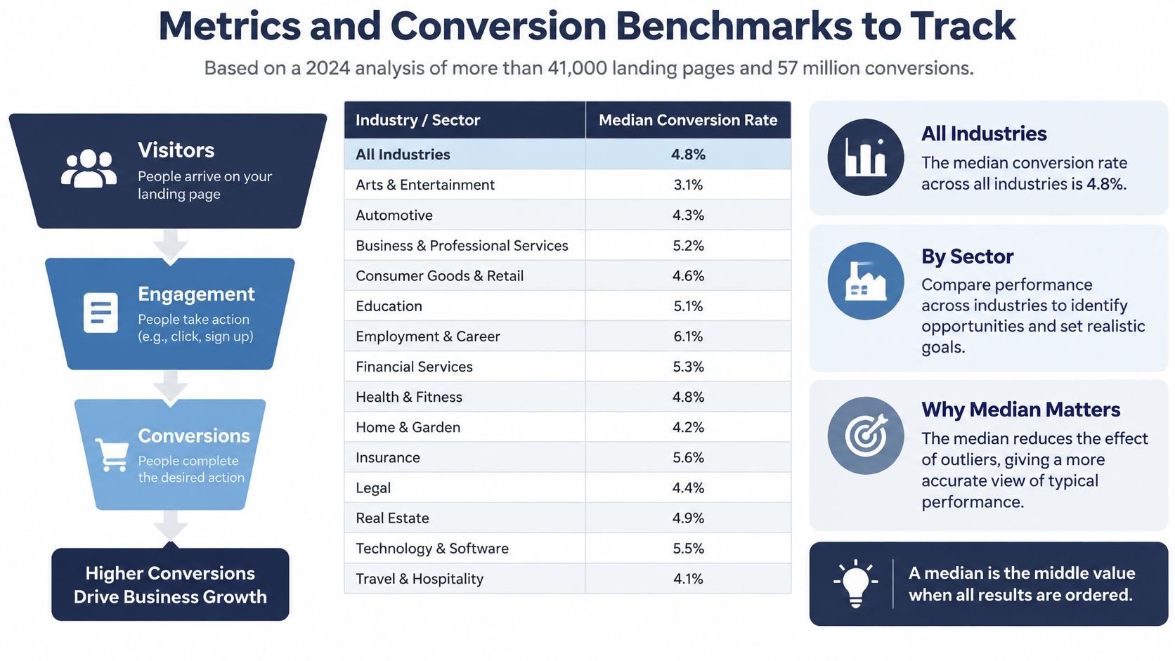
Median landing page conversion rate by industry, 2024
| Industry | Median conversion rate |
|---|---|
| All industries | 6.6% |
| Entertainment | 12.3% |
| Education | 8.4% |
| Finance and insurance | 8.3% |
| Ecommerce | 4.2% |
| Software as a service | 3.8% |
These figures come from Unbounce's 2024 benchmark, summarized by Digital Applied, covering more than 41,000 landing pages and 57 million conversions collected between July 2023 and July 2024; the same reporting puts mobile at 83% of visits and says desktop visitors converted about 8% better on average.
A median is the middle value when results are ordered. Half of the pages fall at or below it, and half at or above it, making it less sensitive than a simple average to unusually high or low results.
The chart provides a visual reference for comparing those benchmarks.
Use benchmarks as context, not a verdict
These aren't author-publishing targets. A sample-chapter download asks for a different commitment from a paid service enquiry, and someone arriving from an established newsletter has a different relationship with you from someone clicking an unfamiliar ad.
Evaluate traffic source, offer strength, audience intent, device, copy, and requested commitment together. Don't label a page unsuccessful just because it falls below a cross-industry median. Equally, don't celebrate a high submission rate before checking whether those submissions are relevant.
Track mobile and desktop separately. Also separate campaign sources and language versions, so a strong result from an established audience doesn't hide problems with a newer audience.
Follow the funnel through to a qualified lead
Record the following events in order, using Google Analytics 4 and your enquiry or customer-management system:
- Landing-page view. Someone loaded the destination. Exclude internal testing from your reporting.
- CTA click. Someone chose to approach the next step. Low click activity suggests reviewing the offer, message match, or visibility of the action.
- Form start. Someone began entering information. A gap between clicks and starts may indicate a confusing destination or unexpected request.
- Form completion. The submission succeeded. Trigger the event on confirmed success, not merely on a button press.
- Consultation booked. The person reserved an actual conversation, rather than stopping at an enquiry.
- Qualified lead. The enquiry matches the service, project stage, and practical conditions needed to proceed.
A completed form and a qualified lead are different outcomes. A novelist seeking proofreading isn't necessarily a fit for a ghostwriting campaign, even if they submit every field correctly. Record qualification consistently so you can distinguish more enquiries from more suitable enquiries.
Measurement rule: Name the action you're counting before you calculate its conversion rate.
Keep visits and completed actions separate, and use the same denominator when comparing versions. For a form-completion rate, compare successful submissions with eligible landing-page visits; for a qualification rate, state whether you're comparing qualified leads with submissions or visits.
If your newsletter runs on Substack, Narrareach's guide to set up GA4 for Substack tracking can help connect subscription activity to measurement. If the page sells a book, extend your reporting to tracking book sales rather than ending at the retailer-button click.
Improve a specific audience segment at a time. Otherwise, a change in who arrived can look like a change in how well the page worked.
Author Landing Page Examples by Goal
Consider a debut novelist who has finished a manuscript and wants help moving toward publication. They aren't looking for inspiration to begin writing. They need to understand what happens to a completed draft and how to discuss its readiness.
A publishing-focused page should reflect that project stage.

The finished manuscript
For this hypothetical novelist, the page can show a cover concept if one exists, a permission-cleared excerpt where relevant, and a straightforward explanation of the first conversation. The CTA should invite a brief call about the manuscript, not send the author into a catalogue of unrelated services.
The excerpt's role needs to be clear. On the novelist's reader-facing page, it demonstrates the book's voice; on a service page aimed at that novelist, a suitable sample should demonstrate the provider's work. Those are different audiences, even though both pages concern the same manuscript.
The memoir idea without a structure
Now consider an executive with a memoir idea, scattered notes, and uncertainty about how to organize them. A page centered on print-ready files would answer the wrong question. This visitor needs to understand how raw experience becomes a coherent narrative.
A ghostwriting-focused page should explain the proposed interview and drafting process, clarify confidentiality arrangements, and show a permission-cleared writing sample. The requested action could be a conversation about the story's scope, without requiring a full personal archive at first contact.
Video can support a page when it helps explain the process. Review any embedded video for relevance, captions, and a usable alternative before publishing it.
The published book that needs attention
A published author whose book isn't selling has another problem entirely. They need a marketing page that explains campaign objectives, reporting, and how progress will be judged, without promising sales that haven't occurred.
Our starting service choice follows the author's stage:
| Author situation | Starting service |
|---|---|
| Finished manuscript | Book Publishing |
| Idea that needs structure | Ghostwriting |
| Writer who gets stuck | Coaching |
| Already published and needs a boost | Marketing |
These choices are useful because they prevent an author from having to translate a broad service menu into their own next step. Each destination should then answer the concerns attached to that stage.
Seer Interactive's AI-search analysis found that only about 7% of AI sessions landed on homepages, with most arriving deeper in websites. A visitor may therefore encounter a service page without first reading your introduction or understanding your business.
Give that page enough context to stand on its own. The analysis describes its conversion evidence as limited, so don't assume AI-referred visitors will behave a particular way. Judge each destination by relevant consultation requests, suitable manuscript enquiries, or another qualified action, rather than bounce rate alone.
Build Your First Page for One Author Goal
Begin with a page you can publish, test, and maintain. A manageable first version is more useful than an elaborate design whose audience and outcome remain uncertain.
- Choose the intent. Write down the visitor's situation and the matching project stage.
- Draft the headline. Describe the problem or desired outcome in language the visitor would recognize.
- Trim the intake. Keep decision-critical questions at first contact and move detailed project information into follow-up.
- Select relevant evidence. Add the appropriate bio, excerpt, or sample. Use a lead magnet only when it supports the campaign rather than competing with it.
- Name the outcome. Make the primary button describe what the visitor will receive or arrange.
- Verify measurement. Complete a test submission and confirm that the funnel records it correctly through qualification.
Test a specific question
Sci-Tech Today reported in 2025 that approximately 60% of companies used A/B testing on their landing pages, according to the SHNO funnel-optimization statistics roundup. You don't need to imitate another company's testing schedule; start with a clear question about your own page.
Compare a situation-led headline with a service-led headline while keeping the remaining page stable. Use the same audience segment, avoid drawing conclusions from a handful of submissions, and assess lead suitability alongside completion.
If your aim is selling directly to readers, plan the purchase and delivery experience too. A guide to direct-to-consumer book sales can help you connect the page with the transaction that follows.
Turn the page brief into a project
With us, starting involves a brief call covering goals, clear pricing, and a launch date, booked through the consultation form or by WhatsApp. Bring your intended audience, the promise you want to make, and the action you want visitors to complete.
The process then moves through choosing a plan, an initial meeting to map the project, progress and feedback, publication, and follow-up.
BarkerBooks offers author landing pages alongside publishing, ghostwriting, editorial, and marketing support. Visit BarkerBooks to arrange a brief consultation and discuss a page built around your author goal, a clear promise, and a measurable next step.