
Getting your book’s formatting right on Kindle Direct Publishing isn’t just a technical box to check—it’s the first promise you make to your reader. This is what separates a book that looks polished and professional from one that screams “amateur.” It directly shapes how readers experience your story, what they say in their reviews, and ultimately, how well your book sells.
Think about it: proper formatting makes your book a pleasure to read, keeps it in good standing with Amazon’s royalty programs, and builds your reputation as an author who cares.
Why You Can’t Afford to Skimp on KDP Formatting
Your book’s formatting is its digital handshake. If it’s messy, inconsistent, or hard to navigate, you’ve already made a poor first impression. That kind of friction can easily lead to a bad review or, even worse, a reader giving up and getting a refund. A clean, thoughtfully structured file, on the other hand, shows you respect your reader’s investment of time and money.
That first impression carries real weight, especially in a crowded market. Before you get lost in the weeds of KDP specifics, it’s worth brushing up on the general book formatting best practices that apply everywhere. It’s the foundation for a quality product.
How Formatting Directly Impacts Your Royalties
Believe it or not, how you format your manuscript can directly affect your bank account. If you’re in KDP Select, your royalties from Kindle Unlimited borrows are tied to the number of pages read. This is calculated using something called the Kindle Edition Normalized Pages (KENP) count.
Sloppy formatting—think weird spacing, missing chapter breaks, or font glitches—can throw off that page count and literally cost you money.
And the stakes are high. Indie authors are a dominant force, with over 50% of Kindle’s Top 400 books in 2023 coming from self-publishers on KDP. The KDP Select Global Fund is massive, paying out $61.3 million in April 2025 alone to authors based on pages read. If your book is a mess, readers won’t stick around, and you’ll miss out on your slice of that pie.
A reader who has to fight your book’s layout is a reader who won’t finish it. Every formatting error is a potential lost sale and a nudge toward a one-star review.
Good formatting isn’t just about aesthetics; it’s a strategic business decision. The table below breaks down how specific choices can either cost you or reward you.
How Formatting Choices Impact Your KDP Royalties
| Formatting Element | The Pitfall (Poor Implementation) | The Payoff (Professional Result) |
|---|---|---|
| Table of Contents | A non-clickable, static TOC frustrates readers trying to navigate the book, leading to poor reviews. | A dynamic, clickable TOC provides a seamless user experience, encouraging longer reading sessions. |
| Chapter Breaks | Missing or improper page breaks merge chapters, confusing the reader and disrupting the KENP page count. | Clean, consistent chapter breaks improve readability and ensure an accurate page count for royalty calculations. |
| Image Resolution | Low-res images (below 300 DPI) look blurry and pixelated in print, cheapening the book’s feel. | High-resolution images look sharp and professional, enhancing the reader’s visual experience. |
| Typography & Spacing | Inconsistent fonts and chaotic line spacing make the text hard to read, causing reader fatigue. | Clean, consistent typography provides a smooth reading experience that keeps readers immersed in the story. |
Ultimately, investing time in quality formatting elevates your work from a simple manuscript to a professional product that can compete in the marketplace.
Sidestep Common Manuscript Rejection Errors
Amazon uses a mix of automated checks and human reviewers to catch formatting issues. A file with major problems can get flagged or outright rejected, delaying your launch and causing a lot of preventable stress. Knowing what to look for from the start is your best defense.
Here are a few of the most common tripwires I see:
- Bad Margins and Gutters: For print-on-demand books, getting the interior margin (the “gutter”) wrong means your words can get swallowed up by the binding.
- Pixelated Images: Any image under 300 DPI is going to look fuzzy and unprofessional in a physical book. It’s an instant red flag for poor quality.
- A Useless Table of Contents: An ebook needs a clickable, dynamic Table of Contents. If readers can’t easily jump between chapters, they get frustrated. Fast.
- Wonky Fonts: Using odd fonts that aren’t properly embedded is a recipe for disaster. They can show up as gibberish or default to a generic font on different Kindle devices and apps.
By focusing on clean, deliberate Kindle Direct Publishing formatting from day one, you’re not just avoiding technical headaches. You’re building a better book, creating a superior reader experience, and setting yourself up for the best possible chance at commercial success.
Preparing Your Manuscript The Right Way
The road to a beautiful Kindle book starts way before you ever think about hitting the “upload” button. A clean, well-structured source file is, without a doubt, the most critical piece of the puzzle for successful Kindle Direct Publishing formatting. It doesn’t matter if you’re writing in Microsoft Word, Scrivener, or Google Docs; getting this initial prep work right will save you from nearly every common formatting nightmare down the line.
Think of it like building a house. If you pour a cracked and crooked foundation, everything you build on top of it is going to be a mess. The same goes for your book file. All those hidden formatting codes and manual tweaks you’ve made over time? They create absolute chaos when KDP’s system tries to convert your file.
This isn’t just about looks. It’s about the reader’s experience and, ultimately, your bottom line.

As you can see, cutting corners here leads directly to frustrated readers, which tanks your reviews and royalties. It’s a vicious cycle that starts with a messy manuscript.
The Essential Manuscript Cleanup
Your very first task is to become a detective. You need to hunt down and destroy every bit of manual formatting you’ve added. Most word processors have a feature called “Show/Hide Formatting Marks” — it usually looks like a little paragraph symbol (¶). Turn it on. You’re about to see the hidden skeleton of your document: dots for spaces, arrows for tabs, and paragraph marks every time you hit Enter.
The mission is to get rid of anything that will confuse KDP’s conversion software. Here’s your hit list:
- Kill the tabs. Seriously. Never, ever use the tab key to indent a paragraph. You’ll handle this later using styles.
- Fix extra spaces. Run a find-and-replace for double spaces and swap them all with single spaces. It’s a classic sign of amateur formatting.
- Nuke manual line breaks. Did you use Shift+Enter to force a line to break in the middle of a paragraph? Get rid of it. Let your text flow naturally from one margin to the other.
This isn’t just busywork; it’s absolutely vital. For a much deeper look at the nitty-gritty, these manuscript formatting guidelines are an excellent resource for getting your file technically perfect.
Harness the Power of Styles
If you only listen to one thing I say in this entire guide, make it this: use Styles. I cannot stress this enough. Instead of manually highlighting a chapter title and changing its font or making it bold, you need to apply a predefined style, like “Heading 1” or “Heading 2,” from your word processor’s style menu.
Why is this a non-negotiable rule? Two huge reasons.
First, it guarantees your book is consistent from start to finish. Every chapter title you tag with “Heading 1” will look exactly the same. But more importantly, this is how KDP builds your book’s clickable Table of Contents. The software scans your document specifically for heading styles and uses them to create the navigation menu for your ebook. No styles, no functional TOC.
A manuscript without properly applied heading styles will result in a failed or non-functional Table of Contents, which is one of the top reasons for a negative reader review.
A simple, effective structure usually looks something like this:
- Book Title: Apply a “Title” style.
- Chapter Title (e.g., “Chapter 1: The Beginning”): Apply the “Heading 1” style.
- Sub-section within a chapter: Apply the “Heading 2” style.
- All your normal body paragraphs: Apply the “Normal” or “Body” style.
Final Touches for a Clean File
Okay, your document is now clean and structured with styles. A few final tweaks will ensure it converts perfectly.
Start with your font. While it’s tempting to get fancy, you’re better off sticking with classic, readable fonts like Garamond, Times New Roman, or Bookerly. These are designed to look great on e-reader screens.
Next, standardize your paragraph settings. The industry standard is single spacing with a first-line indent between 0.3″ and 0.5″. Don’t add an extra space between paragraphs—the indent is all you need to signal a new one. This gives you that professional, published-book look.
Finally, you need to master the page break. To start a new chapter, never just mash the “Enter” key until you spill onto a new page. This creates a mess of blank lines that will look awful on different devices. The right way is to insert a formal Page Break immediately after the final punctuation of a chapter. This tells the KDP converter, “Stop here, and start the next thing on a brand new screen.” It’s the only way to guarantee clean, predictable chapter divisions every single time.
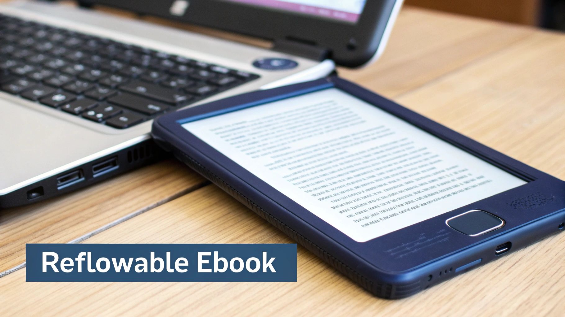
Mastering Ebook Formatting for a Reflowable World
It’s easy to forget, but ebooks and print books are two completely different animals. If you treat them the same, you’re setting yourself up for a formatting nightmare. A physical book is static—what you see on the page is what you get. An ebook, on the other hand, is a fluid, dynamic file designed to adapt to countless screen sizes, from a tiny smartphone to a massive Kindle Scribe.
Readers have all the power here. They can change the font size, fiddle with the margins, and even swap out the font family entirely. Your job isn’t to lock down the design but to build a file that gracefully adapts to whatever they throw at it. Think of it less like designing a fixed page and more like creating a flexible container for your words. The goal is to make sure every element—images, your table of contents, and all your text—looks and works perfectly, no matter how a reader customizes their settings.
Here’s a look at what a properly formatted interior file looks like, taken straight from KDP’s own guidelines. See the visible paragraph marks and breaks?
This behind-the-scenes view reveals the hidden structure of the document. It’s this invisible architecture that KDP’s conversion software needs to produce a clean, professional-looking ebook.
Getting Your Images to Behave
Images are, without a doubt, one of the biggest headaches in ebook formatting. A picture that looks perfect in your Word document can suddenly end up floating in the middle of a sentence or just vanish completely on a Kindle.
Thankfully, the fix is simple but absolutely non-negotiable: you must set every single image to format as In Line with Text.
This setting anchors your image to a specific point, treating it like a giant letter in your manuscript. It stops the image from drifting around as the text reflows on different devices. If you’re tempted to use “Wrap Text” or other floating options, don’t. I promise you it will only lead to unpredictable and frustrating results for your readers.
Beyond placement, image quality is also a big deal. For crisp, clear visuals, make sure your images tick these boxes:
- Format: Save them as JPEGs (.jpg). This is the gold standard for KDP ebooks.
- Resolution: Aim for at least 300 DPI (Dots Per Inch). While this is more of a print requirement, it’s a great habit for ebooks, ensuring your images look sharp on high-resolution screens.
- Alignment: Always center them on the page. It provides the cleanest and most professional look across all devices.
Building a Dynamic Table of Contents
In the world of ebooks, a clickable Table of Contents (TOC) is not optional. It’s a basic requirement. Readers rely on it to navigate your book, and its absence screams “amateur.” The good news is, if you’ve been using Heading Styles correctly, creating a professional TOC is an almost entirely automated process.
Your word processor can generate a dynamic TOC based on any text you’ve formatted with “Heading 1,” “Heading 2,” and so on. When KDP converts your file, it magically transforms that list into a fully interactive menu. Readers can then tap a chapter title and jump straight there. Whatever you do, never try to create a TOC by manually typing chapter names and page numbers—it just won’t work in a reflowable ebook.
The real secret to effective Kindle Direct Publishing formatting is learning to let the automated tools do the heavy lifting. A TOC built from styles is dynamic, always accurate, and provides the seamless navigation readers expect.
Understanding Ebook Typography and Fonts
You might have a favorite font that perfectly captures your book’s mood, but remember this: the reader has the final say. Most e-readers allow them to pick their own font. Because of this, it’s best to stick with simple, web-safe serif fonts like Garamond or Times New Roman for your body text. These are universally supported and always render cleanly.
That said, you can embed custom fonts for things like chapter titles if they’re a key part of your branding. Font embedding packages the font file right inside your ebook, so it displays correctly even if the reader doesn’t have it installed. Just use this feature sparingly. Embedding fonts increases your file size, which can affect your KDP delivery costs and, ultimately, your royalties.
Formatting Special Elements for Ebooks
Certain text elements need special care to make sure they adapt correctly on an e-reader.
- Blockquotes: Use your word processor’s built-in blockquote or indent style. Don’t just hit the spacebar or tab key to create an indent.
- Lists: Always use the automated bulleted or numbered list functions. This is the only way to ensure the list keeps its structure and proper indentation.
- Hyperlinks: Double-check that all external links are active and formatted correctly. The link text should be descriptive (“check out our website”), not just a raw URL.
The KDP boom happened because it made this whole process accessible. Since its launch in 2007, Amazon’s straightforward guidelines have completely changed the self-publishing game. Think about it: by 2018, the number of KDP titles exploded to over 1.4 million from just a few thousand, making up more than 91.5% of all self-published books in the U.S. that year.
This incredible growth proves how easy it is to create a great-looking reflowable ebook when you stick to reliable formats like DOCX and EPUB. For a deeper dive into file types, you can check out my guide on how to convert a Word document to an EPUB.
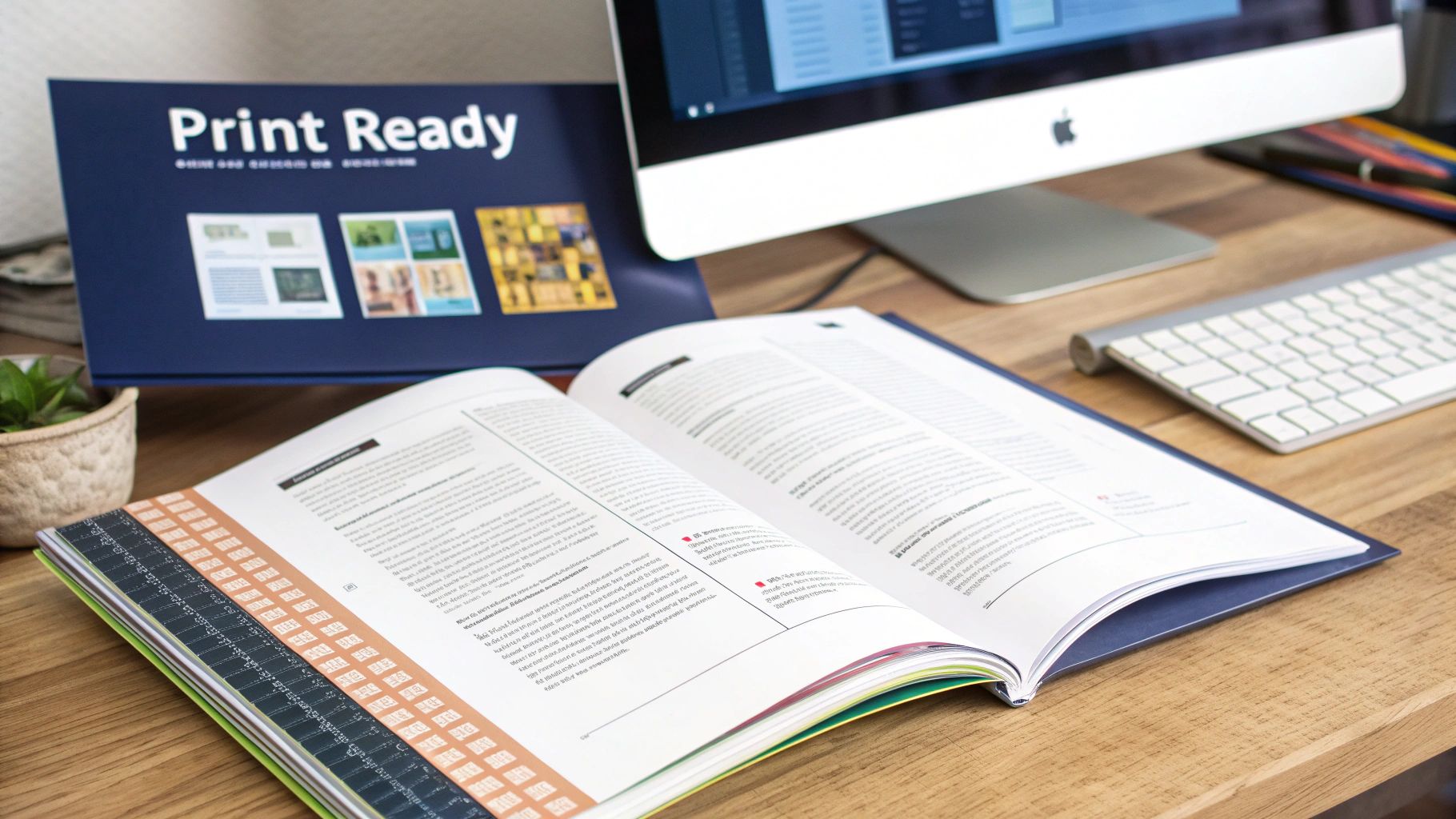
Getting Your Paperback Print-Ready
Ebooks are flexible, flowing to fit any screen. A physical paperback, however, is a different beast altogether. It’s a fixed object, and getting it right demands precision. This is where many authors get tripped up—the world of print-on-demand formatting is a game of measurements and rules. Even a tiny mistake can get your file rejected or, worse, result in a printed book with words disappearing into the binding.
Your first and most critical decision is the trim size. This is simply the final physical dimension of your book, like 6″ x 9″ or 5″ x 8″. It’s not just an aesthetic choice; it directly impacts your page count, which then dictates your printing costs and royalty on every sale. A smaller trim size means more pages, while a larger one means fewer. If you’re unsure where to start, you can find great info on typical standard book sizes and which genres they suit best.
Once your trim size is locked in, every other element—from margins to images—must be set up to match it perfectly.
Mastering Margins, Gutters, and Bleed
Unlike ebooks, paperbacks live and die by their margins. KDP has strict minimums that change based on your page count, and they exist for one reason: to make sure nothing important gets chopped off during printing and binding. You need to get familiar with three key terms.
- Margins: This is the empty space around the edges of your page—top, bottom, and the outside edge. Good margins keep the text from feeling crowded and make the book comfortable to read.
- Gutter: Pay close attention to this one. The gutter is the extra space you add to the inside margin, right where the pages meet the spine. If your gutter is too small, your words will vanish into the book’s crease, making them impossible to read.
- Bleed: You only need to worry about bleed if you have images or colored backgrounds that run all the way to the edge of the page. To achieve this, you have to design your file to be slightly larger than your trim size. The printer then trims off the excess, creating that clean, edge-to-edge look. For a 6″ x 9″ book with full bleed, for example, your PDF pages would need to be 6.125″ x 9.25″.
Setting Up Professional Headers, Footers, and Page Numbers
For that truly polished, bookstore-quality feel, your headers and footers need a specific touch. A professional paperback doesn’t just have page numbers at the bottom; it uses mirrored margins to alternate how information appears on left and right pages.
In your writing software, you’ll want to find a setting like “Mirror margins” or “Different odd and even pages.” This lets you do things like put the author’s name on the top-left of every left-hand page (verso) and the book title on the top-right of every right-hand page (recto). The page numbers then sit neatly on the outer corners. It’s a subtle detail, but it’s one of the clearest signs of a professionally formatted book.
Think of your paperback file as the final, unchangeable blueprint for the printer. KDP requires a print-ready PDF for the interior, which locks every single element—text, images, and margins—into a fixed position.
Handling Images and Exporting the Final PDF
The rules for images in print are much more demanding than for ebooks. Every single image you include must have a resolution of at least 300 DPI (Dots Per Inch). Anything less will look blurry or pixelated on the printed page. Also, while ebooks use the RGB color profile designed for screens, print files are best made using CMYK, the industry standard for physical printing.
The explosion in self-publishing is thanks in large part to KDP making these standards clear and accessible. The industry has seen staggering growth, with over 2.6 million self-published books receiving an ISBN in 2023 alone—more than double the output from a decade ago. KDP’s straightforward requirements for things like 300 DPI images and bleed settings are a major reason why Amazon can successfully publish an estimated 1.42 million indie titles each year.
Once you’ve double-checked every detail, the last step is to export your masterpiece. You’ll need to save your file as a high-quality, print-ready PDF. Look for an option like “Export as PDF” or “Save as PDF” in your software, and always choose a setting like “Best for printing.” This ensures all your fonts are embedded and your high-resolution images are preserved, giving KDP’s printers exactly what they need to create a flawless paperback.
Bringing It All Together with Kindle Create and Kindle Previewer
Once you’ve wrestled your source file into shape, you’re ready for the final leg of your Kindle Direct Publishing formatting journey. This is where Amazon’s own free tools, Kindle Create and Kindle Previewer, come into play. Think of them as the bridge between your manuscript and what your readers will actually experience. They help polish and test everything, but it’s crucial to know what they’re good for—and what they’re not.
Kindle Create is best understood as a finishing tool, not a writing tool. You don’t write your book in it. Instead, you import your polished .docx file to add those last professional touches. It lets you apply different design themes, create elegant drop caps for your chapter headings, and insert stylized elements like custom blockquotes.
Its main job is to simplify the process of making a clean, functional KDP file, which is a lifesaver for authors with text-heavy books like novels or memoirs.
Who Should Use Kindle Create?
If your book is primarily text and you want a straightforward path to a polished ebook, Kindle Create is probably your best friend. It takes a properly structured Word document and turns it into a ready-to-upload file without you needing to know a lick of code.
But it’s no substitute for a well-prepared manuscript. If you throw a messy file at it—one without proper heading styles for chapters—Kindle Create won’t know what to do. It’ll get confused trying to identify your book’s structure. It’s also not the right choice if you need precise control over the design, like with a complex non-fiction layout or a children’s picture book. For that kind of work, a professionally crafted EPUB file is still the gold standard.
Kindle Create is a powerful assistant, but it can’t fix a broken foundation. It’s designed to elevate an already clean manuscript, adding a consistent, professional sheen with very little fuss.
Kindle Previewer: Your Final Quality Check
This part is non-negotiable. Whether you use Kindle Create, upload a Word doc directly, or provide your own EPUB, you absolutely must run your file through Kindle Previewer. This free desktop app is your mandatory final inspection before you publish. It’s the only way to see precisely how your book will look on every device in the Kindle family, from a tiny phone screen to a large Fire tablet to a classic e-ink reader.
Trust me, what you see in Word is not what your readers will see. The Previewer emulates all the different devices, screen sizes, and orientations, exposing formatting gremlins you’d never see otherwise. This is your last chance to catch those embarrassing mistakes that can sink your book with bad reviews.
Your Pre-Flight Checklist for Kindle Previewer
Treat this review like a pilot’s pre-flight check. You need to be methodical. Go through your book page by page, switching between different device emulations, and keep a sharp eye out for these common culprits:
- Test Your Table of Contents: Click every single link. Does each one take you to the exact right spot? A broken TOC is one of the fastest ways to frustrate a reader.
- Confirm Chapter Breaks: As you get to the end of a chapter, does the next one start fresh on a new page? Look for any weird spacing or text that runs together.
- Check Image Placement and Quality: How do your images hold up on a small phone screen versus a tablet? Are they centered? Do they look crisp and clear, or are they fuzzy and pixelated?
- Hunt for Weird Text Flow: Keep an eye out for odd line breaks, random gaps between words, or paragraphs that have smashed together. These issues often pop up when you flip the device from portrait to landscape mode.
Taking the time for this final quality control step ensures all the hard work you put into your Kindle Direct Publishing formatting results in a book that looks professional and provides a fantastic reading experience.
Answering Your Top KDP Formatting Questions
Even after you’ve followed all the steps, a few tricky questions always seem to pop up right before hitting that “publish” button. I’ve seen these trip up authors time and time again, so let’s clear up the confusion on some of the most common KDP formatting hurdles.
Think of this as the troubleshooting section you can jump to when you’re stuck. Getting these details right can be the difference between a smooth launch and a frustrating delay.
“Can’t I Just Upload My Normal Word Document?”
I hear this one all the time. While KDP technically lets you upload a standard .DOCX file, I strongly advise against it. It’s a roll of the dice, and the odds aren’t in your favor.
Your everyday Word doc is a minefield of hidden formatting codes left over from your writing and editing. When KDP’s automated system tries to convert it, that hidden code can wreak havoc, leading to random line breaks, jumbled paragraphs, or a Table of Contents that goes nowhere.
The only way to safely use a Word file is to “clean” it meticulously first. That means applying Styles to every heading, stripping out all manual formatting (like using the tab key for indents), making sure every image is set to “In Line with Text,” and using proper page breaks. Honestly, following the prep steps we covered earlier is your best bet for a clean, predictable result.
Reflowable vs. Fixed Layout: What’s the Real Difference?
This is a crucial fork in the road, and choosing the right path is simple for most authors. A reflowable ebook is the gold standard for novels and most non-fiction. The text “flows” to fit any screen, letting readers adjust the font size and style. It’s flexible and user-friendly.
A fixed-layout ebook, on the other hand, is static, like a digital snapshot of a page. The text and images are locked in place, just like in a PDF.
For almost everyone reading this, reflowable is the way to go. It’s what Kindle readers expect, and it’s a non-negotiable requirement if you want to enroll in Kindle Unlimited and get paid for pages read.
The only time you should even consider fixed-layout is for highly visual books where the layout is part of the experience—think children’s picture books, complex cookbooks, or graphic novels.
What are the Most Common Errors That Get Books Rejected?
Nothing’s more frustrating than getting that rejection email from Amazon. For print books, the two biggest culprits are almost always margins and bleed.
So many authors set their inside margin (the “gutter”) too narrow, and their text ends up uncomfortably close to the binding. The other classic mistake is with full-page images. If an image is supposed to go to the edge of the page, you must extend it 0.125 inches past the trim line to account for the bleed.
For ebooks, the most common rejection flags I see are:
- A broken Table of Contents (nearly always because the author didn’t use heading styles).
- Low-resolution images that look fuzzy or pixelated on an e-reader.
- Unsupported fonts that just show up as generic text on a reader’s device.
My best advice? Use the Kindle Previewer tool before you even think about uploading. It’s brilliant at catching almost all of these deal-breaker issues ahead of time.
“Do I Really Need a Separate File for My Ebook and Paperback?”
Yes. A thousand times, yes. This is not optional. You absolutely must create and format two completely separate files. Trying to use one file for both is a guaranteed recipe for disaster—it will either fail to upload or look terrible in one or both formats.
Your ebook file (a specially prepped .DOCX or an .EPUB) is built to be dynamic and reflowable. It has no page numbers, no headers, and no fixed margins.
Your paperback file, however, has to be a print-ready PDF built to precise measurements. It needs a specific trim size, carefully set margins and gutters, headers and footers with page numbers, and images at a crisp 300 DPI. Always treat them as two distinct projects.
Navigating the world of publishing can feel complex, but you don’t have to do it alone. BarkerBooks offers comprehensive services to transform your manuscript into a professionally published book, handling everything from expert editing and formatting to global distribution. Let our team of specialists guide you every step of the way. Discover how we can bring your author dreams to life at https://barkerbooks.com.