
You’ve poured everything into your manuscript. Countless hours, late nights, maybe a little bit of your soul. The last thing you want is for it to get tossed aside before an agent even reads the first sentence.
That sounds harsh, but it’s a reality in the publishing world. Your manuscript’s formatting is its first test, and you don’t even get to be in the room when it’s graded. It’s not about being pretty; it’s about showing you’re a professional who understands the industry’s unspoken rules.
Why Your Manuscript’s First Impression Is Everything
Think of your manuscript format as its handshake. Is it firm and confident, or is it a confusing mess? A clean, standard layout—think 12-point Times New Roman, double-spacing, and 1-inch margins—tells an agent you’re serious. A chaotic, hard-to-read document just adds to their workload, and with hundreds of submissions piled up, they don’t have time for that.
This isn’t just about making a good impression. It’s about making their job easier.
Speaking the Unspoken Language of Publishing
When you nail the formatting, you’re sending a clear message before they even read your query letter.
- You’re a pro. You’ve done your homework and respect the process.
- Your story is easy to read. Standard formatting is designed for readability, letting them focus on your plot and characters, not on squinting at a weird font.
- You value their time. A properly formatted document slips right into their workflow without needing any extra tweaks from an assistant.
Ignoring these guidelines can have serious consequences. For example, a staggering 20-30% of academic submissions are rejected based on formatting errors alone. In the world of fiction, poor formatting can cause a two to four-week delay in getting a response, turning a potential “yes” into a frustrating request to reformat and resubmit.
If you’re interested in learning more about why these details are so critical, we’ve got more insights for you over at BarkerBooks.
Beyond the Submission Pile: The Long-Term Game
Getting your formatting right isn’t just a hoop to jump through to get an agent. It sets the stage for your book’s entire life. A polished presentation is the very first step toward earning respect from industry pros and, eventually, readers. After all, this initial professionalism has a ripple effect, eventually influencing the direct impact of book reviews on an author’s career.
A manuscript that is easy on the eyes makes an editor’s job easier. It allows them to sink into the story without distraction and focus on what truly matters: your words.
Ultimately, learning how to format a manuscript is a strategic move. It’s about removing every possible obstacle between your story and the person who can bring it to the world. This guide will show you exactly how to do that, giving your work the best possible chance to be read, considered, and loved.
Getting the Manuscript Basics Right
Before we even think about title pages or fancy headers, let’s lock down the absolute non-negotiables. These core formatting elements are the first thing an agent or editor sees, and getting them right is a silent signal that you know the industry’s unspoken rules.
Think of it this way: these standards aren’t just arbitrary gatekeeping. They exist for a very practical reason—readability. An editor needs a clean, predictable page so they can sink into your story, not get distracted by your design choices.
The Bedrock: Font, Margins, and Spacing
Let’s start with the font. It’s tempting to pick something with a bit more flair, but the industry standard is clear and unwavering: 12-point Times New Roman. It’s classic, easy on the eyes, and exactly what professionals expect. Using anything else is an immediate red flag.
Next up is line spacing. Your entire manuscript, from page one to “The End,” must be double-spaced. This isn’t just for aesthetics; it gives editors the physical room they need to make line edits and scribble notes, whether on paper or a screen. A common mistake is to add extra spaces between paragraphs—don’t do it. The double-spacing is all you need.
Finally, we have the margins. The universal standard is 1-inch margins on all four sides: top, bottom, left, and right. Most word processors default to this, but it’s always worth double-checking.
A Quick Tip from Experience: Some writers try to shrink the margins to lower their page count, thinking it makes a long book seem shorter. Trust me, publishing professionals spot this a mile away. It signals inexperience faster than almost any other formatting mistake.
To help you get set up, I’ve created this quick-reference table. Keep it handy!
Standard Manuscript Formatting At-a-Glance
| Formatting Element | Industry Standard Specification |
|---|---|
| Font | 12-point Times New Roman |
| Line Spacing | Double-spaced throughout (no extra paragraph spacing) |
| Margins | 1-inch on all four sides (top, bottom, left, right) |
| Alignment | Left-aligned (do not justify text) |
| Paragraph Indent | 0.5-inch indent for the first line of each paragraph |
| Page Size | 8.5 x 11 inches (standard U.S. Letter) |
This table covers the essentials that should become second nature. Nail these, and your manuscript will look professional from the first glance.
How to Set It Up in Your Software
Here’s a quick breakdown of how to apply these settings in the most common writing programs:
- Microsoft Word: Head to the
Layouttab to set yourMarginsto “Normal” (1-inch on all sides). Then, in theHometab, find theParagraphsettings and setLine spacingtoDouble. - Google Docs: For margins, go to
File>Page setupand ensure all four are set to 1. To adjust spacing, go toFormat>Line & paragraph spacingand selectDouble. - Scrivener: This is handled during the export process. When you’re ready, the
Compilesettings give you precise control over the final document’s font, spacing, and margins, so you can make sure it meets every submission guideline.
Why Does This Foundation Matter So Much?
These three elements—font, spacing, and margins—create a silent agreement between you and the reader. They establish a clean, predictable canvas that lets your story shine. When you get these details right, you’re not just formatting a document; you’re showing respect for the process and the professionals you want to work with.
It’s a crucial part of your book’s architecture, just as important as knowing the parts of a book that make up the final product. You’re proving you’re a pro who’s ready to be a partner in bringing your book to life.
Structuring Your Pages for a Professional Read
Alright, you’ve got your basic document settings dialed in. Now it’s time to get into the nitty-gritty of how the pages themselves are assembled. This is where we move from general file setup to the specific, time-honored structure that agents and editors have come to expect.
These details might seem small, but they add up. Getting them right signals that you’re a professional who understands the industry, and it makes the reading experience clean and seamless for the people who matter.
Let’s start from the top—the very first page they’ll see.
Crafting the Perfect Title Page
Think of your title page as a business card for your book. It’s not the place for fancy fonts or creative layouts; its job is to deliver key information clearly and quickly. Everything here should be in your standard 12-point Times New Roman font and double-spaced.
Here’s the industry-standard layout:
- Top Left: Your legal name and contact details (mailing address, phone, email). If you have an agent, their info goes here instead of yours.
- Top Right: The word count, rounded to the nearest thousand. So, if your manuscript is 87,450 words, you’ll just write “87,000 words.”
- Center: About halfway down the page, put your book’s title in ALL CAPS. Drop down a couple of lines and add “By [Your Name or Pen Name].”
- Bottom: Centered near the bottom, state your category and genre. Be specific but brief, like “Adult Science Fiction” or “Young Adult Fantasy.”
This layout isn’t a suggestion—it’s a convention. It gives an editor everything they need at a glance without any distractions.
Setting Up Your Page Headers
Every single page after the title page needs a header. This is a non-negotiable part of professional manuscript format. It keeps your work organized (imagine a dropped stack of printed pages) and constantly reinforces your book’s identity.
The header should live in the top-right corner of the page, and the standard format is simple:
LAST NAME / BOOK TITLE / PAGE NUMBER
If you have a long, magnificent title like The Astonishing Adventures of Bartholomew Finch, shorten it for the header. Something like “FINCH / ASTONISHING ADVENTURES / 12” works perfectly. Make sure you use your word processor’s header function to skip the header on the first page—your title page should always be clean.
Pro Tip: When setting up your page numbers, tell your word processor to start counting from page “0” on the title page but to hide the number. This is a neat little trick that ensures the first page of your actual story properly starts with page number “1” in the header.
Perfecting Paragraphs and Indents
How you handle your paragraphs speaks volumes. The standard is a first-line indent of 0.5 inches for every new paragraph. The crucial part here is to set this up automatically in your paragraph styles.
Do not, under any circumstances, use the Tab key to create indents. I’ve seen it a hundred times, and it creates a massive headache for typesetters down the line. Setting an automatic indent ensures every paragraph is perfectly and consistently formatted.
Another common mistake I see from new writers is adding an extra line of space between paragraphs. Don’t do it. In a traditional manuscript, the only thing separating one paragraph from the next is that simple half-inch indent.
If wrestling with these settings feels overwhelming, grabbing one of our professional book layout templates can give you a solid, pre-formatted foundation to work from.
Managing Chapters and Scene Breaks
New chapters always get a fresh start on a new page. The right way to do this is by inserting a “page break.” Please don’t just hit the Enter key a dozen times until you spill onto the next page—that’s another formatting nightmare waiting to happen.
The chapter heading itself should start about a third of the way down the page. Center the text and format it simply, like “Chapter One” or “CHAPTER 1.” If your chapters have titles, place them on a double-spaced line just below the chapter number.
What about breaks within a chapter? When you need to show a shift in time, location, or point of view, you’ll use a scene break. The simplest and most universally understood symbol is a single, centered hash mark (#). Just drop it in on its own line, and you’re good to go.
Getting Your Manuscript File Ready for Submission
You’ve tweaked every chapter, perfected every header, and wrestled with every indent. Now for the final hurdle: exporting your manuscript. This is where so many authors stumble. A poorly saved file can make your hard work look amateurish, or worse, appear as a garbled mess on an agent’s or editor’s screen.
Getting this right isn’t just about clicking “Save As.” It’s about creating a clean, stable document that looks professional whether it’s opened in Word, converted into an ebook, or sent to a printer. The single most powerful tool you have for this is built right into your word processor: Styles.
Why You Need to Be Using Styles
Instead of highlighting a chapter title and manually centering it, making it bold, and changing the font size, you should be using the “Styles” feature in Word, Google Docs, or Pages. Think of Styles as a set of rules for your formatting. You can define a style for your “Chapter Title” (e.g., centered, bold, 14-point font) and another for your “Normal” body text (12-point, double-spaced, 0.5-inch first-line indent).
Applying these styles creates a document with a predictable, consistent structure. Need to change the font for the entire manuscript? Just edit the “Normal” style once, and every single paragraph updates automatically. This is an absolute game-changer for clean conversions to ebook formats like EPUB, as it prevents the bizarre spacing and font errors that plague manually formatted files.
A manuscript built with Styles is like a house with a solid frame—it’s stable, adaptable, and ready for anything. A manually formatted document is like a house of cards. One small change can make the whole thing collapse.
Print vs. Ebook: A Tale of Two Formats
The file you send to a literary agent is not the same file you’ll upload for a self-published ebook or a print-on-demand paperback. Understanding this difference is crucial.
For Submissions & Print: Agents almost universally ask for a standard Word document (.docx). Sometimes, they’ll accept a PDF. A PDF is essentially a snapshot of your document, locking in your fonts, margins, and page breaks. It ensures what you see on your screen is exactly what they see on theirs, which is perfect for print layouts.
For Ebooks: Ebooks are a whole different world. An ebook file (like an EPUB) must be reflowable. This means the text automatically adjusts to fit any screen, from a tiny smartphone to a large e-reader. The reader is in control of the font size and style, so your meticulously set page numbers and margins become meaningless. Your job is to provide a clean, structurally sound file—built with Styles, of course—that can adapt to any device.
This matters more than ever. With digital book sales making up a huge chunk of the market—climbing to 72.4% in some regions like Brazil—a properly structured file is non-negotiable. You can read more about these global trends reshaping the publishing industry on theglobalpublishers.com.
Dodging Common Export Disasters
One of the most common mistakes is creating a file full of hidden formatting chaos. Using the Tab key for indents or hitting Enter five times to start a new page might look fine on your screen, but it creates a messy document that ebook converters can’t understand. This is what leads to your masterpiece looking like a jumbled mess on a Kindle.
If you’re pulling your hair out trying to produce a clean file, looking into the best book formatting software might be a good next step. These tools are built specifically to handle these conversions and can save you a world of frustration.
Ultimately, preparing your file correctly is the final handshake. By using Styles and knowing the difference between print and digital needs, you ensure your manuscript arrives looking exactly as you intended: professional, readable, and ready to be loved.
Avoiding Common Formatting Mistakes
Even the most incredible story can be hobbled by simple formatting mistakes. These little errors might seem minor, but they can signal to an agent or editor that you’re an amateur, creating friction that pulls them right out of the world you’ve built.
Think of this as your pre-flight check before you hit send. A lot of promising manuscripts stumble on these common pitfalls, but the good news is they’re incredibly easy to fix once you know what to look for.
The Most Damaging Manuscript Errors
Some mistakes are definitely worse than others. One of the biggest offenders I see is authors manually hitting the Tab key to indent paragraphs. It might look okay on your screen, but it creates a mess of inconsistent spacing that becomes a typesetter’s worst nightmare. The right way is to set an automatic first-line indent of 0.5 inches in your paragraph style settings.
Another classic error is typing headers manually on every single page. This is a surefire way to get inconsistent placement and screw up your page numbers. Instead, use your word processor’s built-in header tool to automatically insert your LAST NAME / TITLE / PAGE NUMBER after the title page.
A Note from the Trenches: I once reviewed a submission where the author had used a gorgeous—but completely unreadable—script font for the entire manuscript. It was exhausting to get through. The agent I spoke with later confirmed they gave up after page two. Just stick to 12-point Times New Roman. It’s the standard for a reason.
This workflow shows how using styles from the beginning creates a clean foundation for your final PDF and ebook files.
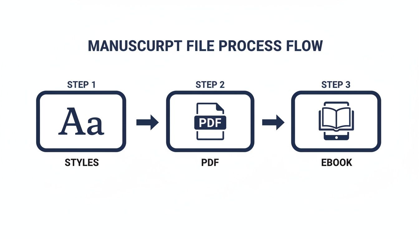
The takeaway here is simple: automate everything you can with styles. It prevents headaches down the line.
Hunting Down Hidden Formatting Problems
So, how do you catch these lurking errors? Your secret weapon is the “Show Formatting” or “Show/Hide ¶” button in your word processor. It reveals all the invisible characters—spaces, paragraph breaks, tabs—that are secretly wrecking your document.
Flipping this on lets you instantly spot problems like:
- Double spaces after periods. This is a stubborn habit left over from the typewriter days. Modern convention is a single space.
- Multiple paragraph breaks between chapters. If you see a stack of paragraph marks (¶), you’ve been hitting Enter to create space instead of inserting a proper page break.
- Tab characters at the start of paragraphs. These little arrows are a dead giveaway that you’ve been indenting manually.
To give you a clearer picture, here’s a quick rundown of some common missteps and how to handle them professionally.
Manuscript Formatting Pitfalls vs Professional Solutions
| Common Mistake | Professional Solution |
|---|---|
| Hitting Tab to indent paragraphs. | Set a 0.5-inch first-line indent in your paragraph styles. |
Using multiple Enter key presses for chapter breaks. | Insert a Page Break to start each new chapter on a fresh page. |
| Manually typing page headers and numbers. | Use the built-in Header/Footer function to automate numbering. |
| Using two spaces after a period. | Use a single space. A simple Find and Replace can fix this. |
| Choosing a creative or hard-to-read font. | Stick to the industry standard: 12-point Times New Roman. |
| Justifying text to create a “book-like” block. | Use left-aligned text for submissions; justified text is for final typesetting. |
Getting these details right shows you’ve done your homework and respect the agent’s time.
Cleaning up these hidden formatting gremlins is a non-negotiable step. And while we’re focused on the digital file, it’s smart to consider how your manuscript might look if printed. To learn more about avoiding physical output issues, this guide on 5 Classic Printing Mistakes has some great tips. A clean manuscript, both on-screen and on paper, demonstrates a commitment to quality that agents and editors will always appreciate.
When to Hire a Professional Formatter
Learning to format your own manuscript is a great skill to have, but let’s be realistic—sometimes, handing it off to an expert is the smartest play you can make. It’s not about giving up; it’s about making a strategic investment in your book’s quality and, more importantly, saving your own sanity and time.
Think of it like this: you’ve spent hundreds, maybe thousands, of hours crafting your story. You’re the creative architect. A professional formatter is the specialized contractor who makes sure the final build is flawless and ready for the public, whether it’s a paperback or an ebook.
You’ve done the hard work of writing. Now, do you really have the time and energy to become an expert in the nitty-gritty of print layouts and ebook conversion? Sometimes the answer is just “no,” and that’s completely okay.
When an Expert Makes All the Difference
Bringing in a pro isn’t just for authors who are intimidated by the technical side of things. It’s a calculated move, especially when your book’s design needs are more complex than a standard novel, or when you simply want to guarantee a perfect reading experience right out of the gate.
Here are a few common situations where I see authors wisely choose to hire out the formatting:
Complex Non-Fiction: Is your book packed with images, tables, charts, footnotes, or an extensive index? A DIY job can quickly become a tangled mess. A pro knows exactly how to make these elements look clean and professional in both print and on-screen.
Image-Heavy Books: If you’ve written a cookbook, a children’s book, or a graphic-intensive guide, you’re dealing with a whole different beast. Managing high-resolution images, text wrapping, and specific color profiles for printing is a specialized skill.
Distributing Everywhere: An expert formatter ensures your files are perfectly optimized for every single retailer, from Amazon Kindle and Apple Books to Barnes & Noble and beyond. This is how you avoid those dreaded formatting glitches that tank reviews.
You’re on a Deadline: Got a book launch breathing down your neck? A professional can turn around pristine, ready-to-upload files much faster than you could learn the process from scratch. It’s about speed and accuracy when it counts.
A professional formatter doesn’t just push a few buttons. They offer peace of mind. They ensure the presentation of your book lives up to the quality of the words inside, freeing you up to focus on what you do best—writing and marketing your next story.
Answering Your Lingering Manuscript Formatting Questions
Even when you think you’ve got the formatting down, a few tricky questions always seem to pop up right at the end. It’s totally normal. These are the little details that can make you second-guess your entire setup before you hit “send.”
Let’s clear up some of the most common formatting oddities I see authors wrestling with. Getting these right shows an agent or editor that you’re not just a great storyteller, but also a professional who’s done their homework.
What If My Book Doesn’t Use Chapters?
Not every manuscript follows a simple “Chapter 1,” “Chapter 2” structure. Maybe your story is broken into large parts, uses dates as section breaks, or switches between character points of view. That’s perfectly fine—the key is to apply the same principles of clarity and consistency.
- Part Openers: Treat a new “Part” just like you would a new chapter. Start it on a brand-new page with a page break, and place the heading (e.g., “Part One”) about a third of the way down.
- Subsections: For smaller divisions within a part, like a date or a character’s name, you don’t need a full page break. Just drop down a few lines, center the new heading, and keep rolling. The goal is for the reader to immediately grasp how your book is organized.
How Do I Format Special Text Like a Letter or Text Message?
So your character gets a text message, finds an old letter, or you’re showing their inner thoughts. It’s tempting to get fancy with fonts to make it look “real,” but please, don’t. Simplicity is your best friend here.
The industry standard for setting apart blocks of text—like a journal entry, email, or letter—is to simply italicize the entire block. Sometimes, you might also see it indented slightly from the left margin, but often, just the italics are enough to do the trick.
For individual words needing emphasis or a term in another language, stick with standard italics. Avoid using bolding, underlining, or all caps in your narrative; it comes across as amateurish.
Do I Need to Include a Copyright Page?
When you’re submitting a manuscript to an agent or editor, the answer is a hard no. You absolutely do not need a copyright page. The same goes for a dedication or an acknowledgments section.
This material, called “front matter,” is all added much, much later in the publishing process, after a publisher has already acquired your book. A manuscript submission should be lean: title page, then straight into Chapter 1. Sticking a copyright notice in your submission is a classic rookie mistake that immediately signals inexperience.
At BarkerBooks, we know that sometimes a manuscript has unique quirks that don’t fit the standard mold. If you’re wrestling with a tricky formatting issue or just want the peace of mind that comes from a professional review, our team is here for you. Check out our expert manuscript formatting services and let us sweat the small stuff.