
Think of book page layout design as the art of making a page readable. It's how you arrange the text, images, and even the empty spaces to create a book that’s not just professional, but a genuine pleasure to read. Everything from the fonts you choose to the width of the margins plays a part in connecting the reader to your story.
Why a Great Page Layout Isn't Optional
Finishing your manuscript is a huge milestone, but it's really just the beginning of creating the final book. The cover might grab a reader's attention on the shelf, but it's the interior design that keeps them turning the pages. A thoughtful book page layout design is the invisible scaffolding that holds your entire work together, boosting both your credibility as an author and your reader's engagement.
Every decision you make here matters. The layout choices—the space between lines, the style of the chapter headings—create a subconscious experience for the reader. A great layout makes reading feel effortless and immersive. A poor one? It's distracting, frustrating, and can pull someone right out of the world you’ve worked so hard to build. It’s what separates a book that feels like a polished, professional product from one that just looks amateur.
Building Reader Trust Through Good Design
A book’s interior makes a silent promise to the reader. It signals that you respect their time and have put care into your work. When a layout is cluttered, inconsistent, or just plain hard to read, it breaks that trust. Readers might not know the term for bad kerning, but they feel it when the text is a chore to get through. Suddenly, your powerful message is lost in a sea of visual noise.
"A well designed chapter title page, with that design carried through the book, is an obvious example. Running headers; graphics placed in similar locations with similar spacing… all help readers know where they are and what kind of information they’re looking at."
That consistency is everything. It creates a comfortable, predictable environment where the reader can forget about the page and just get lost in your words. Think of it as a long-term investment in your book's reputation.
The Foundation of a Professional Book
Good design isn't just about making things look pretty; it's about function. It’s a reader-first approach that clears any obstacles between your content and your audience. When you truly grasp this, like in Mastering User Centered Design Principles, you start making choices that put the reader's experience first. A truly professional layout achieves a few key things:
- It boosts readability. Proper line spacing (leading) and smart font choices prevent eye strain, making it easy to read for hours.
- It creates a clear hierarchy. Headings, subheadings, and body text look distinct, so readers can scan and navigate the content without thinking.
- It sets the right tone. The design should feel like it belongs to the genre. A business book might call for a clean, minimalist layout, while a fantasy novel could have more ornate touches.
Skipping a professional interior is like building a gorgeous house on a shaky foundation. No matter how incredible the writing is, a flawed presentation will always hold it back. Taking the time to craft a thoughtful layout ensures your book not only looks the part but delivers the powerful experience your readers deserve.
Building Your Book's Foundational Blueprint
Before a single word of your manuscript hits the page layout software, you need a solid plan. Think of it as the architectural blueprint for your book. Getting these foundational decisions right from the start is what separates a professional, polished interior from one that just feels… off.
The very first choice, and it's a big one, is your trim size. This is simply the final dimension of your printed book, like 5.5" x 8.5" or 6" x 9". It’s not a decision to be taken lightly, because trim size is deeply connected to genre conventions and what readers expect.
A pulse-pounding thriller feels right at home in a mass-market paperback size (4.25" x 6.87"), while a stunning coffee table book on photography needs a much larger format to do the images justice. Picking the wrong size can make your book look amateurish before anyone even reads the first sentence. To dive deeper, you can explore a full guide on selecting a standard book size to nail down the perfect fit.
A professional layout is the first handshake with your reader—it builds trust and credibility.
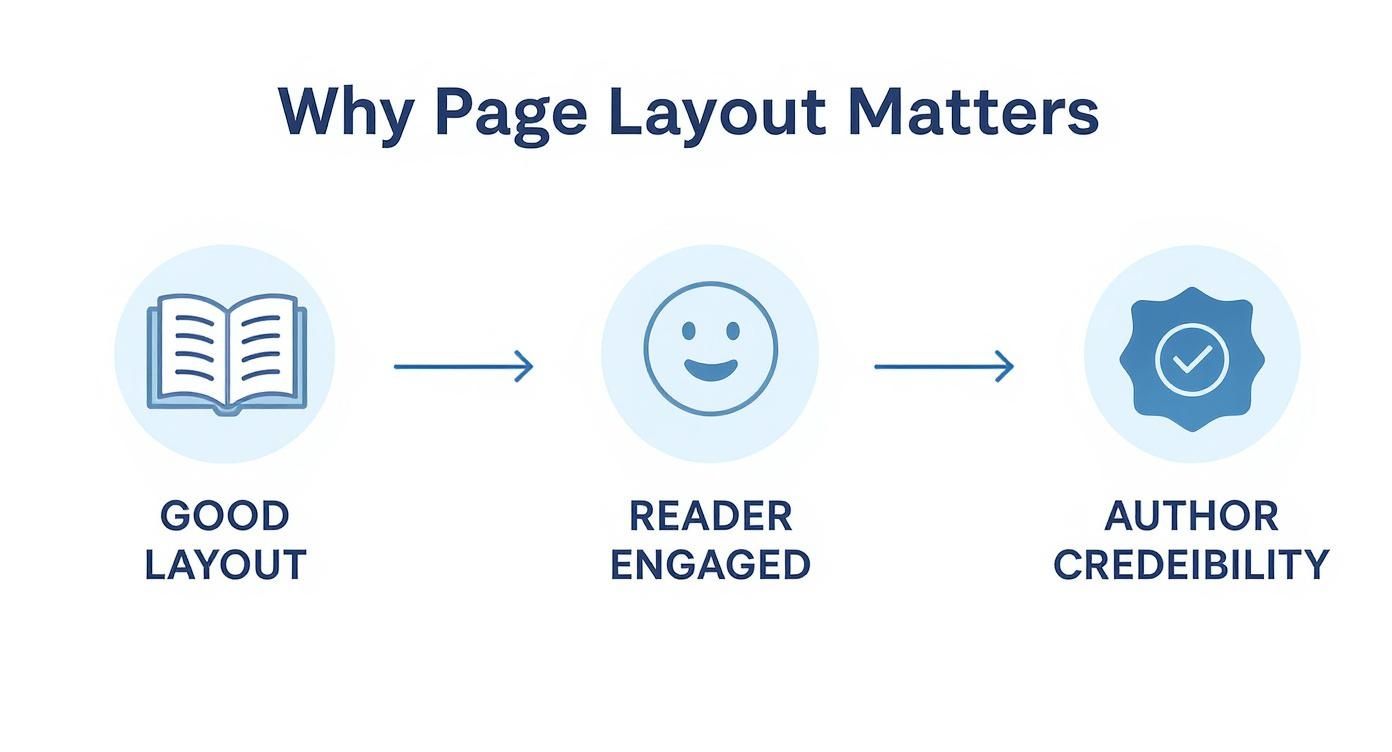
This simple visual flow shows how a thoughtful layout directly engages the reader, which in turn establishes you as a credible author.
To help you get started, here's a quick-reference table outlining some of the most common trim sizes and the genres they're typically used for.
Common Book Trim Sizes and Their Genres
| Trim Size (Inches) | Common Genres | Key Considerations |
|---|---|---|
| 4.25" x 6.87" | Mass-Market Paperbacks (Thrillers, Romance, Sci-Fi) | Economical to print, portable, and fits standard bookstore racks. |
| 5" x 8" | Trade Paperbacks (Literary Fiction, Memoirs) | A slightly smaller, classic "book" feel. Comfortable to hold. |
| 5.5" x 8.5" | Trade Paperbacks (Most Fiction & Non-Fiction) | A popular, versatile size that balances readability with cost-effectiveness. |
| 6" x 9" | Hardcovers, Non-Fiction, Textbooks | The industry standard for hardcovers. Offers more space per page. |
| 8.5" x 11" | Workbooks, Cookbooks, Manuals, Art Books | Ideal for content with lots of images, charts, or interactive elements. |
This is just a starting point, of course. The key is to look at the successful books in your specific genre and see what dimensions they use.
Defining Your Margins and Grids
Once you've locked in your trim size, it's time to set your margins. Margins are the empty spaces that frame your text, and they do more than just sit there—they are critical for readability and giving your pages a sense of balance and professionalism.
You have four margins to consider:
- Inside (Gutter) Margin: This is the most important one to get right. It's the space where the pages meet in the spine. If it's too narrow, your text will get swallowed by the curve of the binding, forcing readers to crack the spine to read. It's a classic rookie mistake.
- Outside Margin: The space on the outer edge of the page.
- Top Margin: The space at the top, which usually holds headers like the book or chapter title.
- Bottom Margin: The space at the bottom, where you’ll almost always find the page number (also called the folio).
Together, these margins create the container for your grid system—the invisible skeleton that holds everything on the page together. A grid brings order and consistency to your design, ensuring every chapter, heading, and image feels like it belongs.
A well-structured grid is the secret weapon of professional book design. It creates a quiet, predictable rhythm that lets the reader get lost in your words instead of being distracted by a messy layout.
Implementing a Practical Grid System
For most books, especially novels and narrative non-fiction, a simple one-column grid is all you'll ever need. The real magic happens with the baseline grid.
In design programs like Adobe InDesign or Affinity Publisher, the baseline grid is a series of evenly spaced horizontal lines that every line of your main body text "sits" on. This forces the text on the front and back of a page to align perfectly.
Why does this matter? It prevents the text from the other side from "ghosting" through the paper, which can be incredibly distracting. It’s a subtle detail, but it screams quality. As a rule of thumb, you'll set your baseline grid increment to match the leading (the space between lines) of your body text. So, if your font is 11 pt with 14 pt leading, your baseline grid should be set to 14 pt.
From there, you can add column guides if needed. While novels stick to one column, a non-fiction book might use a two- or three-column grid to create flexible spaces for placing callout boxes, images, or sidebars. By snapping all your elements to this underlying grid, you ensure every single page looks intentional and cohesive. This is the groundwork that makes the rest of the design process fall into place.
Mastering Typography for Readability and Style
Typography is your book’s voice. Before a single word is consciously read, the style of the text sets a tone and establishes a mood. It’s an invisible handshake with your reader, and getting it right is a cornerstone of professional book page layout design.
Your goal is to make the text not just aesthetically pleasing but so readable that the reader forgets they are even looking at letters on a page.
This all starts with choosing the right typeface. It’s a bit like casting an actor for a role—the font’s personality has to match your book’s genre and content. You wouldn't use a playful, quirky font for a serious historical account, just as you wouldn’t use a stark, modern typeface for a children's story.
Choosing Your Core Typefaces
The first big decision you'll make is the classic divide: serif or sans-serif. This choice is the foundation of your book's visual hierarchy and has a massive impact on the reading experience.
- Serif Fonts: These are the traditional workhorses of the book world, identifiable by the small "feet" (serifs) at the ends of the letter strokes. Think Garamond, Caslon, or Minion Pro. For print, serifs are king for body text because those little feet help guide the eye smoothly from one letter to the next, which significantly reduces reader fatigue over hundreds of pages.
- Sans-Serif Fonts: Lacking those decorative strokes, sans-serifs like Helvetica, Franklin Gothic, or Open Sans offer a cleaner, more modern look. They are fantastic for headings, subheadings, and captions, where their stark clarity creates a perfect contrast against a serif body font.
A tried-and-true strategy is pairing a classic serif for the main text with a clean sans-serif for chapter titles and headers. This combination provides immediate structure and is incredibly effective.
One of the biggest rookie mistakes is font overload. As a rule of thumb, avoid using more than two or three typefaces in your entire book. Stick to your chosen pair and use variations (like bold or italic) to create emphasis. Too many fonts just create visual noise.
The Devil Is in the Typographic Details
Beyond the font itself, several small adjustments are what truly give a page its professional polish. These subtle settings work in concert to create a smooth, inviting texture for the eye.
While your readers won't consciously notice these things, they will absolutely feel them. It’s the difference between a pleasant, effortless read and one that just feels… off.
Point Size and Leading
Point size is simply the height of your letters. For the body text in most print books, the sweet spot is between 10 and 12 points. Go smaller, and you risk eye strain; go larger, and the page can start to feel clunky and juvenile.
Even more critical is leading (pronounced "ledding"), which is the vertical space between lines of text. Tight leading is a cardinal sin of book design, making paragraphs feel dense and impenetrable. Aim for leading that is 120% to 145% of your font size. For example, if you're using an 11-point font, a leading of around 14 points would be a great starting point.
Tracking and Kerning
Tracking refers to the overall spacing across a group of letters. You might slightly increase the tracking on a chapter title to give it a more open, airy feel.
Kerning, on the other hand, is the fine-tuning of space between specific letter pairs. Think about the awkward gap between an uppercase 'A' and 'V'. Good kerning tucks them closer together for a more natural look. Professional fonts have solid built-in kerning, but you might still need to make manual tweaks for large headlines.
Avoiding Common Typographic Pitfalls
Knowing what not to do is just as important. A few common mistakes can instantly sabotage your layout and make it feel amateurish.
One of the most jarring errors is creating rivers of white space. This happens when you use justified text (aligned to both margins) and the spaces between words accidentally line up across several lines. This creates distracting vertical gaps that pull the reader's eye down the page instead of across. Smart hyphenation settings and slight tracking adjustments can usually solve this.
You also have to watch out for widows and orphans.
- Widow: A single, short line from the end of a paragraph that gets stranded at the top of a new page.
- Orphan: The first line of a paragraph left all by itself at the bottom of a page.
Both create awkward visual breaks and disrupt the flow of reading. Your layout software should have settings to prevent them, but it’s always wise to do a final manual check.
Good typography is a tool that should serve the text, never overpower it. If you're new to this, using professionally designed book layout templates can give you a solid head start, as they are built on these time-tested practices. And to go even deeper, exploring the broader principles of readability will help you understand the psychology behind why these rules work. By being thoughtful and reader-focused, you give your words the clear, confident voice they deserve.
Designing Your Book's Anatomy
A truly professional book is more than just a collection of chapters. The pages that come before your story begins and after it ends—what we call the front matter and back matter—are just as critical. A thoughtful layout in these sections frames the entire reading experience, signaling quality from the first page to the last.

Think of these elements as the architectural entryway and exit of your book. Getting them right tells the reader they're in the hands of a professional who understands and respects the craft of publishing.
Crafting the Front Matter
The front matter is everything a reader encounters before diving into Chapter 1. It's the formal introduction to your work, and each page serves a distinct purpose. While there's room for creativity, sticking to publishing conventions is almost always the right call.
Here are the essential pages you'll need to design, generally laid out in this order:
- Half-Title Page: This is usually the very first printed page. It's elegantly simple, featuring only the main title. It acts as a soft opening, a quiet moment before the full introduction.
- Full Title Page: This one is more comprehensive, including the full title, subtitle, your name as the author, and sometimes the publisher's logo or name. The typography here should feel connected to your cover design to maintain a consistent visual identity.
- Copyright Page: Often called the colophon, this is the legal heart of your book. You'll find it on the reverse of the title page. It must contain the copyright notice (© Year Author Name), publisher details, your ISBN, and printing history. This page is almost always set in a small, no-nonsense font.
- Dedication Page: This is your personal space to honor someone. It's typically short, sweet, and centered on the page, creating a moment of genuine connection before the book properly begins.
- Table of Contents (TOC): A detailed TOC is an absolute must-have for non-fiction, helping readers navigate your ideas. In fiction, it’s often much simpler, perhaps just listing chapter numbers. A great TOC uses a clear visual hierarchy, often with dot leaders (…) to guide the eye from the entry to the page number.
Your front matter sets the stage. When it’s clean, well-spaced, and conventionally ordered, you build subconscious trust with the reader, assuring them that the book they're holding is a quality product.
Structuring the Back Matter
The back matter wraps things up by providing valuable supplementary information. This is where you can give readers additional resources, define key terms, or tell them a little more about yourself. What you include really depends on your book's genre and goals.
For instance, a deep dive into historical non-fiction would feel incomplete without a solid index, but you'd almost never see one in a contemporary romance novel. These components aren't afterthoughts; they add significant value and credibility.
Key Back Matter Elements
Consider which of these elements will best serve your readers and your book:
- Appendix: This is the perfect spot for supplementary material that would have bogged down the main text—think detailed charts, source documents, or extensive data tables. Be sure to label each one clearly (e.g., Appendix A, Appendix B).
- Glossary: If your book is heavy on specialized terminology (common in sci-fi, fantasy, or technical guides), a glossary is a gift to your readers. It's a simple, alphabetized list of terms and their definitions that makes your work far more accessible.
- Index: For any serious non-fiction, a professionally prepared index is non-negotiable. It’s an alphabetized list of keywords, people, and concepts, showing every page number where they appear. This is an indispensable tool for anyone using your book for research or reference.
- About the Author: Here's your final chance to connect with your audience. Write a brief, professional bio and be sure to include links to your website or social media. A good headshot here helps turn a reader who just finished your book into a follower of your career.
By carefully designing both your front and back matter, you elevate your manuscript from a simple document into a complete, polished, and professional book.
Finalizing Your Files for Print and Digital
Alright, you’ve designed a beautiful interior. Now comes the moment of truth: getting those files ready for the printer and for digital readers. This is the final, technical handoff, and it's where a project either shines with professionalism or falls apart. Getting this right is what separates a book that looks expertly produced from one that just feels… off.
Think of this stage as your final inspection. You're about to send your work out into the world, and it needs to be flawless. Professional design software like Adobe InDesign has built-in tools to help, but they won't catch everything. You need to know what to look for.
Running Your Preflight Checklist
Your first stop is the preflight check. This is your software's automated diagnostic, and it’s an absolute lifesaver. It scans your entire document for common technical errors, but you still need to interpret the results and fix a few critical issues yourself.
The most common culprit I see is low-resolution images. A picture might look perfectly sharp on your backlit screen, but for print, it needs to be at least 300 DPI (dots per inch). Anything less than that will come out looking fuzzy and pixelated on the printed page. No exceptions.
Another classic mistake is missing fonts. If you send a file to a printer and haven't embedded the fonts you used, their computer will substitute them with whatever it has on hand. All your beautiful typography? Gone. Always, always make sure your fonts are embedded in the final file.
Finally, get your color profiles straight. Your monitor uses RGB (Red, Green, Blue) light to display color, but printers use CMYK (Cyan, Magenta, Yellow, Black) ink. If you export your print file in RGB, you’re in for a nasty surprise when you see the proofs. The colors will look dull and washed out. Convert everything to CMYK before you export.
This final check is your last line of defense. A single overlooked error—like a low-resolution photo or an incorrect color mode—can compromise the quality of your entire print run. Taking an extra hour here can save you thousands of dollars and immense frustration.
Exporting a Flawless Print-Ready PDF
Once your preflight check gives you the all-clear, it's time to generate the print-ready PDF. This is more than just hitting "Save As." You need to export with very specific settings that commercial printers require. The industry gold standard is a PDF/X-1a:2001 file, a format designed to lock everything in place.
Two of the most crucial settings you’ll configure are bleed and crop marks.
- Bleed: If you have any photos or colored backgrounds that go right to the edge of the page, they need to extend beyond the final trim line by about 0.125 inches (or 3mm). This little bit of extra image area is called the bleed. It gets trimmed off, ensuring you don't end up with any ugly white slivers at the edge of the page if the cutting machine is a fraction of a millimeter off.
- Crop Marks: These are the little hairline markers in the corners of your PDF that show the printer precisely where to make their cuts. Your software will add these for you; just be sure to check the box when you export.
Pivoting to Digital Ebook Formats
Creating an ebook, usually an EPUB file, is a completely different ballgame. Forget everything you know about fixed pages. An EPUB is "reflowable," meaning the text and images will resize and rearrange themselves to fit any screen, from a tiny phone to a big tablet. You’re no longer designing a static page; you’re formatting fluid content.
This requires a mental shift. For ebooks, huge image files are the enemy. They make the file slow to load and clunky to navigate. Downsample your images to a screen-friendly 72 DPI and compress them to keep the ebook lightweight.
A clickable table of contents is absolutely essential for ebooks. Readers demand it. You’ll need to set up your paragraph styles correctly so your software can automatically generate an interactive TOC that lets readers jump to any chapter with a single tap. If you want a deeper dive, our guide on how to format a book for publishing walks through the entire process.
Remember, a professional interior matters just as much in digital as it does in print. A 2022 Nielsen BookData survey found that a staggering 63% of book buyers decide to purchase based on the cover alone. While that's about the cover, the principle extends inward—a polished interior confirms their decision was a good one and keeps them reading. You can discover more insights about book design's commercial impact to see why this matters. By mastering file prep for both print and digital, you're guaranteeing a professional-grade book, no matter how someone chooses to read it.
You've Got Questions, We've Got Answers
Even with the best plan in hand, you're bound to run into a few specific questions during the layout process. It just comes with the territory. Let's walk through some of the most common hurdles authors and designers face so you know exactly how to handle them when they pop up.
"What Software Should I Actually Use?"
This is always the first question, and for good reason. For a truly professional, print-ready book, your best bets are the industry workhorses: Adobe InDesign and Affinity Publisher.
InDesign is the powerful, subscription-based tool that most seasoned pros have been using for years. Then there's Affinity Publisher, a fantastic one-time purchase that delivers serious muscle without the monthly fee. It's an excellent option for authors and smaller presses.
Sure, you can lay out a book in Microsoft Word, but you'll be fighting it the whole way. It just doesn't have the granular typographic control or the precise export options you need for a polished, professional result.
"How Do I Pick the Right Fonts?"
Next up is the great font debate. The number one rule here is simple: readability is everything.
For the main body text in a print book, you can rarely go wrong with a classic serif font. Think Garamond, Caslon, or Baskerville. Those little "feet" on the letters, the serifs, do a wonderful job of guiding the reader's eye along the line, making long reading sessions much more comfortable.
To create contrast and a clear visual hierarchy, a great trick is to pair your serif body font with a clean, simple sans-serif for your chapter titles and headings.
The font’s personality has to match the book's tone. A sleek, modern sans-serif might be perfect for a sci-fi thriller, but it would feel completely out of place in a historical romance. Before you commit, always print a test page. Seeing it on paper is the only way to know how it truly feels.
"What Are 'Widows' and 'Orphans,' and How Do I Fix Them?"
Finally, let's clear up two confusing terms that can instantly mark a layout as amateurish: widows and orphans. They’re the stray lines that disrupt a reader’s flow and look sloppy on the page.
- An orphan is the first line of a paragraph stranded all by itself at the bottom of a page.
- A widow is the last line of a paragraph left alone at the top of the next page.
Both of these create awkward white space and break the reader's immersion.
Most design programs have settings to help prevent these automatically, but don't rely on them entirely. The software isn't foolproof. The only way to be sure is to do a final manual sweep, page by page, to catch any stragglers. This last bit of polish is what separates a good layout from a great one.
Ready to transform your manuscript into a professionally designed book? The expert team at BarkerBooks offers comprehensive interior layout and design services to ensure your book provides an exceptional reading experience. Visit us to learn how we can bring your vision to life.