
Great book design is so much more than just picking a nice font. It's really the art of turning a manuscript into something that feels right in a reader's hands. It's about creating a smooth, inviting journey from the first page to the last, and that involves a careful balancing act between the book's size, margins, typography, and even the paper it's printed on.
Building Your Book's Design Foundation
Before you even think about firing up your design software, the real work begins. The decisions you make at this stage are the bedrock of your entire project, and they'll influence everything from how comfortable the book is to read to how much it costs to print. This is where you draw the line between a professional-looking book and one that just feels… off.
A well-designed book is no accident; it’s the result of very deliberate choices. These principles have been honed over centuries of printing, and they're just as important today. It's a team effort, really, with authors, editors, and designers all weighing in on the details that shape a book’s feel and function. Some industry analyses even suggest that great design can boost sales by as much as 30%, which shows you just how critical these initial steps are.
Defining Your Book's Physical Form
First things first, you have to decide on the book's physical characteristics. Think of it like drafting the architectural blueprints for a house. How big will it be? What kind of paper will you use? These aren't random choices; they're driven by genre expectations and the practicalities of printing.
-
Trim Size: This is simply the final width and height of your book's pages. A pocket-sized thriller might be a 4.25" x 6.87" mass-market paperback, while a detailed non-fiction guide is more likely a larger 6" x 9" trade paperback. The easiest way to get this right is to look at other successful books in your niche. Sticking to standard sizes also helps keep printing costs down.
-
Margins: That empty space around your text isn't wasted—it's essential for readability. The inside margin, often called the gutter, needs to be wide enough so the words don't get swallowed up by the spine. The top, bottom, and outer margins frame the text block, giving the reader's eyes a comfortable space to move.
-
Paper Stock and Finish: Are you picturing creamy, off-white pages or crisp, bright white ones? Will the paper be coated (glossy) or uncoated (matte)? Novels often use a creamy, uncoated paper because it's easier on the eyes for long reading sessions. In contrast, a photography book would almost always use a glossy, coated paper to make the images pop.
Beyond these tangible elements, great book design helps tell the story visually. It guides the reader through the narrative with subtle cues in the layout and typography. This is why having a solid grasp of visual storytelling techniques can be a huge asset in creating a truly immersive experience.
Key Takeaway: Don't treat your book's physical specs—trim size, margins, and paper—as an afterthought. They are your first and most important tools for signaling genre and creating a book that people will love to hold and read.
Before you jump into the layout, taking a moment to map out these foundational elements is crucial. The table below breaks down these key decisions and shows how they directly influence the final product.
Key Pre-Design Decisions and Their Impact
| Design Element | Description | Impact on Reader Experience & Production |
|---|---|---|
| Trim Size | The final physical dimensions of the book (e.g., 6" x 9"). | Determines how the book feels in hand, its portability, and printing costs. Genre conventions heavily influence this. |
| Margins | The blank space surrounding the main text block (top, bottom, inside, and outside). | Crucial for readability. Proper margins prevent text from feeling cramped and ensure nothing is lost in the spine (gutter). |
| Paper Stock | The type, weight, and color of the paper used for the interior pages. | Affects the book's feel, durability, and cost. Cream paper is easier on the eyes for fiction; white coated paper enhances visuals. |
| Typography | The selection of fonts for body text, headings, and other elements. | Defines the book's voice and personality. It's the single most important factor for readability and setting the tone. |
Getting these four elements right from the start provides a solid, professional framework for the rest of your design process.
The Tools of the Trade
Once you have a solid plan, you'll need the right software to bring it to life. While you have a few options, the undisputed industry standard for professional book design and layout is Adobe InDesign. It gives you incredible control over every tiny detail, from complex typography to precise grid layouts and print-ready file exports.
Here’s a glimpse of the InDesign interface, where all these foundational elements come together.

As you can see, professional software is all about precision. It lets you set up document grids, manage paragraph and character styles, and ensure everything is perfectly aligned for a clean, cohesive look.
If you're looking for a more budget-friendly option, Affinity Publisher is a fantastic alternative that you can buy with a one-time purchase. The important thing is to choose a tool specifically built for page layout, not just a word processor. This ensures you can properly handle print-specific needs like bleed, margins, and color profiles, setting your project up for success from the get-go.
Choosing Typography That Tells Your Story
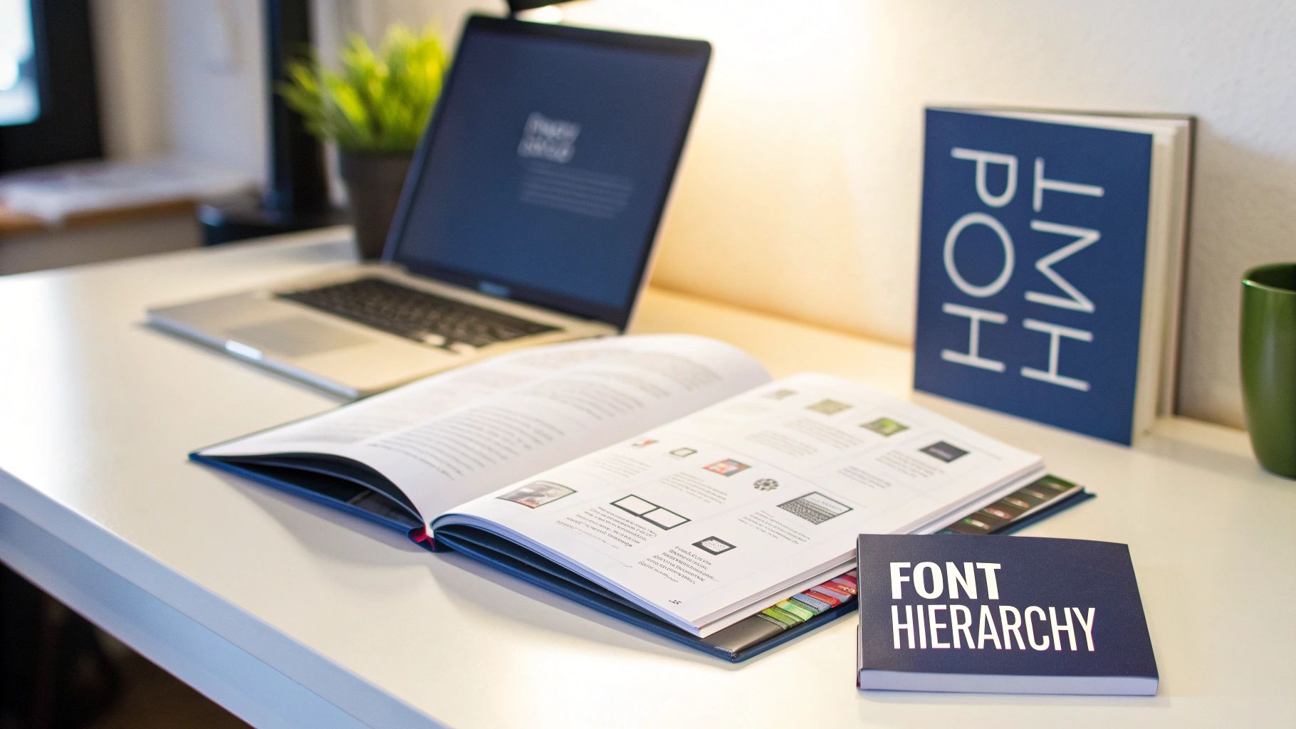
Typography is so much more than just the words on the page; it’s the voice of your manuscript. The fonts you pick will set the emotional tone, create a visual hierarchy, and ultimately decide how comfortable your book is to read. Getting this right is a cornerstone of professional book design and layout.
Think of your body text as the main narrator. For most books, especially novels and in-depth nonfiction, a serif font has long been the standard for a reason. Typefaces like Garamond, Caslon, or Minion feature small "feet" on the ends of their letters. These tiny details actually help guide the reader's eye across the page, which can make a huge difference in reducing fatigue over a long reading session.
On the other hand, sans-serif fonts (like Helvetica or Open Sans) don't have those feet, giving them a much cleaner, more modern look. They work brilliantly for headings, subheadings, and captions, where you want to create a clear, crisp contrast with the body copy.
Pairing Fonts for Harmony and Hierarchy
One of the most effective and time-tested approaches is to pair a serif font for the body with a sans-serif for your headers. This simple trick instantly creates a visual guidepost that helps readers navigate the content without even thinking about it. You might, for example, pair the classic readability of Georgia for your main text with the clean, modern lines of Lato for chapter titles.
The real secret is choosing fonts that feel like they belong together. Look for pairs that have complementary x-heights (the height of a lowercase 'x') and similar visual weights. A word of caution: avoid pairing two highly decorative or complex fonts. They'll just end up fighting for the reader's attention and make the page feel chaotic.
Here are a few classic font pairings to get you started:
- Classic & Elegant: Garamond (serif body) with Gill Sans (sans-serif header)
- Modern & Clean: Merriweather (serif body) with Montserrat (sans-serif header)
- Friendly & Readable: Lora (serif body) with Nunito Sans (sans-serif header)
If you want to go deeper, exploring effective strategies for choosing fonts can be a huge help. Even though that guide focuses on branding, the core principles of building a typographic system apply directly to book design.
A Quick Note on Font Licensing
Always, always check that you have the proper license to use a font in a commercial product like a printed book or an ebook. Many fonts you find for free are only licensed for personal use, so it pays to read the terms carefully before you commit.
Refining the Reading Experience
Picking your fonts is just the first step. The true craft of typography emerges in the small, subtle adjustments you make to spacing and alignment. Honestly, these tiny details are what separate an amateur layout from a truly professional one.
This isn't a new idea. Back around 1500, the Italian printer Aldus Manutius commissioned the very first italic typeface, which allowed for more text on a page—a revolutionary change for the economics and aesthetics of printing. This legacy of refinement continues today through three key settings you need to master.
-
Leading (Line Spacing): This is the vertical space between lines of text. Too tight, and the text feels cramped and intimidating. Too loose, and the lines feel disconnected. A great starting point for body text is a leading value between 120% and 145% of your font size.
-
Tracking (Character Spacing): This adjusts the overall space between all characters in a block of text. Sometimes adding a tiny bit of positive tracking can make text easier to read, but be careful—too much can make words fall apart visually.
-
Kerning: This is the art of adjusting the space between specific pairs of letters (like 'A' and 'V') to create a more balanced and visually pleasing result. Professional software like Adobe InDesign does a lot of this for you, but you’ll often need to manually kern headlines and titles to get them just right.
By carefully considering your font choices and these micro-adjustments, you build an invisible structure that supports the reader, letting them sink into your story without any visual distractions.
Structuring Your Pages With a Layout Grid
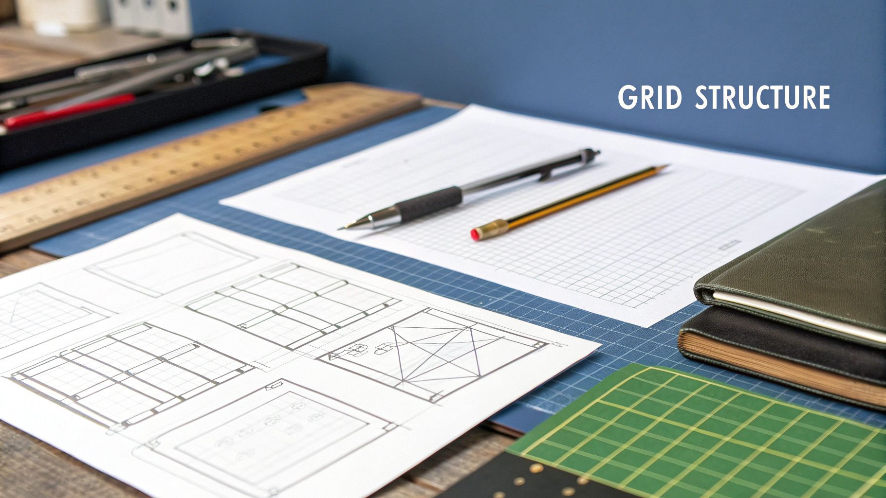
When you flip through a professionally designed book, the layout feels effortless. Words and images seem to fall into place exactly where they should. But this harmony isn't an accident. The secret behind that clean, consistent look is the grid system—an invisible framework of columns and guides that brings order and rhythm to every page.
Think of the grid as the architectural blueprint for your book's interior. It dictates where your text blocks, images, headings, and even page numbers will sit, ensuring everything remains perfectly aligned from one page to the next. This structure creates a subconscious sense of calm for the reader, allowing them to get lost in your content instead of being distracted by a messy design.
Grids aren’t some newfangled digital concept; their roots are as old as printing itself. Since the printing press first rumbled to life in the mid-15th century, book design has been a balancing act between art and technical constraints. Early grids emerged from the simple vertical and horizontal lines of movable type, evolving over hundreds of years from a practical necessity into a powerful design tool. For a fascinating look at this history, the UCLA Hobson Archive is a great resource.
Choosing the Right Grid for Your Book
So, what kind of grid do you need? The answer depends entirely on your content. Different books have different needs, but for most authors diving into book design and layout, one of two simple grids will do the job beautifully.
A single-column grid is the undisputed workhorse of the publishing industry. It’s exactly what it sounds like: one main block of text that fills the space between your margins. This is the go-to choice for fiction and most narrative nonfiction, where the main goal is to provide a smooth, uninterrupted reading experience. Its strength lies in its simplicity.
Then you have the two-column grid, which divides the page into two vertical sections. This layout is incredibly handy for textbooks, workbooks, or complex guides. It gives you a dedicated space—a sidebar—for placing things like key terms, small photos, or pull quotes next to the main body of text. It’s a step up in flexibility without getting overly complicated.
Pro Tip: When setting up a multi-column grid, pay close attention to the gutter, which is the empty space between your columns. If it’s too narrow, the page will feel cramped and the text blocks will look like they’re about to collide. A generous gutter creates breathing room and makes the entire page easier to read.
Setting Up Your Grid in Design Software
Let's get practical. When you fire up a program like Adobe InDesign or Affinity Publisher, establishing your grid is one of the very first things you'll do. You can usually find these settings under a "Layout" or "Document Setup" menu.
Here’s what you’ll be defining:
- Columns: This is the number of vertical divisions on your page. For a novel, stick with one. For a textbook or guide, try two.
- Gutter: The space between the columns. As a rule of thumb, a good starting point is to make the gutter width double the leading (line spacing) of your body text.
- Margins: You've already set these, but your grid lives inside them. The grid helps you organize everything within the "live area" of the page.
Once your columns are in place, every element you add should "snap" to these guides. Your main text block will align perfectly with the column edges, and any images can be sized to fit neatly within one column or span across both. This is what creates that polished, intentional look you see in professional books. For a more detailed walkthrough of the file setup process, check out our guide on how to format a book for publishing.
The name of the game is consistency. Every chapter title should start at the same vertical point. Every photo should align with the grid. This discipline is what elevates a book from a DIY project to a professional publication, and the grid is your single best tool for getting there.
Polishing Your Book with Professional Front and Back Matter
A reader’s journey with your book begins long before chapter one and lingers well after the final page. The front and back matter are the professional bookends framing your core content, and they do much more than just fill space. These sections add a crucial layer of polish that tells readers they’re holding a high-quality, thoughtfully produced book. Getting this part of your book design and layout right is non-negotiable.
The front matter is your book's formal introduction. It’s where you set the stage, establish your authority, and give readers a roadmap for what’s ahead. Think of it as the grand foyer, guiding them from the cover into the world you’ve built.
On the other hand, the back matter is your professional farewell. It's your opportunity to wrap things up neatly, offer extra resources, and point readers toward what’s next, whether that’s another book or your website. A well-executed back matter leaves a lasting impression of thoroughness and expertise.
Laying Out the Essential Front Matter
Front matter follows a time-honored sequence that readers intuitively understand. You don't have to include every single element, but following the conventional order is key to looking professional. Naturally, the design here—your fonts, margins, and spacing—should align perfectly with the rest of your book's interior.
Here’s the typical flow you should follow for your front matter pages:
- Half Title Page: This is often the very first page a reader sees. It contains just one thing: the book’s title. It’s a beautifully simple and clean way to begin.
- Title Page: This page is the main event. It features the full title, the subtitle, your name as the author, and sometimes the publisher's name and logo.
- Copyright Page: Always found on the reverse side of the title page, this is the legal hub. It includes the copyright notice (© Year, Author Name), publisher details, your ISBN, and printing information.
- Table of Contents: This is one of the most functional pages in your entire book. Pay close attention to alignment—make sure chapter titles and page numbers are perfectly lined up, often using dot leaders to help the reader’s eye connect the two.
I've seen a lot of self-published authors overcrowd their title pages. Less is more. Give the text plenty of white space to breathe. A minimalist design here projects confidence and lets your title and name speak for themselves.
Formatting Your Back Matter for Readability
The back matter is where you provide supporting resources, and its design should be all about clarity and ease of use. Readers turn to these pages to find specific information quickly, so good organization is paramount. This is especially true for nonfiction, academic books, or any guide where people will want to reference things later.
Just like the front matter, there’s a standard structure that helps readers know what to expect. A messy or illogical back matter can frustrate someone who loved your book just moments before, undermining the professional image you've worked so hard to build.
Here are the key components you might include:
- Appendix: This is the perfect spot for supplementary material that would have bogged down the main text—think raw data, charts, extended examples, or source documents. Each one should be clearly labeled (e.g., "Appendix A: Survey Results").
- Glossary: If your book is filled with industry-specific jargon or technical terms, a glossary is an absolute must. Format it as a simple alphabetical list with short, clear definitions.
- Bibliography or References: Here, you'll list all the sources you cited or consulted. The most important thing is to stick to one citation style (like Chicago, APA, or MLA) consistently.
- Index: For any nonfiction book, a good index is invaluable. It’s an alphabetical list of the key concepts, names, and topics mentioned in your book, along with the page numbers where they appear. A professionally prepared index can make your book ten times more useful as a long-term reference tool.
By giving these opening and closing sections the design attention they deserve, you complete the professional arc of your book design and layout. You’re not just finishing a manuscript; you’re creating a polished, credible, and reader-friendly experience from the first page to the last.
Exporting Your Book for Print and Digital
You’ve done the hard work of designing and laying out your book. Now it’s time for the final, crucial step: preparing the files for their destination. Whether you’re sending your book to a printing press or an e-reader, this is where your project becomes a real, tangible product.
Getting these final export settings right is non-negotiable. I’ve seen authors have to order expensive reprints or deal with a flood of reader complaints all because of a few incorrect settings. The needs of a print book and an e-book are worlds apart—one is a static physical object, while the other needs to be a flexible digital file that adapts to different screens. This means you’ll be creating at least two completely different files.
Think of it this way: for print, you're giving the printer a perfect, locked-down blueprint. For digital, you're handing over a smart, fluid set of building blocks that can rearrange themselves on the fly.
Creating a Press-Ready PDF for Print
When you send a file to a printer, they need a high-resolution PDF that contains every bit of information they need to print, cut, and bind your book flawlessly. This is what we call a press-ready PDF. One of the most common rookie mistakes is just hitting "Save as PDF" and calling it a day. That standard file is almost never good enough.
Here are the absolute must-haves for a print-ready file:
- Bleed: Does your design have any images or colors that touch the edge of the page? If so, they need to extend beyond the final trim line by about 0.125 inches (or 3mm). This little bit of extra margin is the bleed, and it’s your insurance against any ugly white slivers appearing after the pages are trimmed.
- Crop Marks: These are tiny guide lines in the corners of your PDF that show the printer precisely where to make their cuts. Most design software lets you add these automatically when you export.
- Color Profile: Your computer screen uses an RGB (Red, Green, Blue) color model, which is great for digital viewing. But commercial printing presses run on CMYK (Cyan, Magenta, Yellow, Black). You have to convert your file to a CMYK profile during export; otherwise, the colors in your printed book might look dull, muddy, or just plain wrong compared to what you saw on screen.
Once your design is locked and you’re ready to go into production, it's time to find reliable professional book printing services. Always ask for their specific file requirements before you export your final PDF, as they can vary slightly.
Exporting a Reflowable EPUB for Digital Readers
Making an e-book is an entirely different ballgame. The industry standard is a reflowable EPUB, a format designed to let text flow and adapt to fit any screen, from a tiny smartphone to a large tablet. This flexibility is what separates a great reading experience from a frustrating one.
The image below from Adobe InDesign’s export panel gives you a glimpse into the controls you'll use to build a clean, user-friendly e-book.
This dialog box is your command center for getting the navigation and content order just right.
For a top-notch EPUB, pay close attention to these details:
- Image Handling: Unlike in print, massive, high-resolution images are your enemy. They bloat the file size and can slow down e-readers. You should optimize all images for screens, usually at a resolution of 150 PPI (pixels per inch).
- Clickable Table of Contents: This is absolutely essential for navigation. Your design software can generate a hyperlinked table of contents automatically if you’ve been diligent about using paragraph styles for your chapter titles.
- Metadata: When you export, you'll be prompted to fill in your book’s metadata—the title, author, publisher, and your unique ISBN. Getting an ISBN is a critical step for selling your book, and you can learn all about it in our guide on how to get an ISBN for my book.
My Pro Tip: The Final "Pre-Flight" Check
Before you hit send, do one last review. For your print PDF, open the file and zoom in to 200% to make sure your images are sharp and the text is crisp. For your EPUB, use an e-reader simulator (or better yet, a few different real devices) to test that the formatting looks good everywhere and that every single link works as it should.
To help clarify the differences, here's a quick comparison of the settings you’ll be focused on for each format.
Print vs. Digital Export Settings
This table breaks down the key considerations when you're exporting your book for the physical world versus the digital one.
| Setting/Consideration | Print (Press-Ready PDF) | Digital (Reflowable EPUB) |
|---|---|---|
| Primary Goal | Create a static, high-resolution file for precise physical reproduction. | Create a flexible, lightweight file that adapts to various screen sizes. |
| File Format | PDF/X-1a or PDF/X-4 | EPUB3 (most common) |
| Color Space | CMYK (e.g., SWOP v2) | sRGB (standard for screens) |
| Image Resolution | 300 DPI (Dots Per Inch) | 150 PPI (Pixels Per Inch) is a good target. |
| Page Elements | Bleeds and crop marks are essential. | Bleeds and crop marks are not used. |
| Navigation | Visual page numbers, printed Table of Contents. | Hyperlinked Table of Contents is critical. |
| Metadata | Embedded in file properties, but not as critical for the reader experience. | Essential for distribution. Includes ISBN, author, title, publisher, etc. |
Understanding these distinctions is the key to producing a book that looks professional and provides a seamless experience for your readers, no matter how they choose to enjoy it.
Common Questions on Book Design and Layout
Even with the best-laid plans, you’re going to run into questions when you start designing and laying out your book. It’s completely normal. Honestly, working through these little hurdles is just part of the process of creating something truly polished and professional.
Here are a few of the most common questions I hear from authors and first-time designers, along with some straightforward, practical advice.
What Is the Best Software for Book Design?
For any serious book project, the answer is almost always Adobe InDesign. It’s the undisputed industry standard for a reason. InDesign gives you precise, granular control over every single element on the page, from typography down to the millimeter. This is why every major publisher relies on it.
However, if you're looking for a powerful alternative without a monthly subscription, Affinity Publisher is a fantastic choice. It’s a one-time purchase and packs a serious punch, delivering a feature set that can go toe-to-toe with InDesign for the vast majority of book projects.
For simple, text-heavy novels, you might get away with tools like Vellum (Mac-only) or even Scrivener's compile feature. Just know their limits. They’re great for basic formatting but lack the deep design flexibility you'll need for anything more complex, like books with lots of images, tables, or unique typographic touches.
How Do I Choose the Right Trim Size?
Your best guide here is your book's genre. Readers have a built-in, subconscious expectation for how a book in a certain category should look and feel.
- Mass-market paperbacks—the kind you see in a grocery store aisle—are usually small and compact, around 4.25" x 6.87".
- Trade paperbacks are the most common size for both fiction and nonfiction, typically ranging from 5.5" x 8.5" to the very popular 6" x 9".
- Art books, cookbooks, and photography collections are almost always larger to give their visuals the space they need to shine.
The absolute best thing you can do? Go to a bookstore. Seriously. Head to your genre’s section and pick up the bestsellers. Measure them. This tells you exactly what your readers expect and helps you align with standard printer sizes, which can have a big impact on your printing costs.
Expert Insight: Don't try to reinvent the wheel with your trim size. Picking an oddball dimension might feel unique, but it often leads to higher printing costs and can even cause distribution headaches if it doesn't fit standard shelving. Sticking to genre conventions is almost always the smarter, more professional play.
What Are the Most Common Layout Mistakes?
I see the same three mistakes over and over, and they instantly scream "amateur design." If you can avoid these, you're already halfway to a professional-looking book.
- Tiny Inner Margins: The inner margin, also called the gutter, is critical. Make it too narrow, and your reader will have to practically break the book’s spine to read the words near the center. It’s an incredibly frustrating reading experience.
- Poor Typography: This can mean a lot of things: using too many fonts that clash, picking a body font that's hard to read, or cramming lines of text too close together. Good typography should feel invisible. Bad typography is a constant distraction.
- Inconsistent Alignment: When headings, images, and paragraphs don't line up to a consistent grid, the page just looks messy and chaotic. A solid grid is the bedrock of good design and the cure for this common problem.
A great way to keep these details top of mind is to work from a guide. For example, our comprehensive self-publishing checklist can serve as a valuable reminder of these critical points throughout your project.
Do I Design the Cover Before the Interior Layout?
You can—and should—start brainstorming cover concepts anytime inspiration strikes. But the final, print-ready cover file cannot be finished until your interior layout is 100% done.
The reason is simple: your final, formatted page count determines the exact width of your book’s spine. Your cover designer needs that precise measurement to build the spine correctly into the full wraparound cover (which is a single file containing the front cover, back cover, and spine). The workflow is always the same: finalize the interior, then finalize the print cover.
Turning a manuscript into a beautiful, professionally designed book is a detailed journey, but it's also one of the most rewarding parts of publishing. At BarkerBooks, our team of expert designers specializes in creating stunning interior layouts and covers that capture your book's essence and meet global publishing standards. Let us help you create a book you'll be proud to share with the world.