
Before you write a single word or sketch a cover concept, you need to make a foundational decision: your book's physical size. This isn't just a random measurement; it's a critical choice that sets the stage for everything from printing costs to how a reader feels when they pick it up. While sizes like 5.5" x 8.5" and 6" x 9" are incredibly popular, the right choice for your book depends on your goals and your genre.
Why Your Paperback Dimensions Matter

Think of your book's physical size—what we call trim size in the publishing world—as its first handshake with a potential reader. Long before they read your carefully crafted blurb, the book's feel in their hands sends a powerful signal. A small, lightweight book feels like a perfect beach read, while a larger, heftier volume suggests a deep dive into a serious non-fiction topic.
Getting this one detail right makes everything else in the production process fall into place. It’s a strategic decision that directly impacts:
- Reader Expectations: Every genre has unspoken rules about size. A thriller that feels like a textbook is jarring, and a children's book the size of a pocket novel just feels wrong.
- Production Costs: This is a big one. Larger books use more paper and ink, which means your printing costs per copy will be higher.
- Retail Placement: Booksellers have limited shelf space. Standard, familiar sizes are easier to stock, display, and sell, giving your book a better shot at getting noticed.
Understanding Trim Size and Its Strategic Importance
So, what exactly is "trim size"? The term comes from the printing process itself. After the pages are printed and bound together, a large blade trims the edges to create clean, uniform pages. The final width and height of the book after this trim is its official trim size.
Deciding this upfront is non-negotiable. Trying to change it later means reformatting your entire interior manuscript and redesigning your cover from scratch—a massive headache you can easily avoid.
Your book's trim size is more than a measurement; it's a critical piece of your marketing and product strategy. It communicates genre, perceived value, and portability at a single glance.
The paperback dimensions we see today have a fascinating history, evolving differently around the world based on printing technology and consumer habits. For example, the compact mass-market paperbacks popular in the UK (known as A-format) were designed for portability, perfect for travelers. Meanwhile, US trade paperbacks like 5.5" x 8.5" and 6" x 9" became the standard for everything from memoirs to business books, hitting a sweet spot between a comfortable reading experience and cost-effective production.
Understanding the importance of content dimensions is a universal principle, applying just as much to a printed book as it does to a social media post. Choosing the wrong dimensions can make your project look unprofessional and less effective. To help you get started on the right foot, here's a look at the most common paperback sizes and what they're used for.
How to Match Trim Size to Your Genre
https://www.youtube.com/embed/84RA5ywAxnM
Picking your paperback’s dimensions isn't just a technical box to check off; it’s one of your most important marketing decisions. Readers are creatures of habit. When they walk into a bookstore or scroll through Amazon, a book's physical size sends immediate, subconscious cues about its content and what kind of experience they’re in for.
Think about it. If you grab a thriller, you expect something compact and easy to hold—a book you can toss in a bag or read on the train. A big, heavy tome would just feel wrong. On the flip side, a tiny, pocket-sized business book might not feel authoritative enough. These genre conventions are powerful because they've been shaped by decades of reader psychology and the practical realities of retail.
Fiction: Sizing for the Reader Experience
For fiction authors, the name of the game is portability and immersion. Most novels are meant to be a getaway, something you can enjoy anywhere. That’s why smaller, more manageable trim sizes are the standard.
-
Mass-Market Fiction (Thrillers, Romance, Mystery): The classic size here is 4.25" x 6.87". This is the quintessential "airport paperback"—highly portable, designed for high-volume sales, and perfect for an impulse buy.
-
Trade Fiction (Literary, Sci-Fi, Fantasy): The industry go-tos are 5.5" x 8.5" and 6" x 9". These are your standard "trade paperbacks," offering a more premium feel with better paper and more generous margins. They feel more substantial in your hands and look great on a bookshelf, signaling a higher literary value.
These established sizes aren’t just arbitrary numbers. They are the result of a finely tuned economic and cultural machine. In fact, trade paperbacks around 5.5" × 8.5" and 6" × 9" account for over 70% of physical book sales in major markets. These dimensions optimize everything from printing and shipping costs to the precious real estate on a bookstore shelf. It's a major reason why worldwide physical book sales are projected to hit around $70 billion in 2025.
Non-Fiction: Sizing for the Perception of Value
With non-fiction, you're often trying to convey authority, seriousness, and practical value. This is usually accomplished with larger trim sizes that give you more room for text, charts, images, and the all-important white space that makes complex information easier to digest.
Choosing a trim size that aligns with your genre isn't about following rules blindly. It's about using a shared language with your readers to instantly communicate what your book is and who it's for.
A bigger format makes a book feel more like a workbook or a reference guide, which helps justify a higher price point.
-
Memoirs and Biographies: 5.5" x 8.5" is a very popular and effective size. It perfectly balances the narrative, story-like feel of fiction with the more substantial presence of a non-fiction work.
-
Self-Help, Business, and How-To: The 6" x 9" format is king in this space. It gives you plenty of room for structured content like checklists, chapter summaries, and exercises. The larger page simply feels more professional and authoritative.
-
Textbooks and Workbooks: For dense content packed with information, illustrations, or sections that require note-taking, even larger formats like 8.5" x 11" are common. This size immediately tells the reader, "This is a tool for learning, not a casual read."
Specialty Formats for Niche Genres
Of course, some genres break the mold entirely, using unique dimensions to reflect their unique content. These non-standard sizes can really make a book stand out, but you’ll need to think carefully about printing costs and distribution. To go deeper into this topic, you might be interested in our guide on standard book sizes.
-
Poetry: Poetry books are often smaller and more intimate. A size like 5" x 8" or 5.5" x 8.5" creates a comfortable reading experience that doesn't overwhelm the text on the page.
-
Children’s Books: These vary wildly, but square formats like 8" x 8" or landscape orientations are popular because they provide a great canvas for illustrations.
-
Graphic Novels and Comics: These tend to follow industry standards, often around 6.63" x 10.25", a size designed to best display the panel art.
Ultimately, your goal is to pick dimensions that honor what readers expect while best serving the content inside. Honestly, one of the best pieces of research you can do is to simply walk into a bookstore and see what’s standard for your specific sub-genre.
Calculating Your Spine Width with Confidence

Once you've settled on a trim size, the next critical piece of the puzzle for your book dimensions paperback is the spine. This can feel a little daunting, but it's really just simple math once you know the right numbers to plug in.
Getting this measurement right is non-negotiable. An incorrect spine width will wreck your entire cover design, pushing text off-center and forcing a frustrating, often costly, reprint. Think of it like building a custom bookshelf for your encyclopedias—if you mess up the depth, the books will either hang off the edge or get lost in the shadows.
The Core Formula for Spine Width
At its heart, the calculation for spine width is surprisingly simple. It all boils down to two things: your final page count and the thickness of the paper you choose.
Here's the formula you’ll need:
(Page Count / Pages Per Inch) = Spine Width in Inches
That’s it. Your "Page Count" is the final number of pages in your formatted interior file. The "Pages Per Inch" (or PPI) is a specific number your printer provides that tells you exactly how many sheets of their paper stack up to make one inch.
Getting your spine width correct is non-negotiable for a professional cover. It ensures the text and design elements wrap perfectly from the front cover, across the spine, to the back cover without awkward shifts or errors.
This single calculation determines the final dimensions for your full cover file (Back Cover Width + Spine Width + Front Cover Width). While it's good to know all the parts of a book diagram, the spine is the one part you absolutely have to calculate yourself.
How Paper Type Dictates Spine Thickness
The single biggest variable in your spine width calculation is the paper itself. Not all paper is created equal, and its color and weight have a direct impact on its thickness, which changes the PPI value.
- Paper Color: Cream paper is often a bit bulkier and feels less compressed than bright white paper. This means cream paper has a lower PPI, so a book printed on it will have a thicker spine than the exact same book printed on white paper.
- Paper Weight: Measured in pounds (lb) or grams per square meter (gsm), paper weight also matters. A heavier 60 lb paper is naturally thicker than a lighter 50 lb paper, which again, affects the PPI.
Because every printer uses slightly different paper stock, you must use the specific PPI values from the printing service you’re working with, whether that’s Amazon KDP or IngramSpark. Never, ever guess or borrow a number from another printer’s website.
Finding Your PPI and Doing the Math
Most print-on-demand platforms have charts or calculators that give you the exact PPI values for their paper options. This is the key piece of data you need for your cover designer.
Before we walk through an example, it’s helpful to see just how much these values can differ.
Paper Type and Its Impact on Spine Width (PPI)
The table below shows some sample PPI values from a couple of the major platforms. Notice how the numbers change based on both the paper color and the company providing it.
| Platform | Paper Type | Paper Weight | Pages Per Inch (PPI) |
|---|---|---|---|
| KDP | White Paper | 55 lb | 434 |
| KDP | Cream Paper | 55 lb | 404 |
| IngramSpark | White Paper | 50 lb | 444 |
| IngramSpark | Cream Paper | 52 lb | 418 |
As you can see, simply switching from white to cream paper on KDP makes a noticeable difference. This is why grabbing the right number is so crucial.
Let’s put it all together. Imagine your finalized manuscript is 300 pages long, and you plan to print with KDP on their 55 lb cream paper.
- Find the Correct PPI: Looking at the chart, the PPI for KDP's 55 lb cream paper is 404.
- Apply the Formula: (Page Count / PPI) = Spine Width
- Calculate: (300 pages / 404 PPI) = 0.7425 inches
Your final spine width is 0.7425 inches. This is the precise measurement your cover designer needs to build the spine. By following these simple steps, you can nail this calculation and avoid one of the most common headaches in self-publishing.
Setting Your Margins, Bleed, and Safe Zones
Once you’ve settled on your book’s dimensions and figured out the spine width, the next stop is your interior layout. This is where we get into a few terms that might sound technical but are actually pretty simple: bleed, margins, and safe zones. Honestly, getting these right is what separates a book that looks self-published from one that looks professionally designed.
Think of it like this: your trim size is the canvas, but these settings are the matting and frame. They make sure nothing important gets sliced off during printing and that the text is actually comfortable to read instead of disappearing into the book’s spine.
First, Let’s Talk About Print Bleed
The idea of bleed trips a lot of new authors up, but the concept is really straightforward. Imagine you’re coloring in a coloring book. If you try to color exactly to the lines, any tiny slip of the printer’s cutting machine will leave a stark white sliver of paper along the edge. It just looks messy and unprofessional.
To avoid that, we intentionally "color outside the lines." If you have any images, graphics, or background colors that are supposed to go right to the very edge of the page, you have to design them to go beyond the final trim line. That extra bit is the bleed. The printer’s big cutting blade will slice right through it, guaranteeing your image or color runs cleanly to the edge.
Bleed is your design's safety net. It’s that little extra bit of your artwork that gets trimmed away, making sure you never see an ugly white border where you don’t want one.
The industry standard for bleed is 0.125 inches (or about 3mm) on the three outer edges: top, bottom, and the outside of the page. You don’t need any bleed on the inside edge that disappears into the spine.
Defining Margins and Safe Zones
While bleed pushes your design out, margins pull your important content in. Margins are simply the blank white spaces around your text block—the empty buffer at the top, bottom, and sides of your page. They are absolutely essential for a good reading experience.
Inside those margins is what we call the safe zone. This is the core area of your page where all the critical stuff—your text, page numbers, and the important parts of any images—needs to live. Anything outside this zone is at risk of getting chopped off or buried in the binding.
Your margins really do two things:
- They look good: Proper margins give your pages a clean, open, and professional feel.
- They’re practical: They give the reader’s thumbs a place to rest without covering up the words.
The single most important margin to get right is the inside margin, often called the gutter. This is the space right next to the book's spine. Because a paperback naturally curves inward when it's open, you need a bigger gutter to keep the text from getting sucked into the binding. Get this wrong, and your readers will have to practically crack the spine just to read the words on the inside of the page.
Recommended Margin Settings
So, how big should your margins be? It really depends on your final page count. The thicker the book, the more the pages will curve, and the wider your gutter needs to be to compensate.
Here are some solid guidelines to follow based on your book's length:
| Page Count | Inside Margin (Gutter) | Outside Margin | Top & Bottom Margin |
|---|---|---|---|
| 24 – 150 pages | 0.375" (9.5mm) | 0.25" (6.4mm) | 0.25" (6.4mm) |
| 151 – 300 pages | 0.5" (12.7mm) | 0.25" (6.4mm) | 0.25" (6.4mm) |
| 301 – 500 pages | 0.625" (15.9mm) | 0.25" (6.4mm) | 0.25" (6.4mm) |
| 501+ pages | 0.75" (19.1mm) | 0.25" (6.4mm) | 0.25" (6.4mm) |
You'll notice the outside, top, and bottom margins can usually stay at a minimum of 0.25". That said, a lot of designers prefer a more generous 0.5" on those three sides for a more spacious, premium look. The most important takeaway is to make sure your gutter is always wide enough for your page count. Nailing these settings is a fundamental part of getting the final book dimensions paperback right and creating a book people will love to read.
How to Prepare Your Print-Ready Files
You've nailed down your dimensions, calculated your spine width, and planned your margins. Now for the moment of truth: putting it all together into the files your printer needs. This is where all that careful planning pays off, ensuring the book you hold in your hands looks just as good as it did on your screen.
We'll walk through the two critical pieces of the puzzle: the interior manuscript file and the full cover file. Getting these right the first time saves you from the headaches of rejection errors and printing delays. Think of this as your pre-flight checklist before sending your book out into the world.
Crafting the Perfect Interior File
Your interior file is literally everything between the covers—from the title page to the very last word—all saved as one continuous document. The name of the game is exporting a high-quality PDF that meets the printer's exact technical specs.
Here’s what you need to do to get your interior file ready for showtime:
- Set Your Document Size: In whatever program you're using, be it Word or Adobe InDesign, the page size must match your final trim size. Don't add the bleed to the page dimensions yourself; that's an extra bit that gets tacked on during the export process.
- Embed Your Fonts: This is non-negotiable. Every font you've used must be embedded directly into the PDF. This locks them in place, so they'll look perfect no matter what computer opens the file. Without this, the printer’s system might swap in a default font, and trust me, you don't want that.
- Use High-Resolution Images: Any photos, charts, or graphics inside your book need to be at least 300 DPI (dots per inch) at the size they'll appear on the page. Anything less will look fuzzy and pixelated—a dead giveaway of an amateur job.
- Export as a PDF/X-1a: When you’re ready to save, always export your file as a PDF/X-1a:2001. It’s the gold standard for commercial printing because it flattens everything and packages all the necessary data in a way that print machines understand perfectly.
Getting the hang of technical details like bleed, safe zones, and gutter margins is what separates a professional-looking book from a sloppy one.
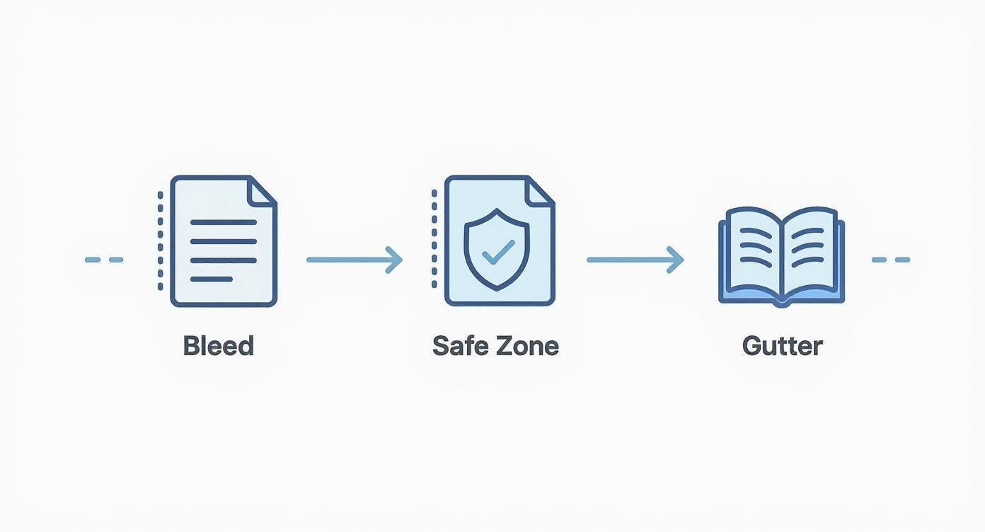
This workflow shows you exactly how the bleed extends your design past the trim line, how the safe zone protects your vital content, and how the gutter gives readers enough room to hold the book comfortably without covering the text. Nailing this ensures your layout translates flawlessly from screen to print.
Assembling Your Full Cover File
Here's a concept that trips up a lot of first-time authors: your cover isn't just the front design. For a paperback, you need to provide a single, flat file that includes the back cover, the spine, and the front cover, all laid out in one continuous image.
Think of your cover file as one single, flattened piece of art. The printer doesn't glue three separate parts together. They print one large sheet and wrap it around your bound pages. Getting the dimensions of this single sheet right is everything.
The total width of your cover file is a simple but crucial formula:
Back Cover Width + Spine Width + Front Cover Width + Bleed (on both the left and right sides)
To make sure your cover is perfect, follow this checklist:
- Use a Template: Seriously, don't try to eyeball this. The easiest way to avoid a costly mistake is to download a cover template directly from your printer, whether it's KDP or IngramSpark. You’ll just need to plug in your trim size, page count, and paper type, and it will spit out a perfect template with all the guides you need.
- Add Your Bleed: Just like the interior, your cover needs that extra 0.125 inches of bleed on all four sides of the flattened image.
- Keep it High-Resolution: The entire cover file—front, back, and spine—must be 300 DPI.
- Set the Right Color Mode: Export your final cover file as a PDF using the CMYK color mode. This is the standard for professional printing and ensures your colors look accurate on paper.
Sweating these small details during file prep is one of the most important things you can do on your publishing journey. If you want to dive deeper into the art and science of making your pages look incredible, check out our complete guide on professional book design and layout. By following these steps, you can send your files off with confidence, knowing you’ve given your book the best possible chance for a flawless print run.
Working Within Your Printer's Limits
Picking your book's size is a huge step, but it’s only part of the puzzle. The next, and arguably more critical step, is making sure your chosen print-on-demand (POD) service can actually bring that vision to life. Services like Amazon KDP and IngramSpark each have their own menu of options, rules, and limitations.
Think of it like this: KDP is a popular, high-volume workshop that excels at producing the most common chair designs quickly and efficiently. IngramSpark is more like a custom furniture shop that can build those same chairs but also offers a wider range of bespoke designs—though it might take a bit more know-how to place your order.
It's absolutely crucial to check these platform-specific rules before you start designing. There’s nothing worse than creating a stunning 6.5" x 6.5" square art book, only to find out your printer can't produce it. That kind of mistake costs you time, money, and a whole lot of frustration.
KDP vs. IngramSpark: A Practical Comparison
In the world of self-publishing, Amazon KDP and IngramSpark are the two heavyweights. They serve different primary purposes, and that difference is reflected in their trim size options.
Amazon KDP (Kindle Direct Publishing) is all about simplicity and direct access to the massive Amazon marketplace. It’s perfect for authors who are happy with the most popular, industry-standard sizes. Because it focuses on these common dimensions, the process is straightforward, but you'll find it's less flexible if you want something unique.
IngramSpark, however, is designed for authors who want to reach a global distribution network of bookstores, libraries, and other retailers. To serve that diverse market, it offers a far greater selection of trim sizes, including many custom and less-common options that KDP doesn't support. This flexibility comes with a slightly more complex setup process and some initial fees.
The platform you choose sets the boundaries for your creative choices. KDP offers a streamlined path with popular sizes, while IngramSpark gives you a much larger canvas to work with if you have specific dimensional goals.
How Trim Size Impacts Your Royalties and Reach
The dimensions of your paperback don't just affect its physical presence; they have a real impact on your bank account and how widely your book can be distributed. Both KDP and IngramSpark calculate their printing costs based on a combination of page count, trim size, and ink type (black and white or color).
Simply put, a larger book uses more paper, which means it costs more to print. That higher print cost is deducted from your sale price, directly reducing your royalty. For instance, a 250-page, 6" x 9" book will have a higher print cost than a 250-page, 5" x 8" book. If you sell both for the same price, you’ll earn less on the larger one.
Beyond just the cost, certain distribution channels have their own rules. IngramSpark's "Expanded Distribution" network, which gets your book into catalogs for physical bookstores and libraries, often requires books to be within a standard size range. If you choose a really unconventional or oversized dimension, you might lock yourself out of these essential sales channels. It's all about striking a balance between your creative vision and the practical realities of printing costs and market access.
Common Questions About Paperback Dimensions
As you get closer to the finish line, a few key questions about paperback dimensions always seem to surface. Getting these sorted out now can save you a world of headaches and costly reprints down the road. Let's tackle some of the most common things authors ask when they're in the final stages of formatting.
What Is the Most Cost-Effective Paperback Size?
This one’s easy. The most budget-friendly sizes are the industry standards you see everywhere: 5.5" x 8.5" and 6" x 9".
There's a simple reason these book dimensions paperback sizes are so common. Print-on-demand services like KDP and IngramSpark have their machines calibrated to churn these out by the thousands, which brings the cost per book way down. If you venture into a custom or non-standard size, you're almost guaranteed to pay more for every single copy, which eats directly into your royalties.
Can I Change My Trim Size After Publishing?
The short answer is yes, but you really, really don't want to. Changing your trim size means you have to unpublish the old version and start over with a brand new book listing, complete with a new ISBN.
Think of your book's trim size and ISBN as its permanent fingerprint. Changing one requires creating an entirely new identity for your book in the global marketplace.
This isn't just a simple tweak. You'd have to reformat your entire interior manuscript and redesign your book cover from the ground up to fit the new dimensions. Worst of all, you'll lose all the customer reviews and sales history tied to the original version. It's so much better to nail this decision before you hit publish.
How Does Trim Size Affect Font Size?
They're two sides of the same coin. The size of your page dictates how you handle the text inside it. A smaller trim size, like a mass-market 4.25" x 6.87", naturally calls for a smaller font. Otherwise, your page count will balloon, or the text will look horribly cramped.
On the other hand, a larger 6" x 9" format gives you more real estate. This allows you to use a more generous font size and add more white space, which makes for a much more comfortable reading experience. You always have to think about how these two elements work together.
Do Non-Standard Sizes Hurt Bookstore Placement?
They absolutely can. Booksellers work with standardized shelving, and they need to maximize every inch of it. A book with an awkward or oversized shape is a logistical pain—it just doesn't fit neatly on the shelf with everything else.
Retailers are far more likely to stock books that slide right in with other titles in the same category. While a unique size might seem like a cool way to stand out, it might just keep your book from ever getting onto a physical shelf in the first place.
Ready to bring your book to life with the perfect dimensions and professional design? BarkerBooks has helped over 7,500 authors navigate every step of the publishing process. Let our expert team handle the details so you can focus on what you do best—writing. Learn more about our publishing packages and start your journey today.