
So, what exactly is book formatting? At its core, it's the art of designing a book's interior pages to create a professional and deeply immersive reading experience. It’s the crucial step that takes your raw text, images, and overall structure and arranges them into a polished final product, whether it's destined for print or a digital screen.
The Hidden Blueprint of a Professional Book
Think of book formatting as the architecture of a building. When it’s done well, you don't even notice the structure; you just enjoy the space. It’s the invisible blueprint that transforms a manuscript into a world readers can navigate with ease and pleasure. This process covers everything from choosing the right font to setting the perfect margins.
Essentially, book formatting is all about presentation. It ensures your words show up clearly, consistently, and attractively on every single page. Shoddy formatting can make even the most compelling story feel amateurish and unreadable. On the flip side, professional formatting lends an immediate layer of credibility that helps build trust with your audience.
This isn't just a "nice-to-have"—it's a critical part of the modern publishing industry. The U.S. book publishing sector, valued at around $46.5 billion in 2025, leans heavily on high-quality formatting to meet reader expectations across countless genres and markets. While print still commands a huge part of the market, the explosion of digital formats means authors have to get formatting right for a whole host of platforms. You can dig deeper into the publishing industry's reliance on formatting with this report from IBISWorld.
Formatting isn't just about making a book look pretty. It's about respecting the reader’s time and investment by providing a seamless, enjoyable journey from the first page to the last.
The infographic below gives a quick visual summary of the key differences between formatting for a physical, printed book and a digital eBook.
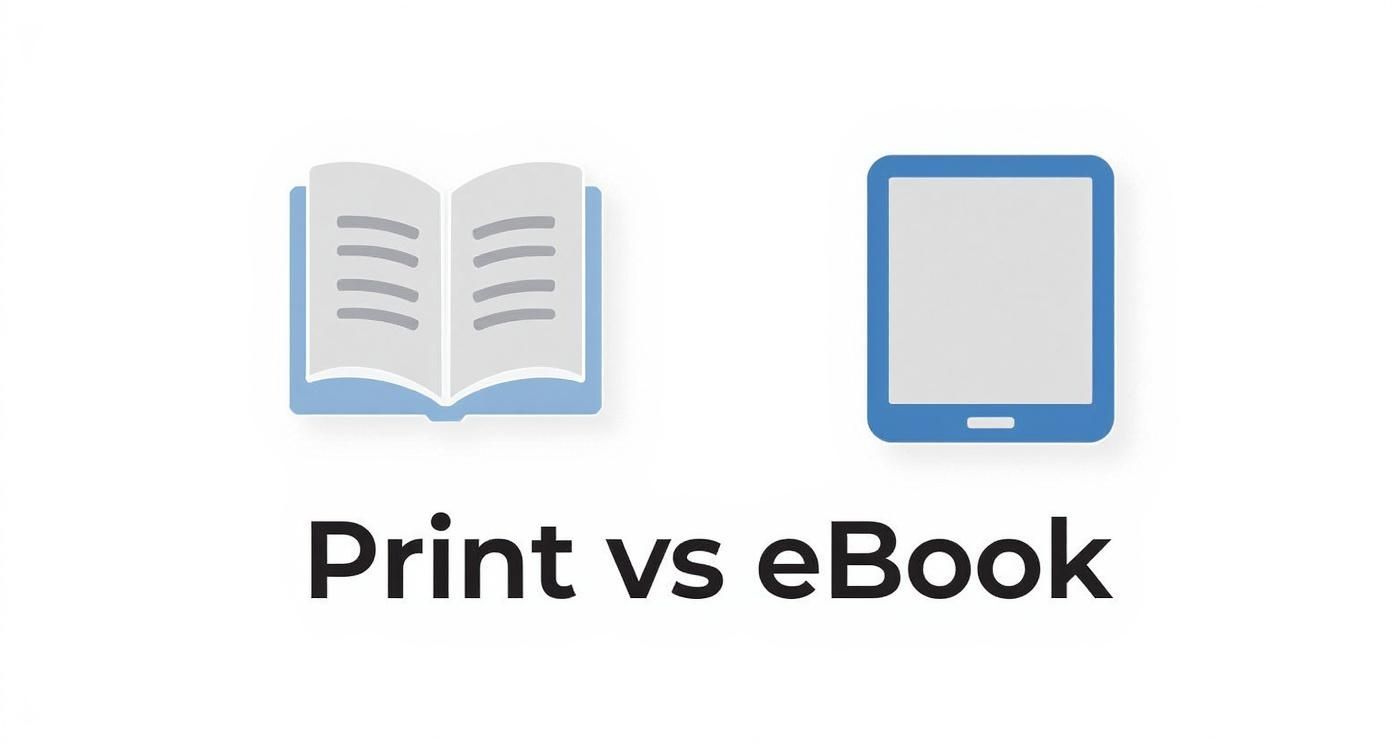
As you can see, the core distinction really boils down to this: print formatting is fixed and permanent, like a painting. In contrast, eBook formatting has to be fluid and adaptable, ready to reflow and adjust to all kinds of different screen sizes.
Why Great Formatting Is Your Best Sales Tool

It’s easy to think of formatting as just the finishing touch, the last bit of polish before you hit "publish." But in reality, it’s one of the most powerful sales tools you have. Readers form an opinion in seconds, and a messy, confusing interior is often the first red flag that screams "amateur."
This snap judgment happens subconsciously. Before they’ve even read a full page, a clunky layout can sour their experience, leading to bad reviews or—even worse—the decision to stop reading altogether.
Think of it this way: your book's interior design is its storefront. A clean, inviting layout draws people in. A cluttered, disorganized one makes them want to walk right back out.
It’s All About Author Credibility
A polished, professionally formatted book shows you respect your reader. When the text is easy to read and the pages are laid out logically, you remove any friction that might pull them out of the world you’ve built. That smooth, immersive experience is what gets them hooked.
When you nail the formatting, you're not just making the book look good; you're proving you're a serious author who cares about quality. This perceived professionalism makes readers far more likely to:
- Leave glowing reviews: A fantastic reading experience is the number one driver of positive feedback.
- Recommend your book to friends: People love to share things that look and feel premium.
- Buy your next book, no questions asked: You've earned their trust with a high-quality product.
A book's interior design is a silent promise to the reader. It says, "The story inside is worth your time, and I've taken the care to present it properly."
The Real-World Cost of Cutting Corners
Choosing to skimp on formatting isn't just an artistic misstep; it’s a business one with a direct impact on your earnings. In a competitive market, you can't afford to give readers a reason to put your book down.
The numbers back this up. With eBook revenues growing by around 2.4% and audiobooks by over 5% by mid-2025, a high-quality presentation is essential to stand out and capture your share of this audience. You can find more details on how production quality impacts book sales statistics over at newprint.com.
Ultimately, investing in proper formatting is an investment in your author brand. It works behind the scenes, ensuring your story makes the best first impression possible and keeps readers coming back for more.
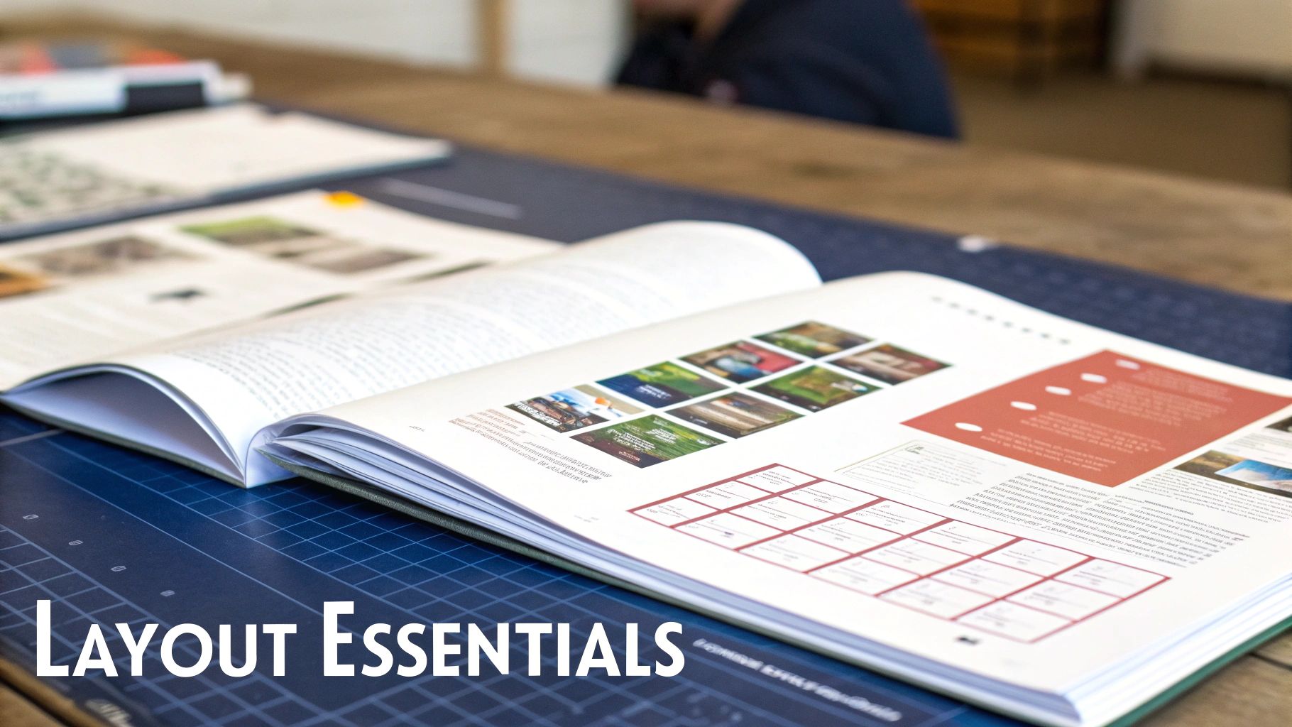
Mastering the Core Elements of Book Layout
So, what actually is book formatting? Let's pull back the curtain and look at the essential building blocks. Getting these details right is what separates a book that feels inviting from one that's a chore to read.
Think of it like being an interior designer for your book's pages. A designer doesn't just throw furniture in a room; they carefully select the paint, lighting, and layout to create a specific feeling. In the same way, a book formatter uses typography, spacing, and margins to make a page effortless and enjoyable for the reader.
Let's dive into the key components you'll need to understand, whether you're tackling this yourself or bringing in a professional.
Typography: The Voice of Your Book
Typography is so much more than just picking a font. It's about choosing the visual voice for your words. The two main families you'll work with are serif and sans-serif.
-
Serif Fonts: You know these fonts—they have the little decorative "feet" (serifs) at the ends of the letters. Think Times New Roman or Garamond. For printed books, those tiny serifs are workhorses; they guide the reader's eye smoothly across the page, which has been shown to reduce eye strain over a long reading session.
-
Sans-Serif Fonts: These are the clean, modern-looking fonts without the little feet, like Arial or Helvetica. They really shine in headings, titles, and on digital screens where clarity and crispness are king.
For the main body text in a printed book, you'll almost always want to stick between a 10 to 12-point font size. This hits the sweet spot—big enough to be comfortable, but not so big it looks clunky.
Creating Breathing Room on the Page
Margins and line spacing are the unsung heroes of great book design. They create the "white space" that keeps a page from feeling cramped and overwhelming.
Proper spacing isn't just empty space—it's a deliberate design choice that gives the reader's eyes a place to rest. This visual breathing room is absolutely critical for keeping someone engaged, page after page.
Margins are simply the blank borders around your text, making sure your words don't get swallowed by the book's gutter or run off the edge. And line spacing (often called "leading" in the design world) is the vertical space between each line of text. If it's too tight, you get a dense, intimidating wall of words. Too loose, and the lines feel disconnected.
Finding that perfect balance is the secret to a professional and readable layout.
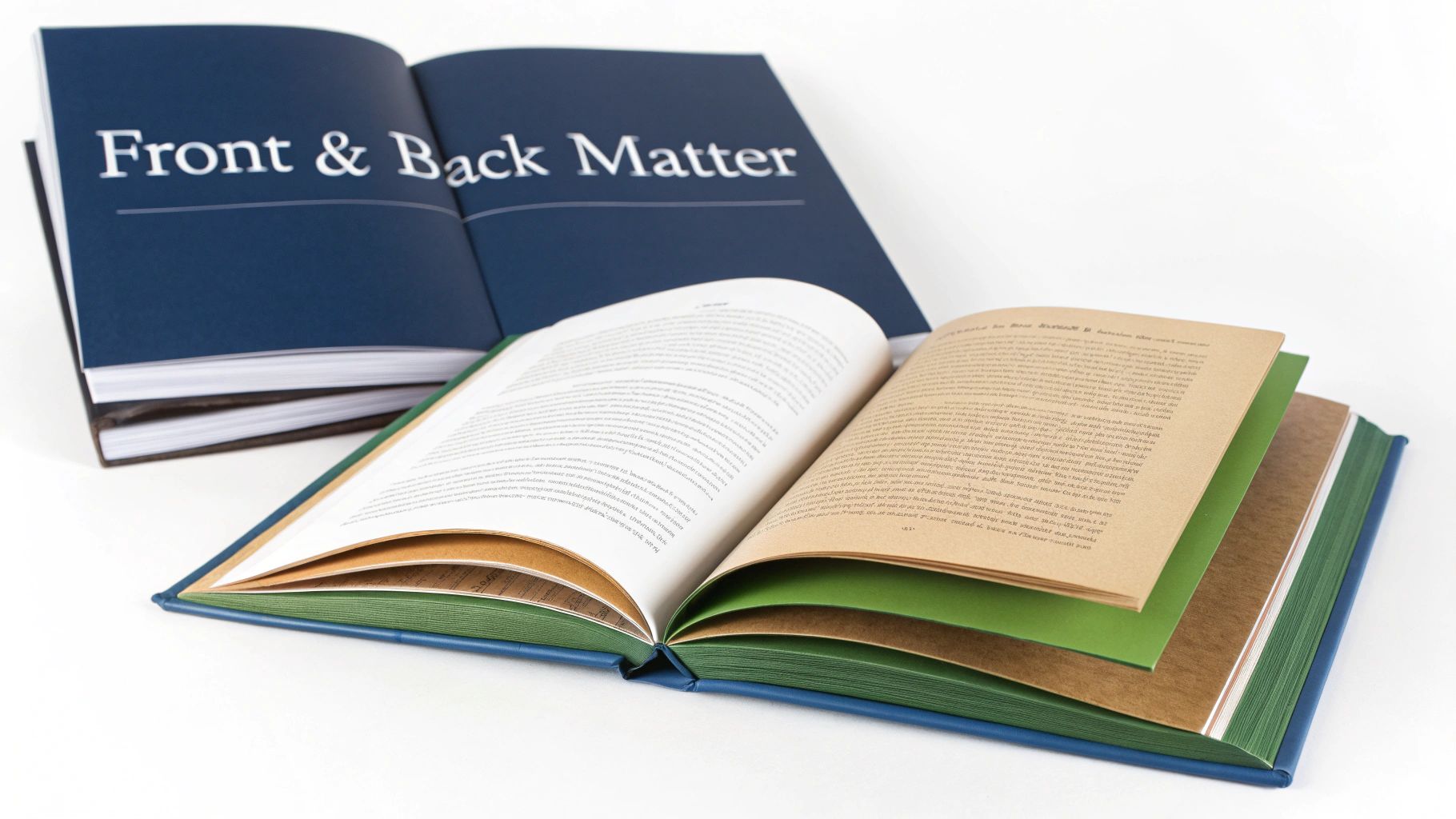
Structuring Your Front and Back Matter
A book is so much more than just its chapters. The sections that sandwich your main content—the front and back matter—are the bookends that create a truly professional reading experience. They’re the formal handshake and the warm goodbye that readers and retailers have come to expect.
Think of the front matter as the opening credits of a film. It’s where you lay out the essential information, from the title page to the legally required copyright notice, before the story even begins. The back matter is like the closing credits, a place to thank people, tell the audience more about yourself, and point them toward what’s next.
Nailing this structure is a non-negotiable part of book formatting. It’s a silent signal of quality that tells readers they’re in good hands.
Key Components Of Your Front Matter
The front matter includes everything a reader sees before they hit Chapter One. While there's a little wiggle room, a few key elements are expected in a specific order. Following this convention is one of the easiest ways to make your book look professionally published.
For a great visual breakdown, check out this guide to the standard parts of a book diagram to see exactly how these pieces connect.
Here’s a look at what typically goes into the front matter:
- Title Page: This is simple and direct. It features your book’s full title, subtitle (if you have one), and your name as the author.
- Copyright Page: This page is a legal must-have. It contains the copyright notice (©), the year of publication, publisher details, and your ISBN.
- Table of Contents: Your book's roadmap. It's especially crucial for non-fiction, listing out chapter titles and the page numbers where they begin.
- Dedication or Epigraph: This is a more personal touch. It's your chance to dedicate the book to someone special or open with a powerful quote that sets the tone.
Polishing Your Back Matter
The back matter is your opportunity to connect with readers after they’ve finished the final page. It’s the perfect spot to provide bonus information, build your author platform, and encourage them to see what else you have to offer.
A well-crafted "About the Author" page, for instance, isn't just a bio—it's a marketing tool that can turn a one-time reader into a long-term fan.
To help you organize everything, here’s a checklist covering the standard components and their conventional order.
Standard Book Structure Checklist
| Section | Component | Purpose |
|---|---|---|
| Front Matter | Title Page | Officially presents the book's title, subtitle, and author. |
| Front Matter | Copyright Page | Contains legal notices, publisher info, and ISBN. |
| Front Matter | Dedication | A personal note dedicating the book to someone. |
| Front Matter | Table of Contents | Lists chapters and page numbers for easy navigation. |
| Front Matter | Foreword/Preface | An introduction written by another person or the author. |
| Back Matter | Acknowledgments | Thanks individuals who contributed to the book's creation. |
| Back Matter | About the Author | A brief author biography to connect with readers. |
| Back Matter | Bibliography/Index | Lists sources (non-fiction) or key terms (index). |
Getting these elements in the right place demonstrates a level of care and professionalism that elevates your work from a simple manuscript to a polished, reader-ready book.
Choosing the Right Book Formatting Tools
Alright, you understand the what and why of good formatting. Now comes the big decision: how are you actually going to get it done?
The right path really boils down to three things: your budget, your patience for technology, and how much control you absolutely need to have over the final look. Generally, you're looking at three main options, each with its own pros and cons. Let's break them down.
For a deep dive into the specific tools, checking out a list of the best book formatting software is a great starting point. It'll give you a feel for what’s out there.
DIY Software Solutions
This is the path for the hands-on author. If you like to get into the details, want to keep costs down, and have the time to learn, doing it yourself can be incredibly rewarding. You're in complete control of every single element.
- Microsoft Word: We all have it, but it wasn't built for professional book layout. Getting it to produce a flawless print-ready file can feel like wrestling a bear.
- Scrivener: A fantastic writing and outlining tool that many authors swear by. Its formatting capabilities are a step up from Word, but they still can't compete with software designed specifically for the job.
- Vellum & Atticus: These are the game-changers for DIY authors. They were created from the ground up to make beautiful print and eBooks without a steep learning curve. If you want a pro look with less frustration, these are where you should start.
Think of it this way: choosing a tool is about finding that sweet spot between power and simplicity. A dedicated program automates the tricky stuff, giving you a professional result without needing a degree in graphic design.
Hiring a Professional Formatter
What if you'd rather spend your time writing your next book instead of fiddling with software? If you have the budget, hiring a professional is a fantastic investment.
An experienced formatter brings a trained eye to your manuscript. They know the industry standards inside and out and can spot subtle issues you might miss, ensuring your book looks polished and credible. It’s the most surefire way to get a top-tier result.
You can find talented designers on freelance platforms. A good place to look for affordable experts is to check out Fiverr coupon codes for professional formatting. Just be sure to do your homework—always review their portfolio and read past client reviews to find someone who's a perfect match for your book.
Common Book Formatting Questions Answered
Diving into book formatting for the first time? It’s completely normal to have a ton of questions. Getting the right answers early on can save you a world of headaches and help you make smart choices for your book right out of the gate.
We’ve pulled together a few of the most common questions we hear from authors to help clear up the confusion and give you some solid, practical advice.
Formatting vs. Typesetting: What’s the Difference?
You’ll often hear these two terms thrown around, sometimes as if they mean the same thing. They’re closely related, but they actually refer to two different stages of the design process.
Think of it this way:
- Formatting is the big-picture architecture. It’s about structuring the entire book—setting the margins, establishing chapter styles, and organizing the front and back matter for both print and ebooks.
- Typesetting is the detail work. This is the art of arranging the text on each page, making sure the spacing is perfect, ensuring line breaks are clean, and hunting down those pesky "widows and orphans."
Basically, typesetting is a specialized craft that happens within the larger framework of formatting.
A great way to think about it is building a house. Formatting is the blueprint that lays out where all the rooms, doors, and windows go. Typesetting is the interior designer who arranges the furniture in each room so it looks great and is easy to walk around.
Can You Format a Book in Microsoft Word?
The short answer is yes, you can. The longer answer is that it's often more trouble than it's worth. While Microsoft Word is a fantastic tool for writing, it just wasn't built for the kind of precise layout control a professionally printed book requires.
Trying to get print-ready margins (especially the tricky gutter margin) to behave, keeping your styles consistent, and exporting a clean file can be a real battle. If you're committed to doing it yourself, you'll need to learn how to properly convert your document from Word to EPUB, which is its own unique challenge.
For a polished, professional result that sidesteps these common frustrations, most authors find that using purpose-built software like Vellum or hiring a professional is the best way to go.
At BarkerBooks, our team of experts handles every aspect of interior formatting to ensure your book meets the highest industry standards. Learn more about our professional publishing services!