
Imagine bringing a vibrant, full-color book to life without having to mortgage your house to pay for a massive print run. That’s the magic of print on demand color books. The concept is simple: a book is printed only after someone actually buys it. This completely changes the game for anyone creating children’s books, cookbooks, or photography collections, making professional publishing accessible to everyone.
Why Print on Demand Is Perfect for Color Books
Not long ago, publishing a book filled with rich color was a high-stakes gamble. You’d have to order hundreds, maybe thousands, of copies and just hope they’d sell. Print-on-demand (POD) completely demolishes that financial barrier, letting creators focus on their vision instead of their wallet.
And this isn't some tiny, niche corner of the publishing industry. The global print-on-demand market is absolutely exploding, with a massive 26% compound annual growth rate (CAGR). It's on track to jump from $12.96 billion in 2025 to a mind-boggling $102.99 billion by 2034, all thanks to people wanting unique, personalized products.
The Big Wins for Independent Creators
For authors, artists, and photographers going it alone, the upsides of POD are huge. You hold all the cards, from the first draft to the final cover. No one is telling you your work isn't "commercial" enough for a big print run.
You get to focus on what you do best: creating. Here’s what makes it so appealing:
- No Inventory Headaches: Forget about a garage overflowing with unsold books. Every single copy is printed to order, which means no waste and no storage fees.
- A Worldwide Bookshelf: Services like Amazon KDP and IngramSpark put your book in a global marketplace. A reader in Australia can order your book today, and it will be printed and shipped from a facility nearby.
- Your Vision, Your Rules: You choose the cover art, the interior design, the paper finish, and the price. It's your project, and it stays that way.
- Fix Mistakes on the Fly: Found a typo after you published? Want to swap out a photo? Just upload the corrected files. All future copies will be printed with the latest version—no need to scrap old inventory.
Key Takeaway: Print-on-demand puts the power back in the creator's hands. It lets you produce gorgeous, high-quality color books with virtually zero financial risk and total creative control. The focus shifts from managing stock to creating something amazing.
Now that you see the potential, let’s dig into the nitty-gritty. This guide will walk you through the key decisions you’ll need to make, from color profiles and paper types to designing a cover that practically leaps off the shelf. To get a complete roadmap for the entire journey, a practical guide to self-publishing can be an invaluable resource.
Let’s start by looking at the most common types of color books and what makes each one unique.
Common POD Color Book Types and Audiences
Not all color books are created equal. A children's book has completely different design needs than a fine art photography collection. Understanding your specific niche will help you make smarter decisions about everything from paper stock to trim size.
Here's a quick look at some popular categories, their audiences, and where you should focus your attention.
| Book Type | Primary Audience | Key Focus Area |
|---|---|---|
| Children's Books | Parents, Grandparents, Educators | Durable paper, vibrant and accurate color reproduction for illustrations, safe materials. |
| Cookbooks | Home Cooks, Food Bloggers, Chefs | High-quality food photography, clear and readable text, lay-flat or durable binding. |
| Photography Books | Photographers, Artists, Hobbyists | Premium paper with excellent photo rendering, precise color management (ICC profiles), cover finish. |
| Graphic Novels/Comics | Comic Fans, Collectors | Bright color saturation, crisp line art, paper weight that prevents ink bleed-through. |
| Art & Coffee Table Books | Art Lovers, Designers, Collectors | Exceptional print quality, heavy paper stock, unique cover treatments (e.g., matte finish with spot gloss). |
| Workbooks/Journals | Students, Self-Help Seekers | Writeable paper surface, thoughtful use of color to guide the user, durable cover. |
As you can see, your target reader directly influences your production choices. A parent buying a picture book cares about durability, while a photographer selling a portfolio book is obsessed with color accuracy and paper texture. Keep your end user in mind every step of the way.
Getting Your Files Print-Ready
This is where the rubber meets the road. That gorgeous design on your screen has to make the leap into a physical, printed book, and it’s a jump where a lot of creators stumble. What looks perfect on a backlit monitor can easily come out looking dull, muddy, or misaligned in print.
Why? Because screens and printers speak two completely different languages. Mastering a few key technical details isn't just a good idea—it's non-negotiable if you want to produce professional print-on-demand color books.
The first, and most important, thing to get your head around is color modes. Your monitor, phone, and digital camera all use the RGB (Red, Green, Blue) color model. It’s an additive system, meaning it starts with a black screen and adds light to create colors. The more light, the closer you get to pure white.
Printers, on the other hand, run on the CMYK (Cyan, Magenta, Yellow, Key/Black) model. This is a subtractive process. It starts with a white piece of paper, and ink is applied to subtract brightness and build up your colors. Since these two systems work in opposite ways, that vibrant electric blue in your RGB file might turn into a disappointing navy when it's converted to CMYK for printing.
Translating Color With ICC Profiles
So how do you bridge that gap? With something called an ICC profile. Think of it as a specific translation dictionary for a printer. It tells the printing press exactly how to interpret the color data in your file to produce the hues you intended on a specific type of paper.
Most POD services, like KDP or IngramSpark, provide their own custom ICC profiles for you to download and use. Applying the right profile while you’re still designing gives you a much more accurate preview of how the final colors will look, saving you from a nasty surprise later.
For a deeper dive, especially if you're creating art-heavy books, it's worth exploring resources on understanding the composition of color from screen to canvas, as it sheds light on how RGB and CMYK models fundamentally differ.
Here’s a peek at a typical color management settings dialog you’d find in a program like Adobe InDesign.
This is where you'd assign the specific CMYK profile your printer provides. It's a critical step that syncs your digital workspace with the real-world printing process.
The Non-Negotiable Rule of Resolution
Beyond color, the sharpness of your images and illustrations comes down to one thing: resolution. We measure this in DPI (Dots Per Inch). For a website or social media, 72 DPI is perfectly fine. For print? 300 DPI is the absolute minimum.
If you try to use a low-resolution image designed for a website, it will look like a blurry, pixelated mess in your printed book. No exceptions.
Pro Tip: Always, always start with high-resolution images. You can scale a big image down without losing quality, but you can never successfully scale a small, low-res image up. No software in the world can magically create detail that isn’t there in the first place.
Understanding Bleed and Safety Margins
Finally, you have to think about the physical reality of how books are made. Printers don’t print right to the edge of the final page size. They print on a larger sheet and then trim it down. That trimming process is never 100% precise, which is why "bleed" is so important.
Bleed is the part of your artwork that extends past the final trim line of your page, usually by 0.125 inches (3mm) on each outer edge. If you have a background image or a photo that’s supposed to go right to the very edge, it must extend all the way into this bleed area. If it doesn't, you’ll risk getting an ugly little white sliver along the edge of your page if the trim is just a fraction of a millimeter off.
On the flip side, you have the safety margin (or "live area"). This is the safe zone inside the trim line where all your critical stuff—like text or the important parts of an illustration—needs to live. This ensures nothing important gets accidentally chopped off during trimming or disappears into the gutter (the center fold of the book).
- Trim Line: The actual, final edge of your page.
- Bleed Area: Your background art must extend 0.125" beyond this line.
- Safety Margin: All your important text and images must stay at least 0.25" to 0.5" inside this line.
Nailing these file specs from the very beginning will save you a world of headaches. This is the technical foundation your beautiful color book is built on—don't skip it.
Designing a Book People Want to Buy
When it comes to print-on-demand color books, design isn't just about making things look nice—it's about creating an experience. The right design choices are the difference between a book that dazzles and one that falls completely flat.
Every single element, from the feel of the paper in a reader's hands to how your cover looks as a tiny thumbnail online, influences that crucial "buy now" decision. This is where you have to think like a product designer, balancing the creative vision with the practical realities of texture, finish, and cost.
Let’s get into the nitty-gritty of how paper, interior layout, and cover design work together to make a book that readers genuinely can't resist.
Your Paper Choice Is a Big Deal
The paper you choose is the foundation of your book’s entire look and feel. It’s what brings your colors to life… or dulls them down. Standard white paper is easy on the wallet, but it can make vibrant inks look a bit muted. If you want colors that truly pop off the page, you'll need to spring for a premium coated paper, which will, of course, cost you more per book.
I've seen artists and cookbook authors agonize over the matte vs. glossy decision. A matte finish gives a soft, almost velvety look that’s fantastic for art books or certain types of children's stories. Glossy, on the other hand, makes colors incredibly vibrant and is a go-to for photo-heavy projects. Keep in mind that both choices affect the book's weight, which trickles down to shipping costs.
This is especially critical in huge markets like children’s picture, drawing, and coloring books. These books are a major driver of the juvenile publishing world, and POD’s flexibility has fueled steady growth in the US and Europe. Getting the paper right here is non-negotiable. Learn more about market growth
So, how do you decide? Here’s a quick breakdown I've put together to help authors wrap their heads around the options.
How Paper Choice Affects Your Color Book
| Paper Type | Best For | Color Vibrancy | Cost Impact |
|---|---|---|---|
| Standard Uncoated | Workbooks, text-heavy interiors, early proofs | Medium | Low |
| Glossy Coated | Photography books, vibrant cookbooks, lookbooks | High | Medium |
| Matte Coated | Art books, children's books, portfolios | High | High |
| Recycled | Eco-conscious projects, zines, journals | Medium-Low | Medium |
Ultimately, the paper you select sets the tone for the entire reading experience. Don’t treat it as an afterthought; it’s a core part of your book’s appeal.
Crafting an Interior That Breathes
A great interior layout doesn't scream for attention; it quietly guides the reader's eye, letting your beautiful images do the talking. The two biggest culprits I see ruining good layouts are cramped margins and inconsistent gutters, which can cause your artwork to get swallowed up by the binding.
Here’s a pro tip: try placing your most impactful full-bleed images on the right-hand (odd-numbered) pages. This gives each new chapter or section a cinematic opening and works wonders in cookbooks to make a recipe photo the star of the spread.
To keep things looking polished and intentional, I always stick to a few ground rules:
- Use a grid system. It’s the secret to keeping your images and text perfectly aligned from one page to the next.
- Let your text support the art. Don’t just plop a text block down; align it to complement the flow of the illustration.
- Embrace white space. Giving your key elements room to breathe is the easiest way to avoid a cluttered, overwhelming page.
- Stick to two fonts, max. Any more than that, and you risk compromising readability.
When you nail these details, your layouts feel professional and inviting, encouraging readers to slow down and savor every page.
Designing a Cover That Actually Converts
Your cover is your book’s billboard, salesperson, and first impression all rolled into one. In a crowded online marketplace, it’s often just a tiny thumbnail competing against dozens of others. You have a split second to grab someone’s attention.
The formula is simple: a clear, readable title, bold contrast, and an image that immediately communicates your book's theme or story.
I always tell my clients to test their cover designs by shrinking them down to the size of a postage stamp. If you can't read the title or understand the main visual at that size, it's not going to work. Your thumbnail has to be legible and striking, even when it’s less than two inches wide.
“A great cover sparks curiosity in one glance and promises the journey within.” — A hard-earned lesson from the design trenches.
Make sure your cover’s aesthetic matches your genre. A children's book usually calls for bright, playful colors, while a high-end cookbook will lean on beautiful, appetizing photography to do the heavy lifting.
The Technical Side of Cover Setup
Don't let the technical file setup trip you up at the finish line. Your full, wrap-around cover is a single PDF that includes the back, spine, and front, all with the correct bleed and safety margins.
Getting the spine width right is crucial. You calculate it by multiplying your final page count by the thickness of the paper you chose. Thankfully, most POD services like KDP and IngramSpark provide templates that take the guesswork out of trim lines and bleed areas. Use them.
Here's the technical checklist to run through before you export:
- Add 0.125 inches of bleed around all four edges of your cover file. This is non-negotiable.
- Keep all important text and logos at least 0.25 inches away from the trim line to avoid them getting chopped off.
- Embed all your fonts and link all your images properly to prevent any missing asset errors during processing.
- Export your final file as a PDF/X-1a, or whatever specific format your POD service requires.
Always, always double-check your final PDF in a proofing tool or, better yet, order a physical proof. Trust me, it's far better to catch a misalignment yourself than to have a customer point it out in a one-star review.
Quick Design Checklist
Before hitting that final "publish" button, do one last sanity check. It can save you a world of headaches.
- Paper: Is the paper type you selected aligned with both your creative vision and your budget?
- Color Profile: Have you applied the correct ICC profile to ensure your colors print as you intended?
- Cover File: Zoom in to 100% on your cover PDF. Is everything sharp, clear, and where it’s supposed to be?
Running through these final steps helps catch those small but costly mistakes. Remember, impactful design is what positions your print-on-demand color book for success, driving those impulse buys, great reviews, and the kind of word-of-mouth buzz every author dreams of.
Where to Publish Your Book
Your files are finally done, polished, and ready. So, what now? The next step is choosing the right print-on-demand platform to actually get your book into readers' hands. This decision is huge, and the two biggest players you’ll hear about are Amazon KDP and IngramSpark.
Think of it this way: KDP is like setting up a stall in the world's biggest, busiest marketplace. IngramSpark is like hiring a professional distributor who can get your product into thousands of different retail shops. One gives you direct access to a massive crowd, the other gives you broad reach. For many authors, the answer isn't choosing one or the other—it's using both.
Amazon KDP: The Behemoth of Online Retail
For most self-publishers, Amazon's Kindle Direct Publishing (KDP) is the starting point, and for good reason. Its killer feature is direct, seamless access to the Amazon ecosystem. When your book goes live on KDP, it's instantly available to millions of shoppers, including Prime members who get that sweet, free two-day shipping. That's an incredible advantage for discoverability you simply can't ignore.
From an author's perspective, KDP is refreshingly easy to use. The dashboard is clean, there are no fees to upload your book, and ordering proof copies is straightforward and affordable. The catch? KDP is designed to sell books on Amazon. It does have an "Expanded Distribution" channel, but the royalties are much lower, and frankly, most independent bookstores won't order from their number one competitor.
My Take: You absolutely need to be on KDP. The sheer volume of traffic and the higher royalty rates you get from direct Amazon sales make it non-negotiable for reaching the vast majority of online book buyers.
IngramSpark: Your Key to Bookstores and Libraries
Ever dream of walking into a Barnes & Noble and seeing your book on the shelf? IngramSpark is the platform that can make that happen. It's the self-publishing arm of Ingram, the largest book wholesaler in the business. When your book is in their catalog, it's visible to over 40,000 retailers, bookstores, and libraries that order their inventory directly from Ingram.
The trade-off for this incredible reach is a bit more complexity. The IngramSpark interface isn't as user-friendly as KDP's, and they typically charge setup fees (though you can often find a promo code to waive them). More importantly, to get bookstores to even consider your title, you need to play by their rules. That means offering a standard wholesale discount (usually 55%) and making your book returnable, which introduces a financial risk you have to be comfortable with. On the plus side, their print quality is widely considered top-notch and bookstore-ready.
Pricing, Printing Costs, and What You Actually Earn
Let's talk money. Figuring out your profit is the most critical part of setting your book's price. While each platform has its own nuances, the core calculation is always the same:
(List Price x Royalty Rate) – Print Cost = Your Profit
To see this in action, here's a look at the royalty calculator inside the KDP dashboard for a sample color book.
In this real-world example, a 40-page full-color paperback priced at $19.99 has a printing cost of $4.65. KDP offers a 60% royalty rate for paperbacks sold on its platform. After subtracting the print cost, you're left with a profit of $7.34 per sale.
This is why you can't just guess your list price. You have to work backward from the printing costs and royalty structure to find a price that not only covers everything but also pays you fairly for your work.
Why You Should Never, Ever Skip the Proof Copy
You've poured your heart into this book. Countless hours spent tweaking illustrations, perfecting photos, and agonizing over every single word. You’ve wrestled with the technical beast of color profiles and file specs. Now, with the finish line so close, you'll feel a powerful temptation to take a shortcut: skipping the physical proof.
Let me be blunt: this is the single biggest mistake you can make when publishing a print-on-demand color book.
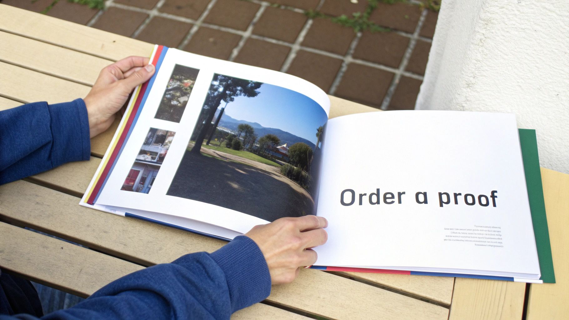
I get the temptation, I really do. You've seen the digital "soft proof" on your screen, and it looks great. But a backlit monitor is a liar. It's an incredibly forgiving environment that can hide a multitude of sins—sins that will be glaringly obvious on a printed page. A PDF can't show you how ink soaks into a specific paper stock or how a glossy finish catches the light.
Soft Proof vs. Hard Proof: What’s the Real Difference?
It’s crucial to understand the distinction here. A soft proof is just a digital preview, usually a PDF. It’s good for a final check on major layout issues, typos, or making sure all your images are present. But it's a terrible way to judge your final color and print quality.
A hard proof is the real deal. It's a physical, printed-and-bound copy of your book, made with the exact same paper, ink, and binding your customers will get. This is your only real chance to see, feel, and hold your book as an actual product before unleashing it on the world.
Think of your hard proof as the final dress rehearsal. It’s your last line of defense against disappointment and the one thing that separates a professional-looking book from an amateur one that gets buried in one-star reviews.
The market for color books is incredibly competitive. Take adult coloring books, a huge niche for print-on-demand authors. It's a booming $151.23 million global market in 2024, and that number is expected to more than double by 2030. That growth means there's a massive audience out there, but they have high expectations. You can explore more about this market's impressive growth and see for yourself why a flawless final product is non-negotiable.
Your Essential Proofing Checklist
When that proof copy finally lands on your doorstep, the excitement is real. But this is not the time for a quick flip-through. This is the time to be a detective. Grab a pen, find a quiet spot with good lighting, and get critical.
What to Look For When Your Proof Arrives:
- Color Accuracy and Vibrancy: How do the printed colors stack up against what you saw on screen? Are they rich and punchy, or do they look flat, dull, or muddy? Pay close attention to things like skin tones in photos and specific brand colors in illustrations—these are often the first to look "off."
- Image Sharpness and Resolution: Are all your images crisp? Hunt for any signs of pixelation or blurriness. That’s a dead giveaway that a low-resolution file snuck into your final manuscript.
- Text Readability: Is the font size easy on the eyes? Is any text too faint, too bold, or lost against a busy background?
- Layout and Margins: Check the gutter (the center spine). Did any important parts of your images or text get swallowed up? Make sure everything is safely inside the margins so nothing gets chopped off during trimming.
- Paper and Cover Finish: How does the paper actually feel in your hands? Does that matte or glossy finish work with your artwork the way you hoped? Scrutinize the cover for any alignment problems, especially the spine text.
- Typos and Grammar: This is it. Your last chance. Read every single word, from the copyright page to your author bio. You will be amazed at what your eyes catch on a physical page after missing it a dozen times on a screen.
Yes, ordering a proof adds a bit of time and a small cost to your project. But the value it delivers is immeasurable. It’s the small investment that guarantees the book your readers hold in their hands is the masterpiece you dreamed of creating.
Common Questions About POD Color Books
Even after you've mapped everything out, jumping into print-on-demand color books can feel like there are still a few loose ends. Let's walk through some of the most common questions I hear from authors and artists to make sure you're ready to publish with complete confidence.
What’s the Real Cost to Print a Color Book?
This is the big one, but the answer is surprisingly straightforward: you pay nothing upfront. That’s the whole point of print-on-demand. A book is only printed after a customer orders it, and the printing cost is simply subtracted from your royalty on that sale.
So, how much does a single copy actually cost to produce? It really comes down to three things:
- Page Count: More pages equals a higher print cost. Simple as that.
- Trim Size: A larger book needs more paper and ink, which nudges the price up.
- Paper Quality: Premium color paper is more expensive than standard, but the results are often worth it.
To give you a ballpark idea, a 40-page, 8.5" x 8.5" full-color children's book on premium paper will likely run you somewhere between $4 to $6 per copy to print through a platform like KDP or IngramSpark. Remember, you're not paying this out of pocket; it’s just the figure used to calculate your earnings.
Can a POD Book Actually Look as Good as One from a Big Publisher?
Yes, it absolutely can. But there’s a catch. The technology behind modern POD printers is fantastic, often producing quality that's impossible to distinguish from a traditional offset print run. The final look, however, isn't really up to the printer—it's up to you.
Your book will only ever be as good as the files you send to the printer. If you upload blurry images or use the wrong color settings, the final product will look amateurish, no matter how great the press is.
A professional, bookstore-quality finish comes down to getting the technical prep work right. You have to use high-resolution images (always 300 DPI), get your color space dialed in (usually CMYK), and make sure your bleed and margins are set up perfectly. Nail those details, and your POD book will look every bit as good as something from a major publishing house.
Do I Really Need to Buy My Own ISBN?
This is a crossroads every indie author faces, and your choice has long-term consequences. A free ISBN from a platform like KDP sounds great, but it locks you into their ecosystem. With a free KDP ISBN, Amazon is listed as the publisher of record, and you can't use that number to sell your book anywhere else—not through IngramSpark, not directly to bookstores, nowhere.
When you purchase your own ISBN from an agency like Bowker in the US, you become the publisher. This puts you in the driver's seat. It gives you the freedom to distribute your book across multiple platforms at the same time, opening up a world of retailers, libraries, and booksellers. It’s a small investment upfront for complete control and independence down the road.
Ready to transform your manuscript into a stunning, globally available book? The expert team at BarkerBooks is here to guide you through every step, from professional editing and design to worldwide distribution. Join over 7,500 authors and publish your dream book with us today!