
The best format for your book actually comes down to two totally different files: a high-resolution, press-ready PDF/X for print and a flexible, reflowable EPUB for eBooks. Nailing these two formats from the get-go is the secret to making sure your book looks fantastic, whether someone is holding it in their hands or swiping through it on a Kindle.
This initial setup is like the architectural blueprint for your entire project. Get it right now, and you'll save yourself a world of headaches later.
Choosing Your Book's Foundational Blueprint
Before you even think about picking fonts or designing chapter headings, the structural decisions you make will set the stage for everything that follows. This isn't just about making things look pretty; it's about the reader's experience, your professional credibility, and even how much it costs to produce.
Think of it as laying the foundation for a house. A solid plan ensures every other piece fits together perfectly. And the very first, and arguably most important, decision you'll make is your book's trim size.
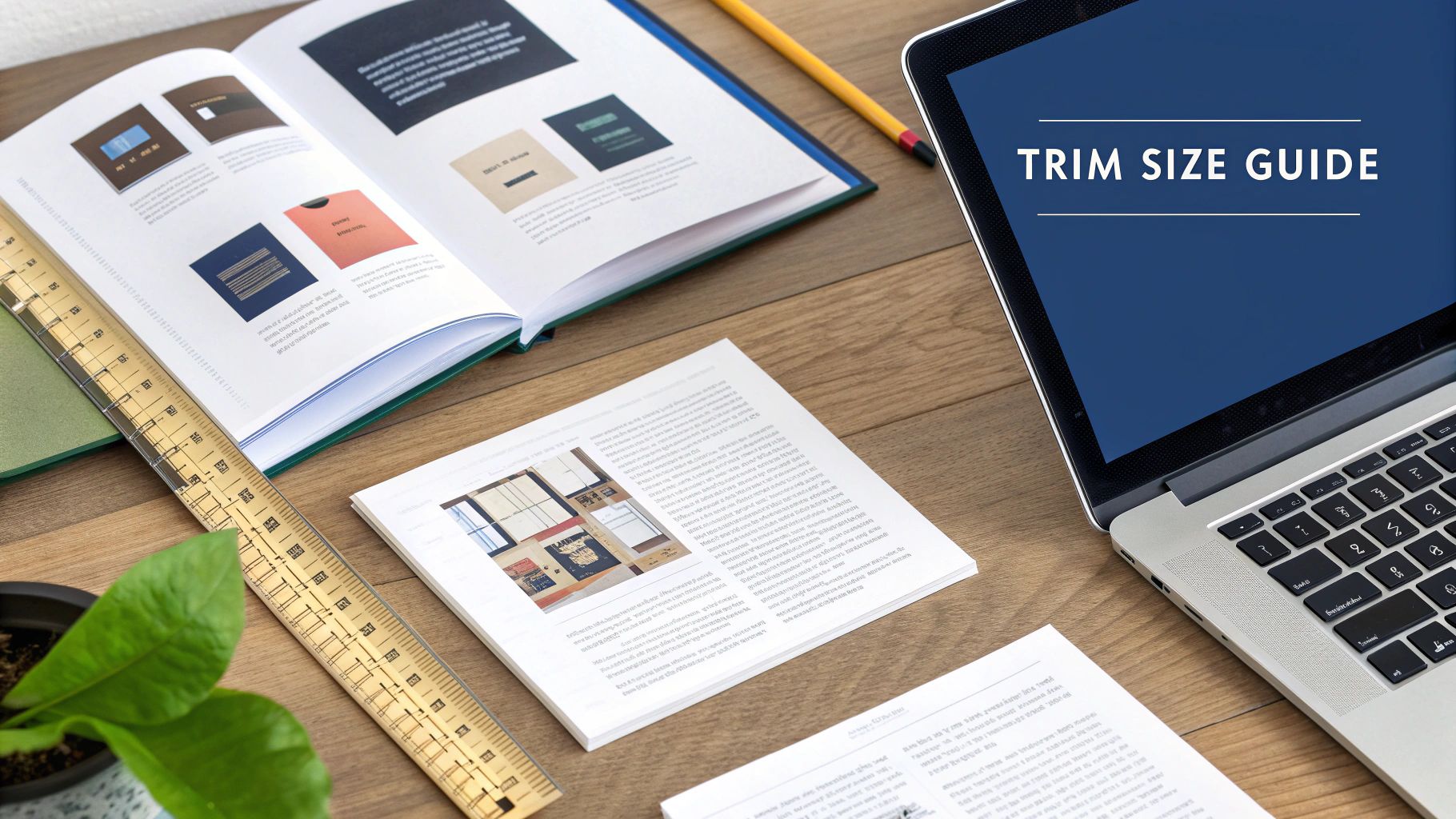
Nail Down Your Trim Size
Trim size is simply the final physical dimension of your printed book. This decision is heavily influenced by genre conventions because readers have a built-in, subconscious expectation for how a book should feel in their hands. A pocket-sized poetry collection feels intimate, while a big, glossy cookbook feels practical and authoritative.
Here are a few of the most common trim sizes I see and what they're typically used for:
- 5" x 8": A classic choice for mass-market paperbacks, memoirs, and fiction. It's easy to carry and generally cost-effective to print.
- 5.5" x 8.5": Often called "digest" size, this is a go-to standard for trade paperbacks. It gives you a little more breathing room on the page than its smaller cousin.
- 6" x 9": This is the industry workhorse. It's perfect for non-fiction, academic works, and many hardcover editions, lending a professional feel with plenty of space for your content.
Sticking to a standard size is a smart move. It ensures your book will fit nicely on bookstore shelves and plays well with print-on-demand (POD) services. If you venture into custom sizes, be prepared for your per-unit printing costs to jump significantly.
Setting Up Your Manuscript File Correctly
Once you've picked your trim size, the next move is to configure your manuscript file to match. Whether you're working in Microsoft Word, Scrivener, or Google Docs, this is a non-negotiable first step. Don't write the whole book on a standard 8.5" x 11" document thinking you can just resize it later—I promise you, it will completely wreck your formatting.
After setting the page size, you need to define your margins. Margins are the blank canvas around your text, the crucial white space that makes a page easy to read and stops words from getting sucked into the binding.
One of the most common rookie mistakes I see is setting identical margins on all four sides. For a print book, you absolutely need a wider inside margin, which we call the "gutter." This extra space accounts for the area that gets lost in the book’s spine. Without a proper gutter, your readers will have to practically break the spine just to read the text near the center.
For a typical 6" x 9" book, a good starting point is 0.75" for the top, bottom, and outside margins, with a slightly larger 0.9" inside margin for the gutter. If you want to dive deeper into this, learning about mastering visual hierarchy and layout techniques can be a huge help.
Finally, let's talk about bleed. If your book has any images or graphics that are meant to run right to the very edge of the page, you must add a bleed. This is usually an extra 0.125" of image area that extends beyond the trim line. When the printer cuts the pages, this little bit of overflow ensures you don't end up with ugly, accidental white slivers along the edge.
If you'd rather not start from scratch, grabbing a professionally designed template can be a massive time-saver. You can find some great options right here: https://barkerbooks.com/book-layout-templates/
Designing Your Book's Interior for a Seamless Reading Experience
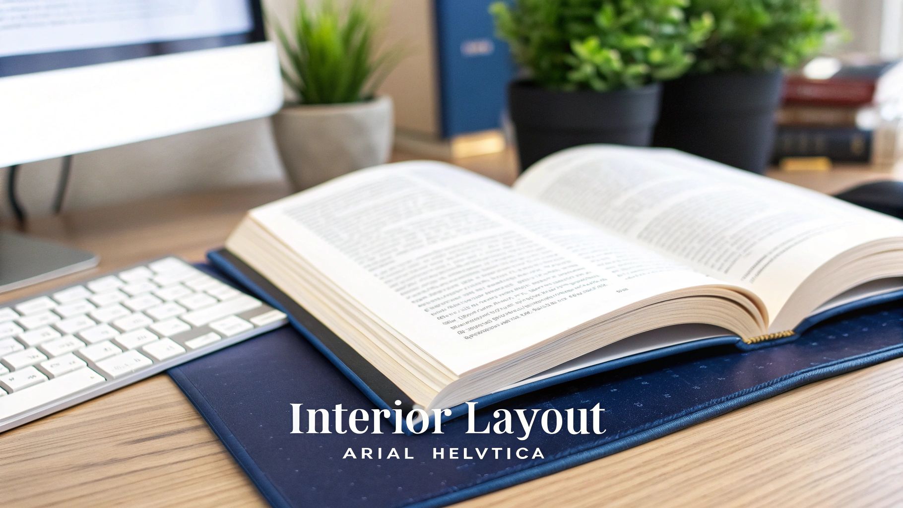
With the foundation of your book set, it’s time to move inside. The interior layout is where your manuscript truly becomes a book. The goal here isn't to be flashy; it's to create a design so intuitive that it becomes invisible, letting your story or message take center stage without any friction for the reader.
Think of a professionally designed page as a delicate dance between text and the negative space surrounding it. When done right, every element works together to guide the reader’s eye effortlessly across the page, making the act of reading a pure pleasure.
Poor internal formatting is more than just an aesthetic problem—it’s a wall between you and your audience. It can also be a major reason your book gets rejected by publishing platforms.
In a global books market projected to hit $142.72 billion by 2025, getting the details right matters more than ever. Platforms like Amazon Kindle Direct Publishing and Apple Books have standards, and formatting errors can lead to rejection rates as high as 30-50%. That's a lot of lost time and potential sales. To get a better sense of the industry, you can check out some fascinating book sales statistics.
Getting to Know the Anatomy of a Page
Before you can design a beautiful interior, you need to understand its core components. These elements are the building blocks that provide structure and a consistent, professional look from the first page to the last.
- Margins and Gutters: We've touched on these, but they deserve a second look. Margins are the blank borders on a page, while the gutter is the extra space added to the inside margin (the spine side) of a print book. This is absolutely critical to ensure your text doesn't get sucked into the binding and become unreadable.
- Headers and Footers: This is the real estate at the very top (header) and bottom (footer) of your pages. They usually contain repeating info like the book title, author name, chapter title, and, of course, the page numbers (often called folios).
- Trim Size: The final physical dimensions of your printed book, which you decided on earlier, define the canvas for everything else.
Why Typography Is Everything
If there's one element that can make or break your interior, it's typography. Your font choices do more than just display words; they set the entire tone of the book and have a massive impact on readability. The wrong font can feel as jarring to a reader as a glaring typo.
A classic and highly effective approach is pairing a serif font for your main body text with a sans-serif font for your headings.
- Body Text: Serif fonts—like Garamond, Caslon, or Baskerville—have tiny decorative strokes at the ends of the letters. These little "feet" actually help guide the eye along a line of text, which is a huge benefit for long-form reading. For most genres, a font size between 10 and 12 points is the sweet spot.
- Headings: Sans-serif fonts—like Helvetica, Franklin Gothic, or Myriad Pro—are clean and modern because they lack those decorative strokes. This creates a beautiful contrast, making your chapter titles and subheadings pop and establishing a clear visual hierarchy.
Beyond the font choice itself, you need to manage the leading (pronounced "ledding"), which is the vertical space between lines of text. If the leading is too tight, the page feels cramped and intimidating. Too loose, and the paragraphs look disconnected. A solid rule of thumb is to set your leading to about 120-145% of your font size.
The Final Polish: Perfecting Paragraphs
Once your typography is dialed in, the last step is to tidy up how your paragraphs flow on the page. This is where you become a formatting detective, hunting down the little quirks that can pull a reader right out of the world you’ve built.
The two biggest offenders are "widows" and "orphans." An orphan is a single word or short line of a paragraph left all alone at the bottom of a page. A widow is that same lonely line, but stranded at the top of the next page. Both create distracting gaps of white space and disrupt the reading rhythm.
Most professional layout programs (and even advanced settings in Word) have features to help you automatically prevent widows and orphans. You can also fix them manually by slightly adjusting the tracking—the space between characters in a word or sentence—to encourage a line to wrap differently. This meticulous attention to detail in the format for a book is what elevates your project from amateur to professional.
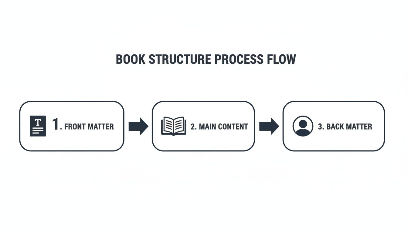
Getting Your Front and Back Matter Right
A professional book is so much more than just the chapters in the middle. The real sign of a polished, thoughtfully produced work lies in the details—specifically, the sections that come before and after your main content. This is your front matter and back matter, and getting it right is a huge signal of quality to your readers.
This isn't just about following old traditions. The global publishing industry, which is on track to become a $229.5 billion market by 2035, is built on these kinds of standards. Major players like Thomson Reuters and RELX Group didn't get to the top by accident; they use rigorous protocols to make sure a book looks and feels professional, no matter where it's sold. In fact, some studies show that books with a clean, correct interior layout can sell up to 22% more in their first year.
The Essential Front Matter Sequence
Your front matter is the formal handshake. It’s what introduces your book to the reader, sets the tone, and provides crucial information before the first chapter even begins. Some parts are optional, but many are absolutely non-negotiable for a professional product.
Here’s the standard, accepted order you should follow:
- Half Title Page: The very first page a reader sees. It contains only one thing: your book's title. Simple, clean, and elegant.
- Title Page: This one is more comprehensive. It features the full title, subtitle, your name as the author, and often the publisher's name or logo.
- Copyright Page: You'll find this on the back of the title page. This is the legal hub of your book, containing the copyright notice (© Year Author Name), your ISBN, and any publisher or edition details.
- Dedication (Optional): A short, personal note dedicating the book to someone important. It’s a wonderful way to add a human touch right from the start.
- Epigraph (Optional): A brief quote or passage that hints at your book's central theme.
- Table of Contents: Your book's roadmap. It lists all the chapter titles and the page numbers where they start, making it easy for readers to find their way around.
- Foreword (Optional): This is written by someone else—usually an expert in your field or a well-known figure. Their endorsement lends your work instant credibility.
- Preface (Optional): This part comes from you, the author. Here, you can explain why you wrote the book, share a bit about your research journey, or tell the story behind its creation.
How to Structure Your Back Matter
If the front matter is the formal welcome, the back matter is the professional goodbye. It's your last chance to connect with readers, give them extra value, and tell them what to do next. Don't just slap it on as an afterthought; a well-planned back matter can turn a one-time reader into a lifelong fan.
The back matter is where you transition from author to brand. It’s a powerful marketing tool hidden in plain sight, allowing you to build a direct relationship with the very people who just invested hours in your work.
Here’s what to include, starting with the most common elements:
- Acknowledgments: This is where you thank everyone who helped you bring the book to life. Think editors, family members, beta readers, and mentors.
- About the Author: This is a must. Your author bio should be short and punchy, highlighting your expertise, mentioning other books you've written, and including a call-to-action (like visiting your website or following you on social media).
- Appendix (Optional): Especially useful for non-fiction, an appendix can hold extra material like data tables, charts, a glossary, or lists for further reading that would have bogged down the main text.
- Index (Optional): For a dense non-fiction or academic book, a good index is invaluable. It’s an alphabetized list of key terms and the pages where they're mentioned, making your book a fantastic reference tool.
Nailing these sections is a fundamental part of understanding the different parts of a book, and it's a detail that instantly separates polished books from amateurish ones. When you assemble your front and back matter with care, you complete the professional format for a book and ensure it can stand proudly next to any traditionally published title.
You’ve done the hard work—the writing, the editing, the interior design. Now comes the final, technical hurdle: exporting the right files for your printers and distributors. This is where your manuscript officially becomes a product.
Getting this step wrong is a rookie mistake that can lead to costly printing errors, jumbled text on a Kindle, or flat-out rejection from platforms like KDP and IngramSpark. But don't worry. Once you get a handle on the two main file types—PDF/X and EPUB—you can nail this final stage and get your book into readers' hands.
The Gold Standard for Print: PDF/X
For any print-on-demand service or traditional offset printer, the file they want to see is a PDF/X. This isn't the same as the simple PDF you might save from Microsoft Word. A PDF/X is a specific, press-ready format built to sidestep common printing disasters by locking in every element of your book exactly as you intended.
The "X" stands for "exchange," which means the file is a self-contained package with everything the printer needs. Here’s what makes it so reliable:
- Embedded Fonts: All your carefully chosen fonts are baked right into the file. This is crucial because it stops the printer’s system from swapping in a default font if they don't have yours, which would completely destroy your typography.
- Locked-In Images: Your cover art and interior photos are embedded at the correct resolution (always aim for 300 DPI for print). This guarantees they come out crisp and clear, not pixelated.
- Managed Colors: The file includes specific color information (like CMYK profiles) to make sure the colors on the printed page match what you saw on your screen as closely as possible.
When you're exporting from software like Adobe InDesign, you'll likely see an option like "PDF/X-1a:2001." This is a universally accepted standard and your safest bet for almost any printer.
The Flexible Choice for Ebooks: EPUB
Ebooks are an entirely different world. A print book is static, but an ebook needs to be fluid. The format that makes this possible is the EPUB (short for "electronic publication"), and its superpower is that it's reflowable.
Reflowable text automatically adjusts to fit any screen, from a small phone to a large tablet. It also lets readers customize their experience by changing the font, text size, and spacing. This flexibility is what makes a great digital reading experience.
The single biggest mistake new authors make is uploading their print PDF as an ebook. This forces readers to pinch and zoom to read the text, which is an immediate deal-breaker and a fast track to one-star reviews.
You'll encounter two main types of EPUBs:
- Reflowable EPUB: This is the standard for over 95% of ebooks, especially novels, memoirs, and other text-heavy books. It puts readability and reader customization first.
- Fixed-Layout EPUB: This is for image-centric books like children's picture books, cookbooks, or graphic novels where the exact placement of images and text is non-negotiable. It behaves more like a digital PDF, but you should only use it when a reflowable format just won't work.
No matter the final format, the core structure of your book remains the same—from the front matter that introduces your work to the back matter that wraps it up.
Ensuring these sections are properly ordered and formatted within your final PDF/X or EPUB file is what gives your book that polished, professional feel.
Navigating Platform-Specific Needs
While PDF/X and EPUB are the industry workhorses, different platforms have their own preferences. Amazon's KDP, for example, will accept a clean Word doc and convert it to its own Kindle format (AZW3 or KFX). However, for maximum control and the best-looking result, I always recommend uploading a validated EPUB file. If you're working from Word, you can learn more about how to convert your manuscript from Word to EPUB.
Proper formatting is more than just aesthetics; it's a key part of succeeding in a book market projected to hit $202.24 billion by 2032. Indie authors, who make up a huge chunk of Amazon's bestsellers, often see sales jump by around 28% with a professional layout. On the flip side, simple formatting errors are one of the top reasons for returns on platforms like Google Books and Barnes & Noble.
Print vs. Ebook Final File Requirements
At a glance, here’s a breakdown of what each format needs to ensure your book looks great, whether it's in print or on a screen.
| Requirement | Print (PDF/X) | Ebook (EPUB) |
|---|---|---|
| File Type | PDF/X (specifically PDF/X-1a or PDF/X-4) | EPUB (validated, reflowable for most books) |
| Color Mode | CMYK (for color interiors and covers) | RGB (for all images and cover art) |
| Image Resolution | 300 DPI (dots per inch) minimum | 72-150 PPI (pixels per inch) is standard |
| Fonts | Must be fully embedded in the file | Must be embedded and licensed for digital use |
| Layout | Fixed; pages do not change | Reflowable; text adjusts to screen size |
| Cover | Separate file (PDF) including spine and back | Embedded as the first page inside the EPUB file |
| Hyperlinks | Generally not active (unless a digital PDF) | Active and clickable for TOC and external links |
| Metadata | Added at the platform upload stage | Embedded directly within the EPUB file |
By generating a clean PDF/X for print and a validated EPUB for digital, you’re setting your book up to meet professional standards and provide a great reader experience on every platform.
You’re so close. The manuscript is done, the files are exported, and that “publish” button is practically calling your name. Before you click it, take a deep breath and do one last, careful check. This final review is your last defense against a silly, avoidable mistake that could tank your reader reviews and force you into costly, frustrating revisions later.
Think of it like a pilot’s preflight check. You’re not just looking for typos anymore; you're making sure the entire package is structurally sound and ready to give your readers a seamless experience. It's amazing how a single overlooked formatting glitch can derail an otherwise fantastic book.
Your Print PDF Inspection
Your print-ready PDF/X file is set in stone. What you see on your screen is exactly what the printer will create, so this last look is non-negotiable. Open that PDF and go through it page by page with a critical eye.
Here’s what I always look for:
- Margin and Gutter Sanity Check: Just scroll through the whole book quickly. Do the outside margins look uniform? Is that all-important inside gutter margin consistently wider, alternating correctly for left and right-hand pages? It's an easy thing to spot when you're just flipping through.
- Image Resolution: This one is huge. Zoom in on every single image and graphic to at least 200%. Are they crisp and clean? Or are they starting to look a little blocky and pixelated? If it looks even slightly fuzzy on your high-res screen, I guarantee it will look ten times worse when printed on paper.
- Font Embedding: Dive into your PDF's properties menu (usually under "File" > "Properties" > "Fonts"). Every single font you used needs to be listed as "Embedded" or "Embedded Subset." If it’s not, the printer’s system might swap in a default font, completely wrecking your carefully chosen typography.
- Page Numbering: Make sure your page numbers actually start where they're supposed to (usually after the front matter). Then, spot-check your Table of Contents—do the page numbers listed there perfectly match the actual pages where your chapters begin? A mismatch here is a classic giveaway of an amateur format for a book.
The eBook EPUB Test Drive
An EPUB file is a totally different beast. It's fluid and reflowable, so you can't just glance at it on your computer. You have to put it through its paces on different devices to see how it behaves in the real world.
An EPUB isn't a fixed layout; it’s more like a flexible website in a box. Each e-reader renders that box a little differently, so testing on multiple devices is the only way to know if you're giving every reader a good experience.
I highly recommend loading your EPUB onto a few different reader apps. Get the free Kindle Previewer from Amazon, Adobe Digital Editions, and Apple Books on your computer and phone. Then, actively try to break it.
Here’s your testing checklist:
- Hyperlink Functionality: Click every single link. Does your TOC jump to the right spot? Do the links to your website or social media actually work? A dead link is a dead end for your reader.
- Image Scaling: Play with the font size, cranking it up and down. Your images should resize gracefully with the text, never blowing up so large they break the page or become distorted.
- Styling Consistency: As you read through, keep an eye out for weird inconsistencies. Did a paragraph suddenly change fonts? Is there a random bolded word that doesn't belong? These little things can pull a reader right out of the story.
This final, meticulous review doesn’t have to take all day, but it’s one of the most critical steps in the whole process. It’s what ensures all your hard work is presented professionally, showing respect for your story and for the readers who’ve decided to spend their time and money on it.
Your Top Book Formatting Questions, Answered
Even after you've got the basics down, a few tricky questions always seem to pop up during the formatting process. Getting these right can be the difference between a polished book and a frustrating, costly do-over. Let's tackle the questions I hear most often from authors.
What’s the Best Software to Format My Book?
Honestly, the "best" software really depends on your budget, your tech-savviness, and how complex your book's design is.
For many authors, a tool you already own—Microsoft Word—is surprisingly capable. If you take the time to really master its "Styles" feature for your headings and paragraphs, you can produce a very clean manuscript that's ready for conversion.
But if you're looking for absolute, pixel-perfect control and the kind of results the big publishing houses demand, Adobe InDesign is the undisputed industry standard. It’s what professional book designers use, period. For a fantastic middle ground that brilliantly combines writing and formatting, look no further than Scrivener. It’s a huge favorite among authors for its organizational power and flexible export options.
The right software for you is the one that lets you work efficiently and produce a clean, professional file. Don't feel like you have to learn InDesign if a well-structured Word document or a Scrivener project delivers the beautiful book your story deserves.
Do I Really Need a Different Format for My Paperback and Ebook?
Yes. A thousand times, yes. This is non-negotiable and one of the most critical things to understand about modern publishing.
A paperback is a fixed-layout format, usually a PDF/X file. Think of it as a snapshot. Every word, every image, every margin is locked into a permanent position. As the designer, you have total control over what the reader sees on each physical page.
An ebook, on the other hand, is almost always a "reflowable" EPUB file. It's a dynamic, fluid format designed to adapt to a dozen different screen sizes, from a tiny smartphone to a large e-reader. More importantly, it gives the reader control to change font sizes and styles. If you just upload your print PDF as an ebook, the result will be a chaotic, unreadable mess for your customers.
How Do I Pick the Right Font for My Book?
When it comes to fonts, one word rules them all: readability.
For the main body text in a print book, your best bet is almost always a classic serif font. Think Garamond, Caslon, or Baskerville. Those little "feet" on the letters aren't just for show; they actually guide the reader's eye along the line, which seriously reduces eye strain during a long read. Stick to a size between 10 and 12 points.
For chapter titles and subheadings, you can create a beautiful visual contrast with a clean sans-serif font like Franklin Gothic or Myriad Pro. This helps build a clear visual hierarchy for the reader.
Before you commit, print out a test page or two. There's just no substitute for seeing how a font actually looks and feels on paper.
What Are the Most Common Formatting Mistakes to Avoid?
I see a lot of the same small-but-mighty errors that instantly scream "amateur." The absolute biggest mistake is using the spacebar or tab key to indent paragraphs. Please, don't do this. The only right way is to set a proper first-line indent in your paragraph styles.
A few other gremlins to watch out for include:
- Forgetting to embed all fonts in your final print PDF. If you don't, the printer's system might substitute a different font, and all your careful work goes out the window.
- Using low-resolution images (anything below 300 DPI). They might look fine on your monitor, but they'll turn into a blurry, pixelated disaster in the printed book.
- Skimping on the gutter (the inside margin). Without enough space, your text will get sucked into the book’s spine, forcing readers to crack the binding just to see the words.
At BarkerBooks, we obsess over these details so you don't have to. From professional interior layout to generating flawless print and ebook files, our team ensures your book meets the highest industry standards. Start your publishing journey with us today!