
Great book design and page layout is about so much more than just dropping words onto a page. Think of it as the invisible architecture of the reader's entire journey. It’s what transforms a simple manuscript into a professional, immersive book that’s a genuine pleasure to read.
The Unseen Architecture of a Perfect Page
Long before a reader even processes the first sentence, your page layout has already made a powerful first impression. It’s the foundation and framework of a house—if it's poorly built, the space feels awkward and confusing. But a well-designed structure feels intuitive, inviting, and completely natural to navigate. Your book's layout does the exact same thing for the reader's mind.
This isn't just about making things look pretty; it's a core part of communication. Every choice you make in spacing, typography, and structure quietly tells the reader how to approach the content. A page crammed with dense text might signal a heavy, academic read, while a more open, airy design feels modern and far more approachable.
Establishing a Seamless Reading Experience
At its heart, the goal of any good page layout is to remove all friction between the reader and the story. When you get it right, the design becomes invisible. The reader completely forgets they're looking at a carefully constructed page and instead gets lost in the author's world.
This seamless experience doesn’t happen by accident. It’s built on a few key pillars that all work in harmony:
- Reducing Eye Strain: The right margins, line spacing, and font size are critical for comfort. They give the eye essential "breathing room," making it easy to read for hours.
- Creating a Visual Rhythm: A consistent structure from one page to the next creates a predictable, comfortable pattern. Readers instinctively know where to find page numbers, chapter titles, and the main text without even thinking about it.
- Setting the Book's Tone: Your layout is your book's body language. It can communicate authority, playfulness, tension, or calm before a single word of the story is absorbed.
A successful book layout is an act of silent storytelling. It guides, clarifies, and supports the narrative without ever demanding attention for itself. The best design is the one a reader never notices.
The Foundation of Professionalism
Ultimately, a professional layout sends a clear signal of quality and respect for the reader. It shows you've invested in creating not just a story, but a complete, polished reading experience. This builds instant trust and credibility from the moment someone opens the cover.
Mastering these fundamentals is what elevates your work from a simple document into a beautifully crafted object. Understanding the principles of professional book design and layout is the first, most crucial step in making sure your story is presented with the care and attention it truly deserves. Every single element, from the width of a margin to the size of a heading, plays a vital role.
Breaking Down the Anatomy of a Page Layout
Every professionally designed page, whether in a novel or a textbook, is built on a few core principles. Think of them as the skeleton that gives your words shape, structure, and strength. Getting a handle on these key elements of book design page layout is your first step toward creating a book that’s not just readable, but a genuine pleasure to hold and get lost in.
These building blocks aren't just technical details you plug into a program. They're the invisible forces that guide the reader’s eye, create a sense of harmony, and make the whole page feel intentional and balanced. Let's pull back the curtain and look at the anatomy of a great page, piece by piece.
Margins: The All-Important Breathing Room
Have you ever tried to read something where the text is crammed right up to the edge of the paper? It’s chaotic and stressful on the eyes. That’s why margins—the empty space around your text—are so critical. They act as a frame for your content, giving it the breathing room it needs to stand out.
Good margins make a book physically easier to hold without your thumbs covering up the words. They also drastically reduce eye strain by providing a calm, uncluttered field of view. On any given two-page spread, you have four key margins to think about:
- Gutter Margin: This is the space on the inside of the page, right next to the book's spine. It needs to be wide enough so that text doesn't get sucked into the curve of the binding. This is a classic rookie mistake, and it makes for a frustrating read.
- Top Margin (Head): The blank space at the top, which is often where you'll find a running head with the book or chapter title.
- Outer Margin (Fore-edge): The space on the outside edge of the page. In traditional book design, this is often the widest margin, giving the reader plenty of room to hold the book comfortably.
- Bottom Margin (Foot): The space at the bottom of the page, which is the traditional home for the page number.
Good margins are like silence in music. They aren't just empty space; they're a deliberate choice that gives clarity and impact to everything else on the page. Your text needs this negative space to feel inviting.
Grids: The Invisible Scaffolding
If margins are the frame, then the grid is the invisible scaffolding holding everything together consistently from page to page. A layout grid is just a simple system of horizontal and vertical lines that tells you where to place text, images, and headings. Your reader will never actually see the grid, but they will absolutely feel its effect in the book's clean, organized, and professional structure.
This underlying framework is the secret sauce for a polished design. It makes sure your main block of text starts in the same spot on every single page, that chapter titles are perfectly aligned, and that images feel like they belong right where they are. Without a grid, a book quickly starts to feel sloppy and amateurish, with elements seeming to drift around from one page to the next.
This infographic shows a simplified hierarchy, which is a core concept that a good grid helps you enforce.
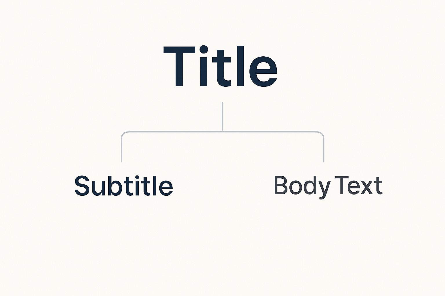
As you can see, the content is broken down into clear levels of importance. A grid is the tool that ensures this kind of visual order is maintained flawlessly throughout the entire book.
Typographic Hierarchy: Giving Your Book a Voice
Finally, we have typographic hierarchy. This is, for all intents and purposes, the "voice" of your book. It’s how you use different font sizes, weights (like bold or light), and styles (like italics) to tell the reader what's most important on the page. It’s a visual road map that says, "Look here first, then here, then here."
Just think about a newspaper. You instantly know which story is the main event because of its huge, bold headline. The subheadings are a bit smaller, and the article text is smaller still. That's typographic hierarchy in action, and it's every bit as important in a book.
A solid, effective hierarchy usually follows a clear structure:
- Chapter Titles (Level 1): The biggest and boldest text, signaling a major new section.
- Subheadings (Level 2): Smaller than chapter titles but noticeably distinct from the body text. They break up long passages and introduce new ideas.
- Body Text (Level 3): The workhorse of your book. It should be set in a comfortable, readable size and style meant for long stretches of reading.
- Captions or Footnotes (Level 4): The smallest text on the page, providing extra info without disrupting the flow of the main text.
By mastering these three elements—margins, grids, and hierarchy—you take control of the reading experience. You're no longer just putting words on a page; you're guiding your reader's journey with purpose, making your book design page layout not just functional, but truly elegant.
Applying Timeless Design Proportions
Once you've got the basics of grids and margins down, you can tap into a much deeper, older layer of design. The books that feel the most elegant and satisfying to hold aren't just well-organized; they have an inherent sense of balance and harmony. This isn't an accident. It often comes from applying mathematical proportions that have guided artists for centuries.
These aren't just stuffy, arbitrary rules. These ratios are found all over in nature, art, and architecture—things the human eye just finds instinctively pleasing. When you ground your layout in these proven systems, the page doesn't just look designed; it feels right.
The Power of Proportional Systems
At the heart of classical page design is a simple but powerful idea: every element on the page should relate to every other element in a mathematically consistent way. Think of it like a musical chord. The individual notes are fine on their own, but when you combine them in a specific mathematical relationship, you get a harmony that’s much more moving. Your page layout works the exact same way.
Historically, this harmony was achieved through what are known as the canons of page construction. These are essentially roadmaps for dividing a page to find the perfect size and position for your block of text. Developed back in the Renaissance, many of these methods aimed to create a natural reading rhythm and a calm, aesthetic balance.
The secret to a beautiful page isn't just about filling the space. It’s about dividing it with intention. Proportional design makes the relationship between your text and the white space around it feel deliberate and harmonious.
Many of these classical systems are tied to famous mathematical concepts. For instance, early printed books often had page proportions close to the golden ratio (roughly 1:1.618), a principle you can see everywhere from the Parthenon in Athens to the spirals of a seashell. You can see how these historical ideas evolved by exploring the canons of page construction, which still guide designers today.
Translating History into Practical Margins
So, how do these grand historical concepts actually help you lay out your book? The most direct and practical application is in setting your margins. Instead of just plugging in random numbers, classical design uses a proportional system to make sure all four margins work together perfectly. One of the most common and effective is the 2:3:4:6 ratio.
This classic formula creates an elegant, asymmetrical layout that's both beautiful and incredibly functional. Here’s a quick breakdown:
- Top Margin: 2 units
- Inner (Gutter) Margin: 3 units
- Outer Margin: 4 units
- Bottom Margin: 6 units
This structure gives you the smallest margin at the top and the largest at the bottom, with the outer margin being wider than the inner one. This isn’t just for show. The wider outer and bottom margins give the reader’s hands plenty of room to hold the book without covering up the text. The slightly smaller inner margin (the gutter) is just enough to keep the words from getting swallowed by the book's spine.
If you want to dig into the nitty-gritty of setting up your document, our guide on how to format a book for publishing is a great next step.
By using these time-tested principles, you're tying your own work into a long history of aesthetic craft. Your book design page layout becomes less of a technical chore and more of an art form, creating a book that feels balanced, professional, and a true pleasure to read.
Putting Page Layout Theory Into Practice
Okay, the theory is great, but let's be honest—confidence comes from seeing real numbers on the screen. This is the moment we go from the why of beautiful, classical proportions to the how of building a practical, professional page layout for your book. It’s time to roll up our sleeves and do some simple math that will completely transform your manuscript.
Think of it like this: the timeless ratios we've discussed are the architect's blueprint. Now, we need to grab our measuring tape and apply those plans to the actual page size we're working with. This is how we build a solid, inviting structure for your words.
A Simple Framework Using the Rule of Thirds
One of the easiest ways to get started is with the rule of thirds, a classic principle you’ve probably seen used in photography and art. When you look at historically well-designed books, you’ll find that the text block often takes up about two-thirds of the page’s height and width. You can find some great visual examples of these classical layout principles on speakipedia.com.
This approach leaves the remaining one-third for the margins, which we then divide up to create that elegant, asymmetrical look. It’s a beautifully simple way to ensure your text feels anchored and balanced while giving it plenty of room to breathe.
The goal isn't just to fill a page with text; it's to frame it intentionally. By dedicating a significant portion of the page to white space, you are actively making the text itself more inviting and easier to read.
This idea of structured design isn't limited to books, either. The same principles of clarity and consistency are crucial in corporate settings. For a great overview of how layout improves usability, check out these business documentation templates which show how strong design can make any document more professional.
Calculating Margins for a Standard Novel
Let's make this concrete. We'll use a super common book size as our example: the 6×9 inch trade paperback. It's a go-to for fiction and non-fiction, so it's the perfect size to work with. We'll apply that classic 2:3:4:6 margin ratio we talked about before.
First things first, we need a base "unit" for our ratio. For a 6×9 book, a good, clean starting point is 0.25 inches. Now, it's just a matter of simple multiplication.
- Top Margin (2 units): 2 x 0.25" = 0.5 inches
- Inner/Gutter Margin (3 units): 3 x 0.25" = 0.75 inches
- Outer Margin (4 units): 4 x 0.25" = 1.0 inch
- Bottom Margin (6 units): 6 x 0.25" = 1.5 inches
And just like that, you've created a sophisticated, asymmetrical layout that has its roots in centuries of proven design. Your page now has a visual rhythm that guides the eye and feels comfortable in a reader's hands.
Why Asymmetrical Layouts Work Better
I know what you might be thinking. An asymmetrical layout sounds… unbalanced, right? Why not just make all the margins equal and call it a day? The answer is a mix of aesthetics and pure, simple ergonomics. A book isn't just a flat page; it's a physical object someone has to hold.
Those wider outer and bottom margins are there for a reason—they give the reader’s thumbs a place to rest without covering up the text. It’s a small, functional detail that makes for a much more comfortable reading experience.
And that gutter margin is absolutely critical. It has to be wide enough to keep the text from disappearing into the book’s spine when it's opened. A skinny gutter is a dead giveaway of an amateur layout. Our calculated 0.75-inch gutter ensures every word is readable, from edge to edge. This is the kind of thoughtful approach that elevates your book design page layout from a simple document to a truly professional product.
How Technology Is Shaping Modern Layouts
While the core principles of good page layout are timeless, the tools we use to bring them to life are anything but. Technology hasn't thrown out the rulebook; it’s just given us a much more powerful and flexible way to apply those rules. This digital shift has handed authors and designers a level of precision that was once the stuff of dreams.
Think of powerful software like Adobe InDesign or Affinity Publisher as the modern-day workshop for book design. These programs give you incredible control over every single element. You can dial in exact margin ratios, build intricate grids that keep everything aligned across an entire book, and experiment with creative ideas that blend classic design with a modern feel.
Adapting To The Digital Reader
Of course, the biggest game-changer has been the rise of the ebook. Designing for a static, printed page is one challenge, but creating a layout for a screen that can shrink to a phone or expand to a large tablet is another thing entirely. This is where the idea of reflowable text becomes absolutely essential.
An ebook isn't like a PDF where everything is locked in place. Its layout has to be fluid, allowing the text to reshape itself to fit different screens, orientations, and even the reader's personal font size preference. This demands a whole new mindset, one that prioritizes:
- Fluid Grids: Building a structure that can bend without breaking.
- Relative Sizing: Thinking in percentages or relative units (ems) instead of fixed points and inches.
- Logical Hierarchy: Making sure headings and subheadings always look like headings and subheadings, no matter how the text flows.
The goal is always the same: make reading effortless and immersive. The new challenge is hitting that target on a canvas that is constantly changing shape.
This dynamic format also opens the door to new ways of engaging with readers. For instance, designers are now integrating digital elements like QR codes that can connect a physical page to online content, adding an interactive layer to the reading experience. This kind of thinking is a key part of the modern https://barkerbooks.com/steps-to-publishing-a-book/ today.
The Rise Of Intelligent Automation
New tech is also beginning to handle some of the more tedious parts of layout design. AI and machine learning are now being used to analyze text and automate typesetting, which is a massive help, especially for complicated digital books.
And this isn't just a concept—it's getting remarkably good. For example, recent developments have produced algorithms that can identify text regions on a page with 94.8% accuracy. That level of precision makes automatic layout analysis a real-world tool, speeding up the formatting process and making it more reliable.
In the end, it doesn't matter if you're designing for a printed book or a flickering screen. The foundations of clarity, balance, and readability are what matter. Technology is simply a brilliant new tool that helps us apply those principles more creatively and efficiently than ever before.
Your Checklist for a Perfect Page Layout
Alright, let's get down to brass tacks. Moving from design theory to a beautifully finished book is all about having a solid process. Think of this as your repeatable workflow—a way to translate all those core concepts of book design page layout into a tangible, professional product.
This isn't just about ticking off boxes. It’s a strategic sequence. By locking in the big-picture decisions first, you create a framework that makes all the smaller details fall right into place. Get this right, and you'll end up with a book that feels cohesive and intentional from cover to cover.
Foundational Decisions First
Before a single word of your manuscript hits the page, you need to define the canvas. These first few choices are the bedrock of your entire design; everything else—from your margins to your font choice—will build upon them. If you rush this part, you're just signing yourself up for headaches and major revisions down the road.
-
Choose Your Trim Size: This is simply the final, printed size of your book. A standard novel might be 6×9 inches, while a textbook is often a larger 8.5×11. Your decision here will be guided by genre norms, reader expectations, and, of course, printing costs.
-
Define Your Margins: Now it's time to set up that all-important white space framing your text. A classic trick is to use a proportional system, like the 2:3:4:6 ratio (inside, top, outside, bottom), which creates a naturally balanced page that’s also comfortable to hold. Pay special attention to the gutter margin—make it generous enough that no text gets swallowed up by the spine's curve.
-
Establish Your Grid: The grid is the invisible skeleton that holds your layout together and ensures consistency from page to page. For most novels, a straightforward one-column grid is all you need. But for something more complex, like a cookbook or a photo-heavy guide, you'll want to build a more sophisticated grid to manage all those different elements.
To help you get a feel for how these foundational elements change from one book to the next, here's a quick look at some common genre conventions.
Page Layout Considerations by Book Genre
This table offers a starting point for thinking about how genre influences layout decisions. Remember, these are common practices, not rigid rules!
| Genre | Typical Margins | Grid Complexity | Typographic Style |
|---|---|---|---|
| Literary Fiction | Generous, often with a wider bottom margin for a classic feel. | Simple single-column grid. | Elegant, serif fonts (e.g., Garamond, Caslon) for readability over long stretches. |
| Thrillers/Sci-Fi | Standard, functional margins that maximize text per page. | Usually single-column, focused on narrative flow. | Clean, modern serifs or sans-serifs (e.g., Minion Pro, Helvetica Neue). |
| Cookbooks | Variable, often wider to accommodate sidebars and notes. | Complex multi-column grids to integrate images, ingredient lists, and instructions. | Highly hierarchical, with distinct styles for titles, ingredients, and steps. Often uses decorative fonts. |
| Textbooks/Academic | Ample margins for notes and pull quotes. | Two or three-column grids are common to handle figures, tables, and sidebars. | Clear, functional serifs (e.g., Times New Roman) or sans-serifs (e.g., Arial), with a rigid hierarchy. |
| Children's Books | Very wide to frame illustrations and keep text blocks small. | Flexible, often no formal grid; layout is driven by illustrations. | Playful, large, and extremely legible fonts. |
Seeing these side-by-side really highlights how the container is shaped by the content. A thriller needs to be lean and fast-paced, while a cookbook needs structure to be useful. Your layout choices are a huge part of delivering that genre-specific experience to the reader.
Building the Typographic System
With your page structure locked in, you can shift your focus to the text itself. The mission here is to create a clear visual hierarchy that acts as an invisible guide for the reader, leading them through the material without a hitch.
A well-structured typographic hierarchy is the voice of your book. It tells the reader what’s important, what’s secondary, and how different pieces of information relate to one another without saying a word.
- Select Your Fonts: First, pick a typeface for your body text that’s easy on the eyes and fits the book's tone. Then, pair it with a complementary font for headings that provides just the right amount of contrast and visual pop.
- Build the Hierarchy: Now, get specific. Define the exact font sizes, weights (like bold or light), and styles (like italic) for every single element on the page. This includes chapter titles, subheadings, body copy, captions, and even page numbers.
- Refine Paragraph Styles: The devil is truly in the details. Set your leading (the space between lines of text), decide on your indentation style, and choose your justification (left-aligned or justified). These small tweaks make a massive difference in how readable your book is over hundreds of pages.
Finally, don't forget the little navigational aids that make a book feel complete, like running heads (those little book or chapter titles at the top of the page) and folios (the page numbers). A thoughtful approach here ensures your reader has a smooth and enjoyable journey from the very first page to the very last.
A Few Common Questions
Getting into the weeds of page layout can feel a bit overwhelming. You're trying to make your book look professional, but a few specific questions always seem to pop up. Let's tackle some of the most common ones I hear from authors and designers.
How Much Should Text Bleed Into The Gutter?
This is a big one, and the answer is simple: never. Your text should absolutely not bleed into the gutter. Think of the gutter as a no-go zone right next to the book's spine. Its whole job is to keep your words from getting swallowed up when the book is bound.
One of the most frequent mistakes is making this inside margin too skinny. For a standard 6×9 inch book, a gutter margin of at least 0.75 inches is a solid, safe starting point. If you have a real doorstopper on your hands—say, over 300 pages—you’ll want to bump that up to 0.875 inches or even more. When in doubt, always go a little wider.
Is Justified Or Left-Aligned Text Better?
Ah, the great debate! The truth is, neither one is inherently "better." The choice between justified text and left-aligned text (often called "ragged right") really boils down to the feeling you want to create for the reader.
-
Justified Text: This is the classic look. It creates those clean, block-like paragraphs you see in most novels and traditional non-fiction. It feels formal and polished, but the trade-off can sometimes be awkward gaps or "rivers" of white space running through the text.
-
Left-Aligned Text: This approach keeps the spacing between words totally natural, which gives the page a more modern, relaxed, and open feel. It’s a great choice for poetry, some children's books, or any design that wants to feel a bit less formal.
The best choice really depends on your book’s personality. A historical novel almost demands justified text. A collection of contemporary poems? Left-aligned will probably feel more at home.
What Is The Ideal Font Size For Body Text?
If readers can't read it comfortably, nothing else matters. For printed books, the sweet spot for your main body text usually falls between 10 and 12 points. I often find that 11 points is a fantastic starting point for books aimed at adults.
But that's not the whole story. The font you choose makes a huge difference. For example, a 10-point Garamond can look much bigger and feel easier to read than a different 11-point font with a smaller design. The only way to know for sure is to print out a sample page. Hold it in your hands and see how it actually feels to read—don't just trust your screen.
Ready to turn that manuscript into a book that looks and feels incredible? At BarkerBooks, our team lives and breathes this stuff. We can take care of everything from the interior layout to getting your book out to readers around the world, making sure it has the professional polish it deserves. Start your publishing journey with us today.