
In a crowded digital marketplace, a book cover is more than just decoration; it's the single most crucial piece of marketing an author has. It's a billboard, a first impression, and a genre signal all wrapped into one thumbnail-sized image. A potential reader makes a snap judgment in seconds, deciding whether to click or scroll past based almost entirely on your cover's visual appeal.
Mastering the art and science of cover design isn't optional, it's essential for discoverability and sales. This guide moves beyond generic advice to provide seven actionable book cover design tips. We will explore specific strategies to help you create a cover that not only looks professional but actively sells your book.
From the psychology of color to the nuances of typography that ensure readability even at a small size, these insights will equip you to make informed decisions. You'll learn how to collaborate effectively with designers and produce a final product that captivates your ideal reader from the very first glance. This article breaks down the essential elements that turn a simple cover into a powerful marketing tool.
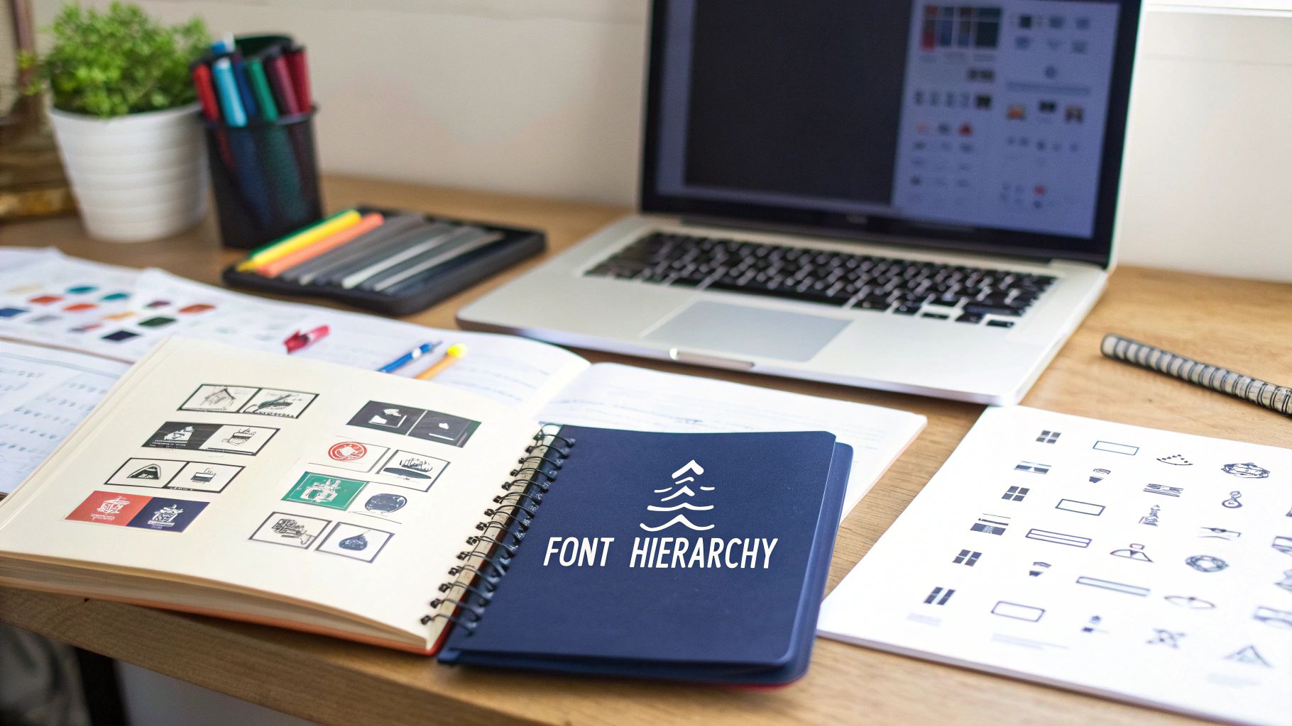
1. Typography Hierarchy and Readability
Typography is more than just text on a page; it’s the voice of your book cover. Establishing a clear typography hierarchy involves the strategic selection and arrangement of fonts to guide the reader’s eye and ensure immediate comprehension. This foundational element of book cover design is crucial for conveying genre, tone, and professionalism at a single glance.
The core principle is to assign different visual weights to the title, author name, and subtitle. The most important element, typically the title, should be the largest and most prominent. The author's name follows, with its size often dependent on their brand recognition. A clear hierarchy prevents visual clutter and helps potential readers quickly process the essential information.
Why It's a Top Tip
A well-executed typography strategy ensures your cover is not only beautiful but also functional, especially in a digital marketplace. Since most books are first discovered online as small thumbnails, legibility is paramount. If a potential reader can't decipher your title on an Amazon or Goodreads search page, they will scroll right past it. This makes typography one of the most critical book cover design tips for discoverability and sales.
How to Implement Typography Hierarchy
- Establish Dominance: Your title should be the most visually dominant element. It should be easily readable and set the tone. For example, Stephen King's horror novels often use bold, distressed fonts to evoke a sense of unease, while romance novels might use an elegant script to suggest passion.
- Support with Subtlety: The author name and any subtitles should support the title, not compete with it. Use a smaller font size or a less stylized typeface for these secondary elements.
- Genre-Specific Choices: The font itself is a powerful genre signifier. Clean, sans-serif fonts are common for business and non-fiction, while literary fiction may opt for minimalist, sophisticated serif typefaces.
Pro-Tip: Limit your font choices to a maximum of two or three per cover. Using too many typefaces creates a chaotic and unprofessional look. Ensure high contrast between the text and the background image to maximize readability.
Actionable Steps for Success
- Test at Thumbnail Size: Before finalizing your design, shrink it down to 100×160 pixels. Can you still clearly read the title and author's name? If not, adjust the size, weight, or font choice.
- Fine-Tune Spacing: Pay attention to kerning (the space between individual letters) and leading (the space between lines of text). Proper adjustments give your text a polished, professional look that builds reader trust.
- Prioritize High Contrast: Ensure your text stands out against the background. A dark font on a dark, busy background will become illegible. Use outlines, drop shadows, or place text in a clear area of the image to solve this.
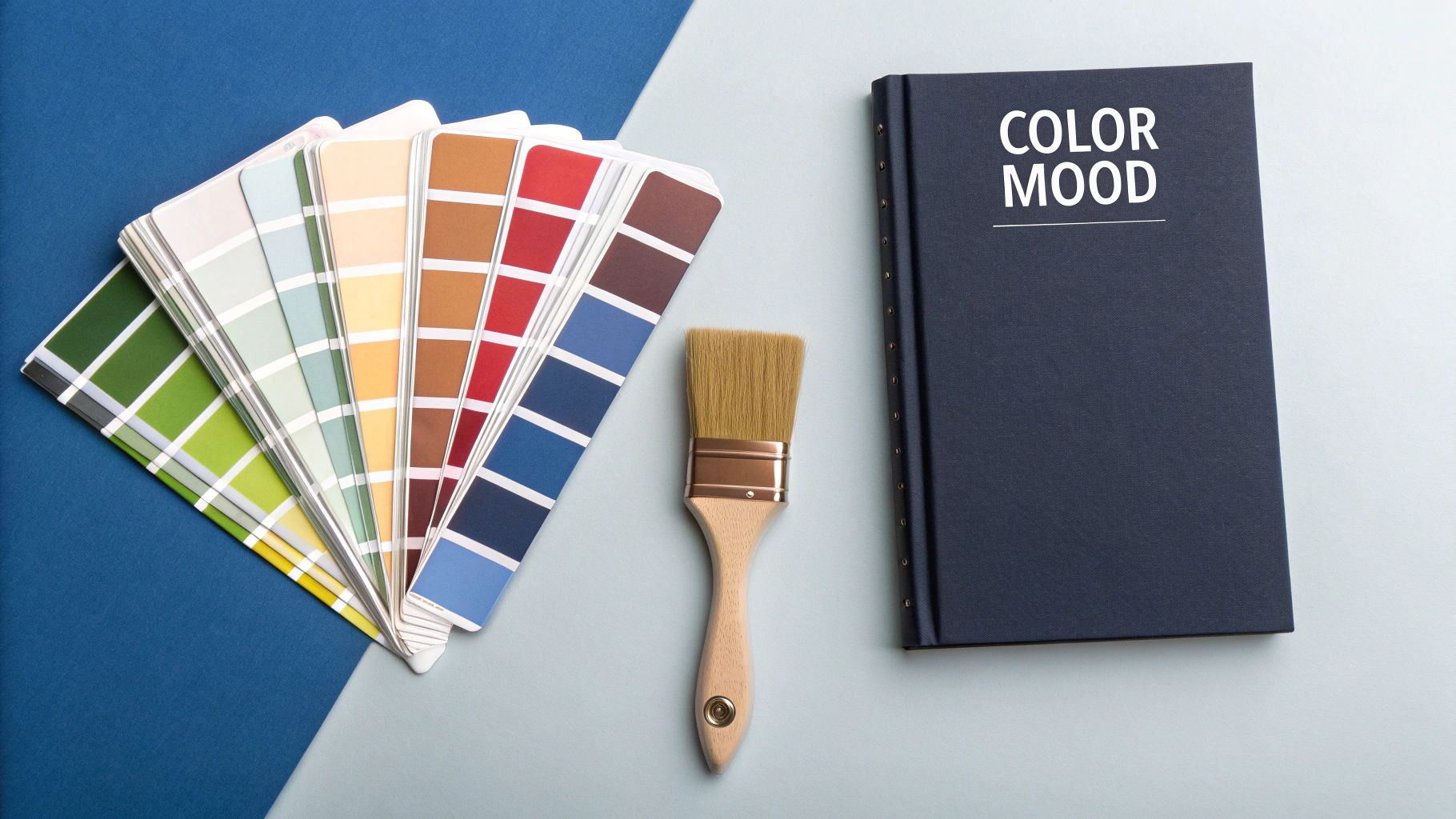
2. Color Psychology and Genre Conventions
Color is a silent narrator, instantly conveying emotion, mood, and genre to a potential reader. Strategic use of color psychology involves tapping into the cultural and emotional associations colors carry to signal a book's contents at a glance. Understanding these conventions is a cornerstone of effective book cover design tips, helping your book meet reader expectations while still carving out a unique identity on a crowded shelf.
From the iconic orange spines of early Penguin Books to modern bestsellers, color acts as a powerful genre signifier. Psychological thrillers often leverage dark blues, grays, and blacks to create suspense, while romance novels lean into passionate reds and warm purples. This visual shorthand helps readers quickly identify books within their preferred genres, making your cover a more effective marketing tool.
Why It's a Top Tip
Color choice directly influences a reader's subconscious decision to pick up a book or click on a thumbnail. A cover that aligns with genre color conventions feels familiar and trustworthy, signaling to the reader that the book will deliver the experience they are seeking. Ignoring these conventions can confuse potential buyers, causing them to overlook a book that might otherwise be a perfect fit for their tastes.
How to Implement Color Psychology
- Align with Genre Expectations: Research the top-selling books in your specific genre. Notice the dominant color palettes. Fantasy novels often use rich purples and golds to suggest magic and royalty, while self-help books might use optimistic blues and oranges to convey clarity and energy.
- Evoke a Specific Mood: Beyond genre, use color to set the tone. Muted, sophisticated palettes are common in literary fiction to suggest depth and introspection. Bright, high-contrast colors can signal action, humor, or a contemporary setting.
- Create Visual Contrast: To effectively utilize color in your book cover, a solid understanding of fundamental color theory is indispensable. Use complementary colors to make key elements like the title pop, ensuring it remains legible against the background image.
Pro-Tip: While adhering to conventions is important, don't be afraid to introduce a unique accent color to stand out. A splash of unexpected color can make a familiar design feel fresh and intriguing without alienating your target audience.
Actionable Steps for Success
- Create a Mood Board: Collect covers from your genre that you admire. Analyze their color schemes and identify recurring patterns. This will help you build a palette that is both appropriate and inspiring.
- Test in Digital and Print: Colors can appear differently on a screen versus in print. Preview your design in both formats (RGB for digital, CMYK for print) to ensure consistency and impact across all mediums.
- Consider Brand Consistency: If you are writing a series, maintaining a consistent color palette or theme is crucial for brand recognition. This helps readers instantly identify books as part of your collection, which is also a key principle in building an author brand. Learn more about how this connects to your broader platform with these author website design insights.
3. Visual Hierarchy and Focal Points
Visual hierarchy is the art of arranging design elements to guide a viewer's eye across your cover in a specific, intentional order. It’s about creating clear focal points using principles like contrast, scale, and positioning to ensure the most crucial information is noticed first. This strategic direction ensures a potential reader instantly understands what your book is about and who wrote it.

This design principle dictates that the title should typically be the primary focal point, followed by the author's name or a compelling image. The goal is to control the narrative of the first impression, making the cover easy to decode within seconds. A well-structured hierarchy prevents visual chaos and communicates professionalism, which is a vital part of effective book cover design tips.
Why It's a Top Tip
A strong visual hierarchy is what separates an amateur cover from a professional one. It makes your book scannable and digestible, especially in a crowded online marketplace. When a cover has a clear focal point, it grabs attention and communicates its core message efficiently. Without it, viewers are left confused, and their eyes wander without direction, often leading them to simply move on.
How to Implement Visual Hierarchy
- Create a Primary Focal Point: In most genres, the title should be the star. Use size, bold color, or a central position to make it the first thing the viewer sees. Dan Brown's thriller covers, for example, often use massive, centered titles that are impossible to ignore.
- Use Scale and Contrast: Make important elements larger or more vibrant than secondary ones. A large, brightly colored title against a muted background instantly establishes dominance. Minimalist literary covers often do this with a single, striking image or typographic element.
- Guide the Eye Path: Arrange elements logically. The viewer's eye will naturally follow a path from the most dominant element to the least. To create truly impactful book covers, mastering the principles of visual design is fundamental to effectively guide the reader's eye and establish these focal points.
Pro-Tip: Conduct a "five-second test." Show your cover to someone for just five seconds and ask them what they remember. If they can recall the title and have a sense of the genre, your hierarchy is working.
Actionable Steps for Success
- Define Your Elements: List your cover elements in order of importance: title, author, image, subtitle, tagline, etc. Your design should reflect this priority list.
- Leverage the Rule of Thirds: Place your primary focal point along the intersecting lines of a 3×3 grid. This creates a more dynamic and visually engaging composition than simple centering.
- Balance with Negative Space: Use empty space (negative space) to give your focal points room to breathe. This prevents visual clutter and strengthens the impact of your key elements.
4. Genre-Appropriate Imagery and Symbolism
Imagery is the visual heart of your book cover, communicating story, theme, and emotion before a single word is read. This tip involves the strategic selection of images and symbols that align with genre expectations while hinting at the book's unique narrative. It's about understanding the visual language of your genre and finding creative ways to represent core concepts, from abstract themes to specific plot elements, through compelling visuals.

The goal is to choose an image that instantly signals the genre to a potential reader. A misty lighthouse might suggest hope and guidance in a literary novel, while shattered glass is a clear indicator of a psychological thriller. This visual shorthand is essential for attracting the right audience and setting the correct expectations from the very first impression.
Why It's a Top Tip
Effective imagery hooks the reader emotionally and intellectually. It creates intrigue and asks a question that can only be answered by reading the book. Suzanne Collins’ The Hunger Games became iconic through its mockingjay pin, a symbol of rebellion that evolved with the series. This approach transforms a cover from a simple advertisement into a piece of the story itself, making it one of the most powerful book cover design tips for creating a memorable brand.
How to Implement Genre-Appropriate Imagery
- Embrace Symbolism: Instead of a literal scene, use a single, powerful symbol. A key can represent mystery and secrets, broken chains can signify liberation, and a lone bird might stand for freedom or transformation. This method adds depth and provokes curiosity.
- Study Genre Conventions: Research the top-selling books in your category. Notice the common visual threads. Thrillers often use dark, high-contrast images, while fantasy covers might feature epic landscapes or magical artifacts. Use these conventions as a starting point.
- Balance the Unique and the Familiar: Your cover should feel at home in its genre but also stand out. The imagery should be familiar enough to attract fans of the genre but unique enough to distinguish your book from the competition.
Pro-Tip: Consider abstract or metaphorical imagery over a literal depiction of a scene from your book. A symbolic cover avoids spoilers and often has a more timeless and professional appeal, inviting readers to interpret its meaning.
Actionable Steps for Success
- Brainstorm Symbolic Concepts: List the core themes of your book (e.g., betrayal, redemption, loss). Next to each theme, brainstorm at least five symbols or images that could represent it visually.
- Research and Gather Mood Boards: Collect covers from your genre that you admire. Analyze why their imagery works. Create a mood board to help you and your designer establish a consistent visual direction.
- Test Your Imagery: Once you have a few concepts, share them with beta readers or your target audience. Ask them what genre they think the book belongs to and what it might be about. This feedback is invaluable for ensuring your cover communicates the right message.
5. Simplicity and Scalability
In the world of book cover design, less is often more. The principle of simplicity and scalability focuses on creating clean, uncluttered designs that remain impactful and readable across all formats, from a large bookstore display to a tiny digital thumbnail. This approach leverages negative space and a single strong focal point to cut through visual noise and communicate a book's essence instantly.
This design philosophy, influenced by masters like Dieter Rams, is about removing non-essential elements until only the core message remains. For a book cover, this means prioritizing one powerful image or a bold typographic treatment to create an unforgettable impression. Covers for books like Malcolm Gladwell's series or many modern poetry collections use this to their advantage, appearing confident and intellectually sharp.
Why It's a Top Tip
Simplicity and scalability are critical in the digital-first era of publishing. Your book cover will most often be judged as a small image on a screen, competing with dozens of others. A complex, busy design becomes an unreadable blur at this size. A simple, bold design, however, remains clear and intriguing, inviting the reader to click and learn more. This makes it one of the most effective book cover design tips for online discoverability and sales.
How to Implement Simplicity and Scalability
- Establish a Focal Point: Decide on the single most important element of your cover. Is it an iconic object, a striking piece of typography, or a powerful silhouette? Build the entire design around this one element. For example, Scandinavian crime novels often feature a single, stark image against a bleak landscape to evoke a minimalist, chilling mood.
- Embrace Negative Space: Don't be afraid of empty space. Negative space (the area around your main subject) is a powerful tool. It helps to frame the focal point, reduce clutter, and give the design a sophisticated, modern feel.
- Choose a Limited Color Palette: Restrict your colors to two or three complementary or contrasting shades. This enhances visual cohesion and ensures your primary elements stand out without creating a chaotic mess.
Pro-Tip: Conduct the "three-second rule" test. Can a potential reader understand your book's genre, title, and general feeling in just three seconds? A simple design passes this test with ease, while a cluttered one fails.
Actionable Steps for Success
- Test at Thumbnail Size: The most crucial step. Before finalizing, shrink your design to 100×160 pixels, the standard thumbnail size on many retail sites. If the title is illegible or the main image is confusing, it needs simplification.
- Strip It Down: Look at your design and ask, "What can I remove?" Take away elements one by one. Remove extra lines of text, secondary images, or complex background textures. Stop when removing anything else compromises the core message.
- Prioritize High-Impact Typography: If your design is text-focused, make the typography itself the art. Use a bold, unique font that captures the book's tone and let it dominate the cover, as often seen in business and tech books influenced by Apple's minimalist aesthetic.
6. Target Audience Alignment
Target audience alignment is the art and science of designing a cover that speaks directly to your ideal reader. It goes beyond aesthetics to consider the demographic preferences, cultural touchstones, and visual language that resonate with a specific group. A cover designed with this in mind acts as a powerful signal, telling the right readers, "This book is for you."
The core principle is to match every visual element, from character depiction to color palette, with the expectations and desires of your intended readership. This strategic approach ensures your cover feels not just attractive but personally relevant, creating an immediate connection that prompts a closer look.
Why It's a Top Tip
In a crowded market, a cover that aligns with its target audience has a significant competitive advantage. It filters out uninterested browsers and magnetically attracts potential fans. This is one of the most crucial book cover design tips because it directly impacts your book's marketability and sales potential. A well-aligned cover tells a story before the first page is even opened, promising an experience the reader is already seeking.
How to Implement Target Audience Alignment
- Genre-Specific Visuals: Different audiences have distinct visual expectations. A business book targeting C-suite executives should use a clean, corporate aesthetic, while a cozy mystery for older women might feature charming, illustrated village scenes. Young Adult fantasy often uses dynamic, character-focused digital art.
- Reflect Reader Identity: The models or characters on the cover should reflect the reader or the characters they want to read about. Romance sub-genres, for instance, use age-appropriate models, and YA publishers prioritize diverse representation to connect with their readership.
- Study Bestseller Cues: Analyze the top-selling books in your specific niche. Notice the recurring colors, font styles, and imagery. These are not coincidences; they are proven visual cues that appeal to your target demographic.
Pro-Tip: Create a detailed reader persona. Give your ideal reader a name, age, occupation, and list of interests. When evaluating cover designs, ask yourself: "Would this person pick up this book?" This simple exercise can bring immense clarity to your design decisions.
Actionable Steps for Success
- Analyze Your Niche: Spend time on Amazon and Goodreads browsing the bestsellers in your most specific sub-category. Take notes on common design elements and think about why they appeal to that audience.
- Survey Your Readers: If you have an existing email list or social media following, ask them directly. Run polls asking which of several cover concepts they prefer and why.
- Consider Retail Environment: Think about where your audience shops. A cover designed for a digital-first audience, like those learning how to publish an ebook on barkerbooks.com, must be impactful as a tiny thumbnail. A cover for a physical bookstore has more room for subtle texture and detail.
7. Competitive Analysis and Market Positioning
Designing a book cover in a vacuum is a recipe for failure. Competitive analysis is the systematic study of successful covers in your genre to understand market trends, identify opportunities for differentiation, and strategically position your book. It involves analyzing what works, what's oversaturated, and finding the sweet spot between meeting reader expectations and standing out from the crowd.
This process isn't about copying other designs; it's about understanding the visual language of your genre. By knowing the rules, you can decide when to follow them to attract your target audience and when to break them to create a memorable and unique cover. This is a foundational step in any professional design or marketing process.
Why It's a Top Tip
A book cover is a marketing tool first and a piece of art second. Competitive analysis ensures your cover communicates the correct genre signals to the right readers. If your thriller cover looks like a romance novel, you will attract the wrong audience and alienate your ideal readers. This research is one of the most effective book cover design tips for avoiding costly mistakes and ensuring your book is positioned for success in a crowded market.
How to Implement Competitive Analysis
- Analyze Bestsellers: Regularly study the top 20-50 bestsellers on Amazon in your specific subcategory. Look for common color palettes, font styles, imagery, and layout compositions. For instance, notice how many psychological thrillers have moved from dark, moody visuals to bright, unsettling imagery with bold typography.
- Identify Patterns and Outliers: Create a mood board of successful covers. Note the recurring visual themes that define the genre. Equally important, identify the outliers that succeed. These often signal emerging trends or an opportunity to do something different that still resonates with the core audience.
- Balance Familiarity and Freshness: Your cover needs to feel familiar enough for a reader to instantly recognize its genre, but fresh enough to pique their interest. For example, fantasy covers might use classic symbols like dragons or swords but render them in a modern, minimalist art style to appeal to a contemporary readership.
Pro-Tip: Don't just look at what's popular now; look at what was popular a year ago. This helps you identify trends that are fading and avoid creating a cover that will feel dated by the time your book launches.
Actionable Steps for Success
- Create a Genre "Swipe File": Use Pinterest or a simple folder on your computer to save at least 50 covers from your genre. Categorize them by common elements (e.g., "Big Text," "Figure from Behind," "Symbolic Object"). This file becomes your reference guide.
- Define Your Unique Position: After analyzing the market, articulate what makes your book different. Your cover should visually represent that unique selling proposition. If your self-help book is more science-backed than inspirational, its design should be cleaner and more data-driven than the competition.
- Perform a "Lineup Test": Place a draft of your cover design alongside the top 10 bestsellers in your category. Does it fit in, yet also stand out? If it blends in too much or looks completely out of place, it needs refinement. This is a critical step in the self-publishing journey; learn more about the entire process with this self-publishing checklist on barkerbooks.com.
7 Key Book Cover Design Tips Comparison
| Aspect | Typography Hierarchy and Readability | Color Psychology and Genre Conventions | Visual Hierarchy and Focal Points | Genre-Appropriate Imagery and Symbolism | Simplicity and Scalability | Target Audience Alignment | Competitive Analysis and Market Positioning |
|---|---|---|---|---|---|---|---|
| Implementation Complexity 🔄 | Moderate – requires typography knowledge, time consuming | Moderate – research and cultural sensitivity needed | Moderate to high – needs design principles understanding | High – symbolic and cultural knowledge required | Moderate – simplicity can be deceptively challenging | High – extensive market research and audience insights | High – time intensive research and trend analysis |
| Resource Requirements ⚡ | Fonts (some premium), software, testing tools | Color tools, cultural research, testing across media | Design tools, testing resources | Image sourcing, cultural consultants, possible licensing | Design tools, extensive size testing | Market data, surveys, focus groups | Market data, competitor analysis tools |
| Expected Outcomes 📊 | ⭐⭐⭐⭐ Enhances readability and professionalism | ⭐⭐⭐⭐ Creates emotional and genre-specific appeal | ⭐⭐⭐⭐ Guides viewer focus, enhances visual impact | ⭐⭐⭐⭐ Strong genre recognition and storytelling | ⭐⭐⭐⭐ Excellent readability across formats | ⭐⭐⭐⭐ Strong emotional connection and market relevance | ⭐⭐⭐⭐ Informed, differentiated market positioning |
| Ideal Use Cases 💡 | Covers needing clear, readable text on digital platforms | Covers targeting emotional or genre-specific reactions | Any cover requiring structured information flow | Genre fiction and conceptual non-fiction covers | Covers requiring clear visibility at all sizes | Covers aimed at specific demographics or niches | Launching books in competitive, genre-driven markets |
| Key Advantages ⭐ | Improves discoverability, professional polish, brand building | Instant emotional connection, genre clarity | Enhances scanning speed, professional polish | Differentiates via meaningful visuals, emotional resonance | Timeless design, cross-platform consistency | Targeted marketing, higher conversion | Data-driven differentiation, risk reduction |
Bringing Your Vision to Life with Professional Design
We have journeyed through the seven foundational pillars of compelling book cover design. From establishing a clear typography hierarchy to decoding genre-specific color psychology, each tip is a vital tool in your author toolkit. These principles are not just abstract theories; they are the strategic elements that transform a simple book cover into a powerful marketing asset. Mastering them allows you to make informed, deliberate choices that resonate with your ideal readers and set your work apart in a crowded marketplace.
Think of these book cover design tips as a comprehensive blueprint. The true power lies in how you assemble the pieces. A strong grasp of visual hierarchy ensures your most critical element, whether it's the title or a striking image, captures immediate attention. Conducting a competitive analysis isn't just about imitation; it’s about finding your unique space and communicating your book's value proposition instantly. Likewise, embracing simplicity and scalability guarantees your cover looks just as impressive as a tiny thumbnail on a smartphone as it does on a bookstore shelf.
Turning Knowledge into a Masterpiece
The ultimate goal of a book cover is to make an irresistible promise. It must accurately convey the tone, genre, and emotional journey awaiting the reader inside. This requires a delicate balance of artistic vision and market awareness. As you begin to apply these insights, consider all the resources available to you. For instance, to bring your unique vision to life, exploring tools like AI art generators can provide novel visual elements and accelerate the design process, helping you experiment with concepts before committing to a final direction.
Ultimately, your cover is the single most important piece of marketing you will create. It’s the handshake, the first impression, and the final nudge that convinces a potential reader to click "buy now" or pull your book from the shelf. While these expert book cover design tips provide a robust framework for success, professional execution is what elevates a cover from simply adequate to truly exceptional. For many authors, particularly those aiming for global distribution or competing in popular genres, partnering with a seasoned design team is the most effective path forward. An expert designer doesn't just apply the rules; they know when to strategically bend them to create something unforgettable. Your story deserves a cover that does it justice, and taking the design process seriously is the first step toward achieving the success you envision.
Ready to create a book cover that captivates readers and drives sales? The expert design team at BarkerBooks specializes in crafting bespoke, market-savvy covers that bring your vision to life. Let us handle the design, so you can focus on writing your next bestseller.