
Every great author website starts with a single, foundational question: What is its job? Before you ever think about fonts, colors, or templates, you have to decide on its core purpose. Is it a machine for selling books? A magnet for newsletter subscribers? A professional hub for media and event bookings?
This one decision will guide every other choice you make.
Defining Your Website's Core Purpose

Diving into website design without a clear plan is a lot like writing a novel without a plot. You might end up with something that looks pretty, but it won’t actually do anything for your career. The best author sites I've seen are laser-focused tools, built with a specific mission in mind.
So, let's get focused. Ask yourself this: "If a visitor could only do one thing on my website, what would I want it to be?"
The answer to that question provides instant clarity. If your main goal is building a loyal reader community, then your newsletter sign-up needs to be front and center on the homepage. But if you’re pushing pre-orders for your next book, a big, bold book cover with can't-miss "Buy Now" buttons should be the first thing people see.
Pinpointing Your Primary Objective
Your author career stage is a huge factor here. A writer looking for an agent has very different needs than a bestselling author with a deep backlist.
-
For unpublished authors: Your site is your digital handshake. The main goal is to build credibility and look professional for agents or publishers. It's a polished portfolio with your best writing samples, a sharp bio, and clear contact details.
-
For newly published authors: It's all about building that audience. Your number one priority is capturing email addresses for your newsletter. This gives you a direct, powerful connection to your readers for your next launch and beyond.
-
For established authors: You’re likely focused on deepening reader engagement and driving consistent sales. Your site needs to showcase your entire book catalog, maybe offer some exclusive content, and perhaps even include an e-commerce store for signed copies or merch.
A well-defined goal transforms your website from a passive online business card into an active marketing engine that works for you 24/7. It ensures every design choice, from color scheme to button placement, serves a specific, measurable purpose.
From Goal to Strategy
Once you’ve nailed down your primary goal, you can start building a strategy around it. This means thinking about your ideal reader—who they are and what they’re looking for when they land on your site. A fan of gritty thrillers expects a totally different vibe than a reader of sweet, contemporary romance.
To help you connect your goals to real-world website features, I've put together a simple table. It's designed to align your main objective with the strategies and tools you'll need to get there, plus how you'll know if it's working.
Author Website Goal and Strategy Alignment
| Primary Goal | Key Strategy | Essential Feature | Success Metric (KPI) |
|---|---|---|---|
| Sell More Books | Create a frictionless path to purchase. | Prominent "Buy Now" links on homepage and book pages for multiple retailers. | Click-through rate on buy links, direct sales tracking (if applicable). |
| Grow Newsletter List | Offer an irresistible incentive to subscribe. | A compelling lead magnet (e.g., free short story, checklist) with sign-up forms in key locations. | Newsletter subscriber growth rate, conversion rate of sign-up forms. |
| Book Speaking Gigs | Showcase professionalism and expertise. | A dedicated "Speaking" page with topics, past event videos, and a booking form. | Number of inquiries through the contact/booking form. |
| Attract Agents/Publishers | Establish credibility and showcase writing skill. | A "Portfolio" or "Writing" section with polished excerpts and a professional "About" page. | Direct contact from industry professionals, positive feedback on submission packages. |
This kind of strategic thinking is what separates a mediocre author website from a truly effective one. It’s not just about looking good; it's about getting results.
This planning phase doesn't have to be overly complex, but it is essential. For a more in-depth look at this process, check out this guide on small business website design: a practical guide to planning and launching.
Taking the time to plan upfront really does pay off. Recent data shows that authors with professionally designed, strategic websites see a stunning 47% average increase in direct book sales compared to those with generic or outdated sites. This isn’t a vanity project; it's a critical investment in your author business.
Weaving Your Visual Brand into Your Website
Think of your author website as the digital home for your brand. It’s where readers who loved your book come to find out more about you and the worlds you create. The goal isn't to follow the latest flashy design trends; it's to build a space that feels like a natural, immersive extension of your stories. A great website design makes readers feel like they're in the right place.
The best part? You don’t have to start from scratch. Your most powerful design tool is already sitting on your bookshelf: your book cover.
Your cover artist did the heavy lifting, capturing your genre, tone, and story in a single image. Let that be your North Star. Use a free online color picker to pull the exact hex codes from your cover art. Grab two or three dominant colors and one punchy accent color. This simple step creates instant recognition, making readers feel an immediate, subconscious connection when they land on your site.
Creating a Cohesive Visual Identity
A strong brand is all about consistency. It's the collection of visual cues that tells a reader, "This is me."
Look beyond just the colors on your cover. What about the typography? A sharp, modern sans-serif probably means you write sci-fi thrillers, while an elegant, flowing script screams historical romance. You don't need the exact font, but choosing a similar, web-friendly font for your website headings reinforces that genre feel instantly.
- Color Palette: Use your main cover colors for backgrounds and text. Save that vibrant accent color for your buttons and links so they really pop.
- Typography: Pick a heading font that echoes the style of your book title. Pair it with a clean, highly readable font for the body text.
- Imagery: Make sure any photos or graphics on your site match the mood of your books. Are they dark and gritty? Bright and uplifting? Mysterious and ethereal? Keep it consistent.
A consistent visual brand does more than just look professional—it builds trust. It signals to readers that you're deliberate and thoughtful about the world you've created, both on the page and online.
Your Author Photo and Bio
Your author headshot is another critical piece of the puzzle. It needs to align with your genre. A thriller author can get away with a more serious, high-contrast photo, but a children's book author’s photo should feel warm, friendly, and approachable. It’s less about looking perfect and more about conveying the right feeling to your ideal reader.
This photo works hand-in-hand with your bio to forge a personal connection. If you're struggling to tell your own story, check out these tips on how to write an author bio that will hook your readers.
Some authors also use a simple logo, but it doesn't need to be complicated. Often, your name written in the same font family as your book titles is all you need. It's a simple, elegant way to tie your personal brand directly to your books.
Using Visual Hierarchy to Guide the Eye
Great design isn't just about looking good; it's about function. Visual hierarchy is just a fancy term for arranging things on the page to show what’s most important. You’re essentially telling your visitor where to look first.
What’s your number one goal for a visitor? If it’s buying your latest book, that "Buy Now" button should be the most prominent thing on the page, probably using that bright accent color we talked about. If you're focused on growing your email list, your newsletter signup form should be impossible to miss, surrounded by plenty of clean, white space.
By strategically using size, color, and placement, you create an uncluttered path for your visitors. It directs their attention exactly where you want it to go, turning your beautiful website into a powerful tool for your career.
Building the Essential Pages for Your Website
A truly effective author website is more than just a digital billboard—it's a carefully planned hub. Each page serves a specific purpose, working in concert to guide everyone from devoted fans to curious journalists. Nailing these core pages is the key to transforming a simple online presence into an interactive experience.
Think of these pages as the backbone of your author platform. They're what turn a static business card into a dynamic home for your work and your readers.
The Homepage: Your Digital Welcome Mat
Your homepage has one job and roughly five seconds to do it: grab a visitor's attention and instantly answer their question, "Am I in the right place?" It needs to shout who you are, what you write, and what they should do next.
The biggest mistake I see authors make is trying to cram everything onto this one page. Don't do it. Instead, focus on a single, primary goal. For most of us, that means showcasing our newest book with a killer cover image and a big, obvious call-to-action like "Pre-Order Now" or "Explore the Series."
My best advice: Don't make people think. A clean layout that puts your latest book and your main call-to-action (like signing up for your newsletter) front and center will always win against a cluttered, confusing design.
Book Pages: The Ultimate Sales Pitch
If your homepage is the handshake, your individual book pages are where you make the sale. Every single book you've written deserves its own dedicated space. This is where you pull together all the critical info a reader needs before they click "buy."
These pages have to be visually engaging and dead simple to navigate.
- High-Resolution Cover Image: This is non-negotiable. Get a crisp, professional mockup of your book cover on there.
- An Irresistible Synopsis: Go beyond the standard back-cover copy. Hook them immediately by zeroing in on the story's central conflict or its big promise.
- Unmissable Retailer Links: Give readers direct, easy-to-find links to buy your book from major retailers like Amazon, Barnes & Noble, and Bookshop.org.
- Powerful Social Proof: Place your best reviews and endorsements where they can't be missed. A fantastic quote from a respected publication or another author provides instant credibility.
Treat this page like your 24/7 salesperson. Make it compelling, informative, and so easy to buy from that it feels effortless.
The About Page: Forging a Human Connection
Readers don't just fall for books; they connect with the people who write them. Your "About" page is where you step out from behind the curtain and show the person behind the stories. It’s your best opportunity to build a real rapport with your audience.
Of course, you need a professional headshot that matches your genre's vibe—a thriller writer's photo will look very different from a children's book author's. But then, share a piece of yourself. What makes you tick? Why this genre? What are your quirky hobbies? If you need more inspiration, there's a ton of great advice out there on crafting the perfect about the author page that truly connects with people.
The diagram below shows how your brand's visual identity should flow from your book cover, creating a unified look and feel across your entire website.
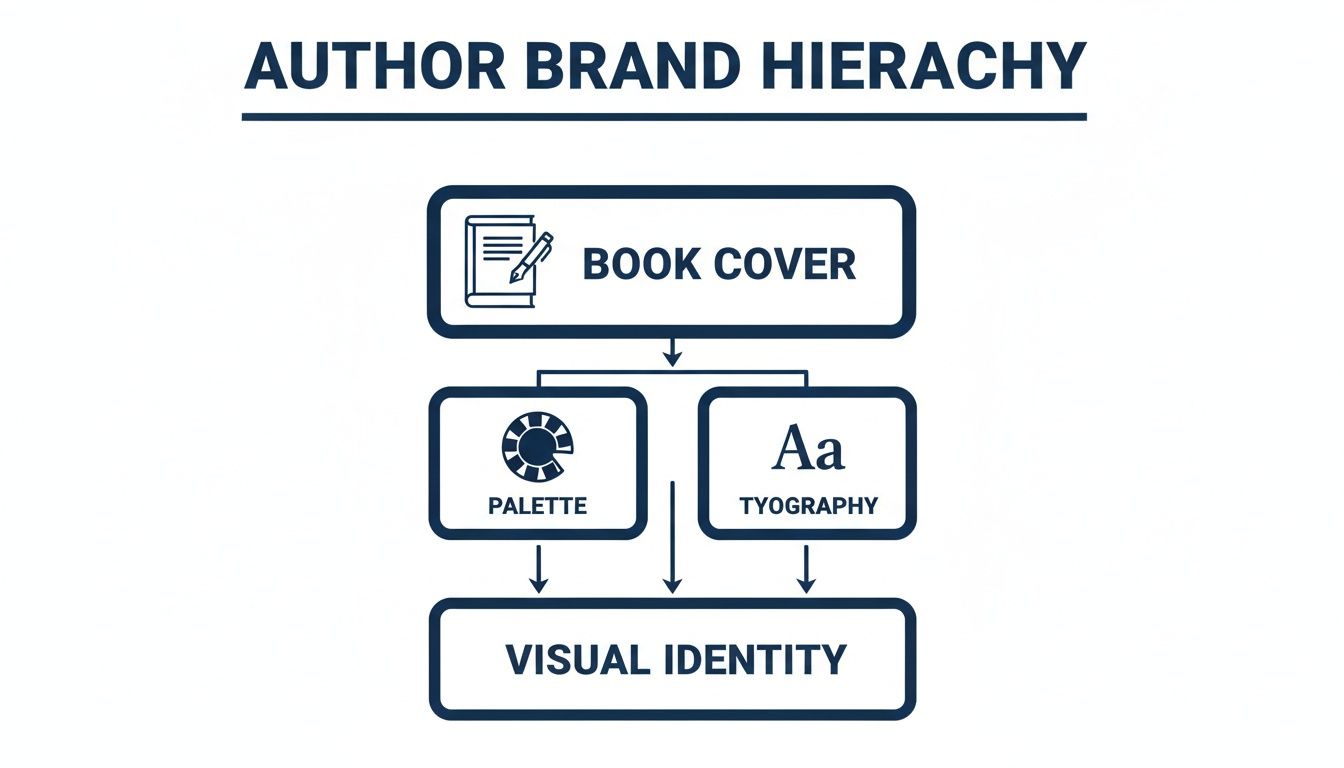
As you can see, your book cover is the foundation. It should inform the color palette and typography that give your site its unique personality.
Beyond the Basics: Your Blog and Media Kit
A blog isn't a must-have for every author, but it's a fantastic way to drive traffic and keep your website feeling fresh. You can share behind-the-scenes glimpses into your writing process, post updates, or write articles related to your book's themes. Blogging consistently is also a huge help for SEO and gives your readers a reason to visit between book launches.
Finally, a Media or Press Kit page is an absolute must for looking professional. It makes life so much easier for journalists, podcasters, and event organizers who might want to feature you.
A good media kit should contain:
- Your Official Bio: Provide short, medium, and long versions they can copy and paste.
- High-Resolution Headshots: Offer a few different downloadable options (e.g., color, black and white).
- Book Cover Images: Include high-quality JPG or PNG files for all of your books.
- Contact Information: List details for your publicist or agent, if you have one.
This one page saves media professionals a ton of time and signals that you're organized and ready for opportunities. Each of these pages plays a role in building a powerful online presence that serves both your readers and your career.
Choosing the Right Website Platform
The technology you choose to build your author website on is its invisible backbone. This isn't just a geeky tech detail—it dictates how easily you can post a new blog entry, how professional your site looks, and how much time (and money) you'll sink into keeping it running. Making the right call here sets the stage for everything that follows.
For most authors, the choice boils down to three major players: WordPress, Squarespace, and Wix. Each one strikes a different balance between creative control, ease of use, and cost. Figuring out which one aligns with your technical comfort zone and career goals is the first real step in building your digital home.
Comparing Top Website Platforms for Authors
So, how do you pick? It really comes down to what you value most: total control, beautiful simplicity, or a bit of both. Let's break down the big three to see where they shine and where they might fall short for an author's specific needs.
| Feature | WordPress.org | Squarespace | Wix |
|---|---|---|---|
| Best For | Authors wanting total control and long-term flexibility. | Authors who prioritize beautiful design and ease of use. | Authors who want a highly intuitive builder with a free starting option. |
| Ease of Use | Steeper learning curve; requires managing hosting and updates. | Very user-friendly with a clean drag-and-drop interface. | Extremely simple drag-and-drop editor, often considered the easiest. |
| Cost | Low initial cost for software (free), but hosting and premium themes/plugins add up. | All-in-one monthly fee (approx. $16-$26/mo), which includes hosting. | Offers a free plan (with ads), with paid plans similar to Squarespace. |
| Flexibility | Nearly infinite customization with thousands of themes and plugins. | Less flexible; you work within the template's structure. | Good flexibility, but you can't switch templates once your site is live. |
For many authors who just want to get a beautiful site up and running without headaches, Squarespace often hits the sweet spot. But if you have bigger plans—maybe an online shop for signed copies or a complex event calendar—the initial effort to learn WordPress will pay dividends for years to come. If you're exploring templates, you might find a guide to Wix Studio templates helpful for seeing what's possible out of the box.
The Technical Non-Negotiables
No matter which platform you go with, there are three technical fundamentals your site absolutely must have. These aren't flashy extras; they're the price of admission for a professional online presence today.
- A Mobile-First Design: It’s no secret that most people browse the web on their phones. In fact, over 50% of all web traffic now comes from mobile devices. If your site is a pinch-and-zoom nightmare on a smartphone, you're slamming the door on at least half your potential readers. Thankfully, nearly all modern themes and templates are "responsive," meaning they automatically adapt to any screen size.
- Speedy Load Times: We've all done it—clicked a link, waited three seconds, and bailed. A slow website is a one-way ticket to a frustrated audience and a lower Google ranking. This is where your choice of web hosting really matters. A solid host keeps your site zippy, even when a book launch announcement sends a flood of traffic your way.
- An SSL Security Certificate: See that little padlock icon next to a website's URL? That’s what an SSL certificate does. It encrypts the connection between your site and its visitors, which is a crucial sign of trust. If you have a contact form or ever plan to sell anything directly, this isn't optional. All-in-one builders and good web hosts almost always include a free SSL certificate.
Your platform choice is a long-term commitment. Think about where you want your author career to be in five years. Choose a system that can grow with you, not one that will hold you back.
Building a secure, fast, and mobile-friendly site is the foundation of your entire author brand. By getting these core technical pieces right from the start, you create a reliable and professional home base for your readers that will serve you well for years.
Turning Your Website into a Reader Magnet
So you've built a beautiful, fast website. That's a huge step, but it's really just the foundation. If you stop there, you’ve built a gorgeous house with no roads leading to it. For your website to actually grow your career, it needs to do two things exceptionally well: help new readers find you, and then give them a compelling reason to stick around.
Think of it as a one-two punch. First, you get found. Second, you make a connection. Let's break down how to make your website an engine that actively pulls readers into your world.
Helping Readers Find You with SEO
Search Engine Optimization (SEO) sounds intimidating, but for authors, it’s just about speaking Google’s language. You need to help search engines understand what your books are about so they can recommend your site to people who are actively looking for stories just like yours. A little effort here can pay off in a big way.
It all begins with keywords. Put yourself in a reader's shoes. What would they type into a search bar?
- Go Beyond Genre: Don't just aim for "fantasy author." Get specific. Think "epic fantasy author with dragons" or "cozy mystery writer set in New England."
- Use Comparisons: Readers often look for their next favorite by comparing it to their last. Target phrases like "authors like Sarah J. Maas" or "books similar to The Martian."
- Lean into Themes: What's at the heart of your story? "Post-apocalyptic survival story" or "historical romance set in Regency England" are much stronger than generic terms.
Once you have a solid list, weave these phrases naturally into your site's most important pages—your homepage, your about page, and especially your individual book pages. This isn't about stuffing keywords everywhere; it's about providing clear signposts for both readers and search engines.
Designing Your Site to Build Fans
Getting someone to your website is only the first part of the equation. Now you have to convince them to join your community. This is where conversion-focused design comes in. Every button, every image, and every line of text should gently guide a visitor toward taking an action—buying a book, or even better, joining your email list.
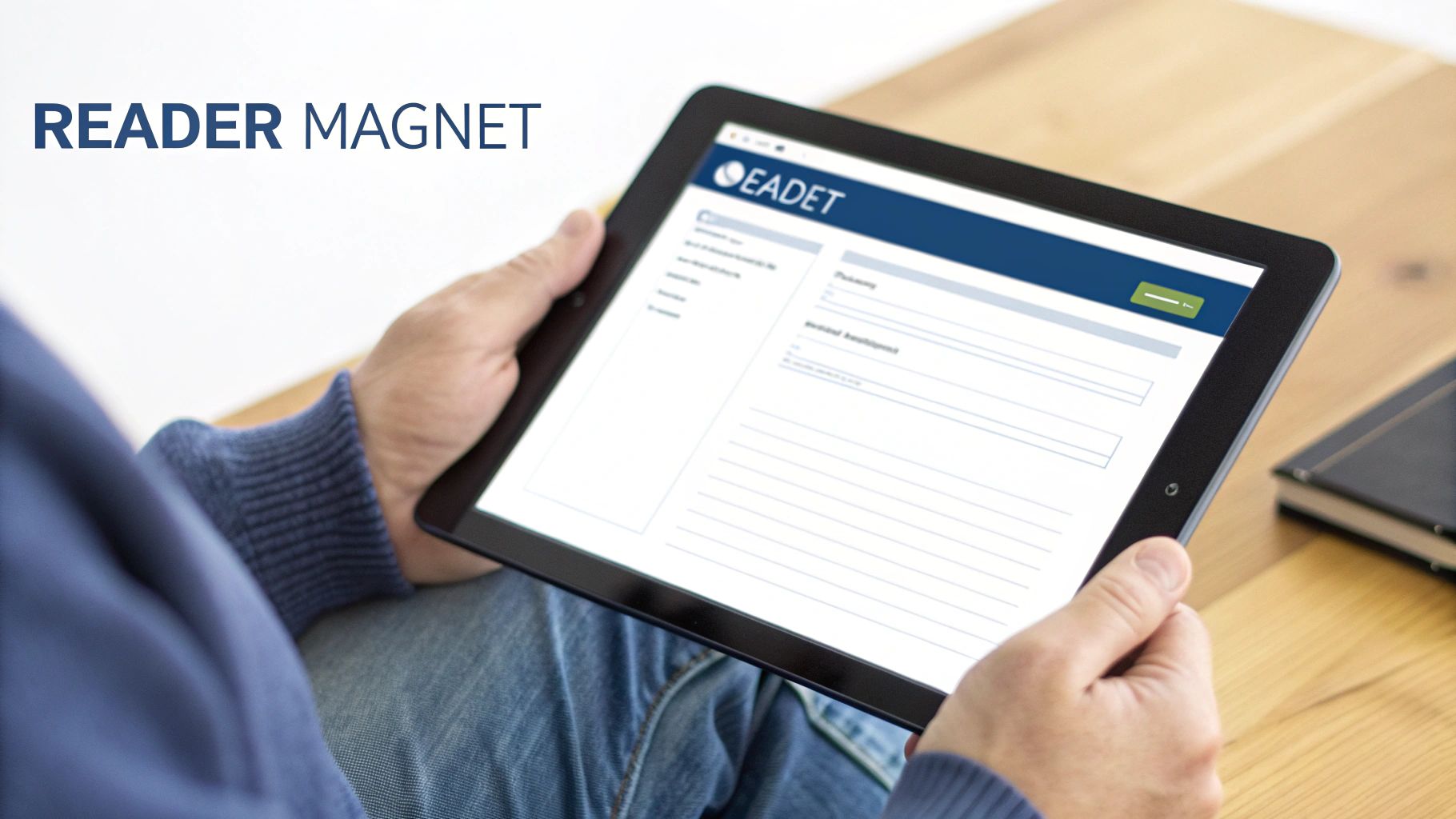
Your newsletter is the most powerful marketing asset you have. It’s a direct line to your readers, completely independent of any social media algorithm. To grow it, you have to make signing up an irresistible offer.
The goal is to offer something so valuable that a reader feels like they're getting an amazing deal just for sharing their email address. A generic "sign up for my newsletter" is easy to ignore; a compelling offer is not.
This is where your lead magnet comes into play. It’s a fantastic piece of free content you give away in exchange for an email address.
- For Fiction Authors: Offer a deleted scene, a bonus epilogue, or a short story set in your book’s world.
- For Fantasy/Sci-Fi Authors: High-resolution character art, detailed maps, or a world-building guide can be incredibly effective.
- For Non-Fiction Authors: A practical checklist, a quick-start guide, or the first chapter of your book works wonders.
The trick is to create something your ideal reader would be genuinely excited to get. For a deeper look at these strategies, our complete guide on creating an author website is a great next step.
New tech is also making it easier to create these personalized experiences. In fact, 93% of web designers have used AI tools in the last three months to help with everything from brainstorming ideas to building out entire sites. You can find more data on this and other author trends in a recent social media study from BookBub.
By pairing smart SEO with compelling offers, you’ll transform your website from a simple online brochure into a powerful hub that consistently attracts new readers and turns them into lifelong fans.
A Few Common Questions About Author Websites
Jumping into the world of author websites can feel a bit overwhelming. It’s totally normal to have questions pop up, from how much this is all going to cost to the nitty-gritty technical details. Getting some straight answers helps clear the fog, letting you focus on what really matters: building a site that feels like you.
Let's go through some of the most common questions I hear from authors. Think of this as your friendly guide to getting over those last few hurdles.
So, How Much Does an Author Website Actually Cost?
This is almost always the first question, and the honest-to-goodness answer is: it really depends on which path you take. You could be looking at a couple of hundred dollars a year or a five-figure investment. Knowing the difference will help you match your budget to your goals.
-
DIY Platforms (Wix, Squarespace): This is the sweet spot for most authors. You're looking at around $200-$500 per year, which typically covers your hosting, domain, and access to their drag-and-drop tools. It’s a fantastic, cost-effective way to get a professional-looking site up and running without touching a line of code.
-
Custom Design (WordPress): If you hire a pro to build you a custom WordPress site, you’re making a much bigger investment. Prices usually start around $2,500 and can easily climb to $10,000+. This route gives you ultimate creative control and is perfect for established authors who need very specific features, but it's overkill for most.
Whatever you do, make sure you get a detailed quote. A simple portfolio site is one thing; a full-blown e-commerce store for direct sales is a whole different beast with a different price tag.
What Are the Biggest Design Mistakes I Should Avoid?
A great website is as much about what you leave out as what you put in. Steering clear of a few classic blunders will make a world of difference for your visitors and turn your site into a much more effective marketing tool.
The most common mistake I see is a cluttered homepage. When someone lands on your site, they shouldn't have to play detective to figure out where to go. Other big no-nos include a clunky mobile experience—which will instantly annoy more than half your potential readers—and hiding your "Buy Now" links. Blurry, low-quality photos or a mismatched design can also make your whole brand feel amateurish.
But the single biggest misstep? Burying your newsletter sign-up form. Your email list is your direct line to your readers. It’s your most valuable asset, so it needs to be front and center, not an afterthought.
How Often Should I Be Updating My Website?
Think of your website as a living, breathing part of your author business, not a static brochure you print once and forget. Keeping it fresh is great for readers and tells search engines that your corner of the internet is active and relevant.
You should plan to update your site anytime there's news. Got a new book coming out? Add it. An upcoming event? Put it on the calendar. Scored a fantastic review? Showcase it. Writing a new blog post? Get it published.
From a technical standpoint, giving your site a quick check-up every 6-12 months is a solid plan. During this review, test its speed, see how it looks on a phone versus a tablet, and click around to find any broken links. A little routine maintenance goes a long way in keeping things running smoothly for everyone.
Should I Bother Selling Books Directly from My Site?
Absolutely. Selling direct is a brilliant move. You get to keep a much bigger slice of the profit, and just as importantly, you can collect your customers' email addresses for your newsletter. Setting this up is easier than you might think with tools like WooCommerce for WordPress or the e-commerce features built into platforms like Squarespace.
The catch is that you become the store. That means you're in charge of packing boxes, shipping, and handling any customer service issues that pop up. Many authors find a happy medium with a hybrid approach: they sell signed copies directly from their site but also provide big, obvious links to major retailers like Amazon and Barnes & Noble. It gives readers a choice and gives you the best of both worlds.
At BarkerBooks, we know that a strong author website is the foundation of a successful writing career. Our team is here to help you build an online home that not only looks incredible but also sells books and helps you connect with your readers. Find out more about our comprehensive author services.