
Professional book layout is so much more than just picking a nice font. It's the silent art of arranging every single element, from the cover to the very last page, to create an experience that feels effortless for the reader.
A truly great layout guides the reader through the text without them ever noticing the design itself. It's about making smart choices with typography, page margins, and the overall flow of content to build a readable, engaging, and marketable book.
Building Your Book's Professional Structure
Before you dive into the creative details, you have to get the foundation right. Every professionally published book follows a time-tested structure that readers subconsciously expect. This isn't about being rigid; it's about creating a familiar path that lets your content shine.
At its core, a book is built in three parts: the front matter, the main body, and the back matter. Each section has a specific job to do, guiding your reader into the world you've created and gently leading them out again. Think of it as the architecture of your book—get this right, and everything else falls into place.
The Anatomy of a Book
Knowing what goes where is the first real step toward a polished interior. The specific elements can shift depending on your genre. For instance, a novel will have a much leaner front matter than a dense non-fiction book, which might need a foreword, a preface, and a detailed table of contents.
Here's a look at the essential elements that make up a book's structure.
| Section | Core Components | Purpose |
|---|---|---|
| Front Matter | Title Page, Copyright, Dedication, Table of Contents, Foreword, Preface, Introduction | Sets the stage, provides legal information, and helps readers navigate the book. |
| Main Body | Chapters, Parts/Sections, Running Heads, Page Numbers (Folios) | This is the heart of your work—the story, research, or core message you're sharing. |
| Back Matter | Epilogue, Acknowledgments, Author Bio, Bibliography, Index, Glossary | Offers supplementary material, provides context, and gives credit where it's due. |
Getting this blueprint right ensures every piece of your manuscript has a home. If you're feeling a bit overwhelmed, starting with some professionally designed book layout templates can give you a massive head start. Check them out here: https://barkerbooks.com/book-layout-templates/
This visual guide really nails down the core pillars of great book design.
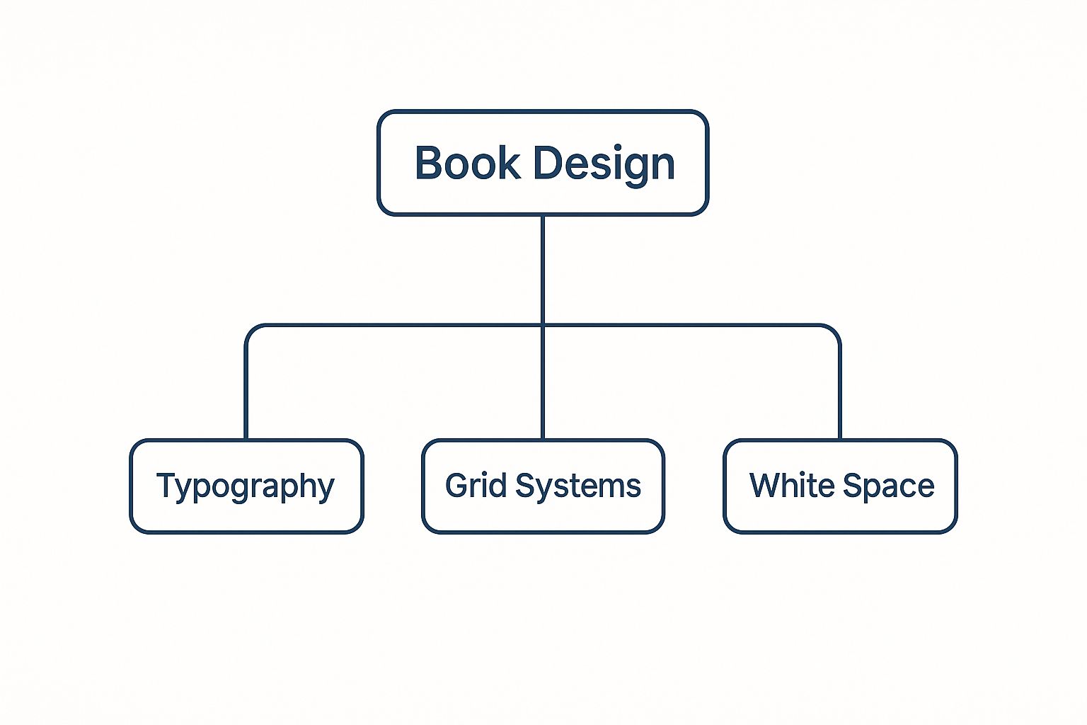
As you can see, things like typography, grid systems, and the strategic use of white space are what create a cohesive, readable final product.
Of course, the physical construction of your book plays a huge role, too. The binding you choose can influence everything from margin size to how the book feels in the reader's hands. It's worth learning more about choosing the right booklet binding machine to understand how these production decisions loop back into your design.
A great book layout is invisible. The reader shouldn't notice the margins, the font, or the spacing; they should only notice the story. The structure is there to serve the content, not distract from it.
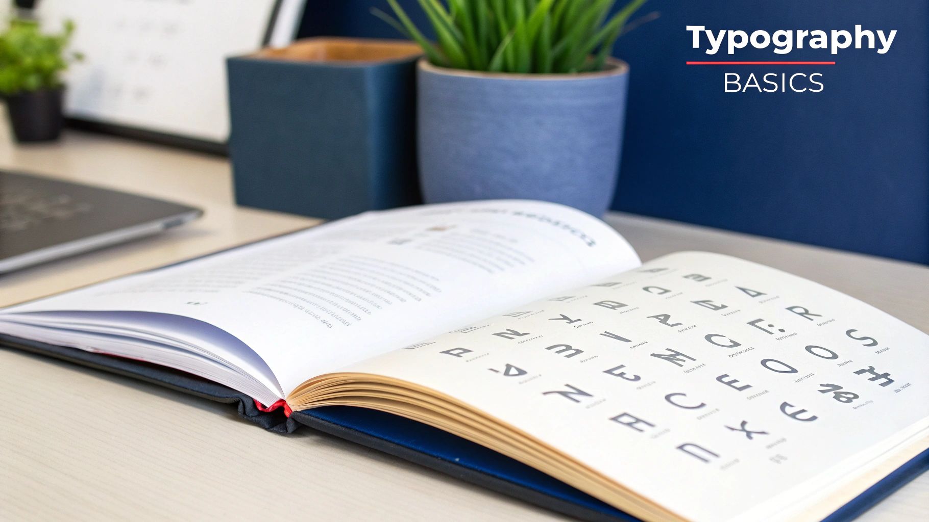
Choosing Typography That Connects With Readers
Think of typography as the voice of your book. Long before someone reads the first sentence, the fonts you choose are already speaking to them. They set a mood and make a promise about the experience to come, either welcoming the reader in or creating a subtle barrier. Getting this right is a cornerstone of professional book design—it's about making choices that are so fitting, they feel almost invisible.
The fonts you select are your secret weapon for reinforcing your book's message and genre. Let’s say you’re designing a gritty crime novel. You might go with sharp, condensed sans-serif fonts for the chapter titles and a tough, no-nonsense serif for the body copy. That combination just feels tense, modern, and direct.
Now, imagine a beautiful cookbook full of fresh, light recipes. It would likely call for something entirely different—maybe an elegant, flowing script for headings paired with a clean, classic serif for the instructions. The feeling is airy, friendly, and inspiring. Your job is to create that same kind of seamless harmony between the words and their visual style.
Pairing Fonts for Readability and Style
One of the most effective strategies I’ve used over the years is pairing a distinctive font for headings with a workhorse font for the main text. This contrast is a simple but powerful way to create a clear visual hierarchy and guide your reader through the page.
- For Body Text: Your top priority—and I can't stress this enough—is readability. Classic serif fonts like Garamond, Caslon, and Minion are staples for a reason. Their little "feet" (serifs) help guide the eye smoothly across the page, which makes a huge difference in reducing reader fatigue over hundreds of pages. Stick to a font size between 10pt and 12pt for most print projects.
- For Headings: Here’s your chance to inject some personality! A bold sans-serif like Helvetica Now or a stylish, high-contrast serif like Playfair Display can create a beautiful counterpoint to a more traditional body font.
The craft of typography is steeped in history. The 18th century was a pivotal time, with John Baskerville's 1750 typeface introducing sharp serifs and high contrast that changed the game for legibility. Then, in 1780, François-Ambroise Didot’s point system finally standardized type measurement, bringing much-needed consistency to the printing world. You can dive deeper into these fascinating historical milestones in printing on printinghistory.org.
Here’s a simple rule of thumb I always follow: opposites attract. If you choose a bold, decorative font for your headings, balance it with a clean, understated font for your body text. This contrast keeps your pages from feeling cluttered or visually overwhelming.
The Details That Make a Difference
Once you've picked your fonts, a couple of small technical tweaks can elevate your layout from good to great: leading and kerning.
Leading (pronounced "ledding") is simply the vertical space between lines of text. If it’s too tight, your paragraphs will feel dense and intimidating. Too loose, and the text can feel disjointed. I find that a good starting point is to set your leading to about 120% to 145% of your font size.
Kerning is all about the space between individual letters. Most quality fonts have solid built-in kerning, but you'll often need to make manual adjustments, especially in large headings or on the cover. Fixing those awkward gaps between certain letter pairs is what gives your typography that final, polished, professional sheen.
Mastering Page Layout and Composition
A truly well-designed page doesn't feel designed at all. It just works. The words flow, the eye is guided naturally, and the whole experience feels inviting. This is where the technical craft of book layout transforms into a genuine art, creating an interior that feels as good as it reads.
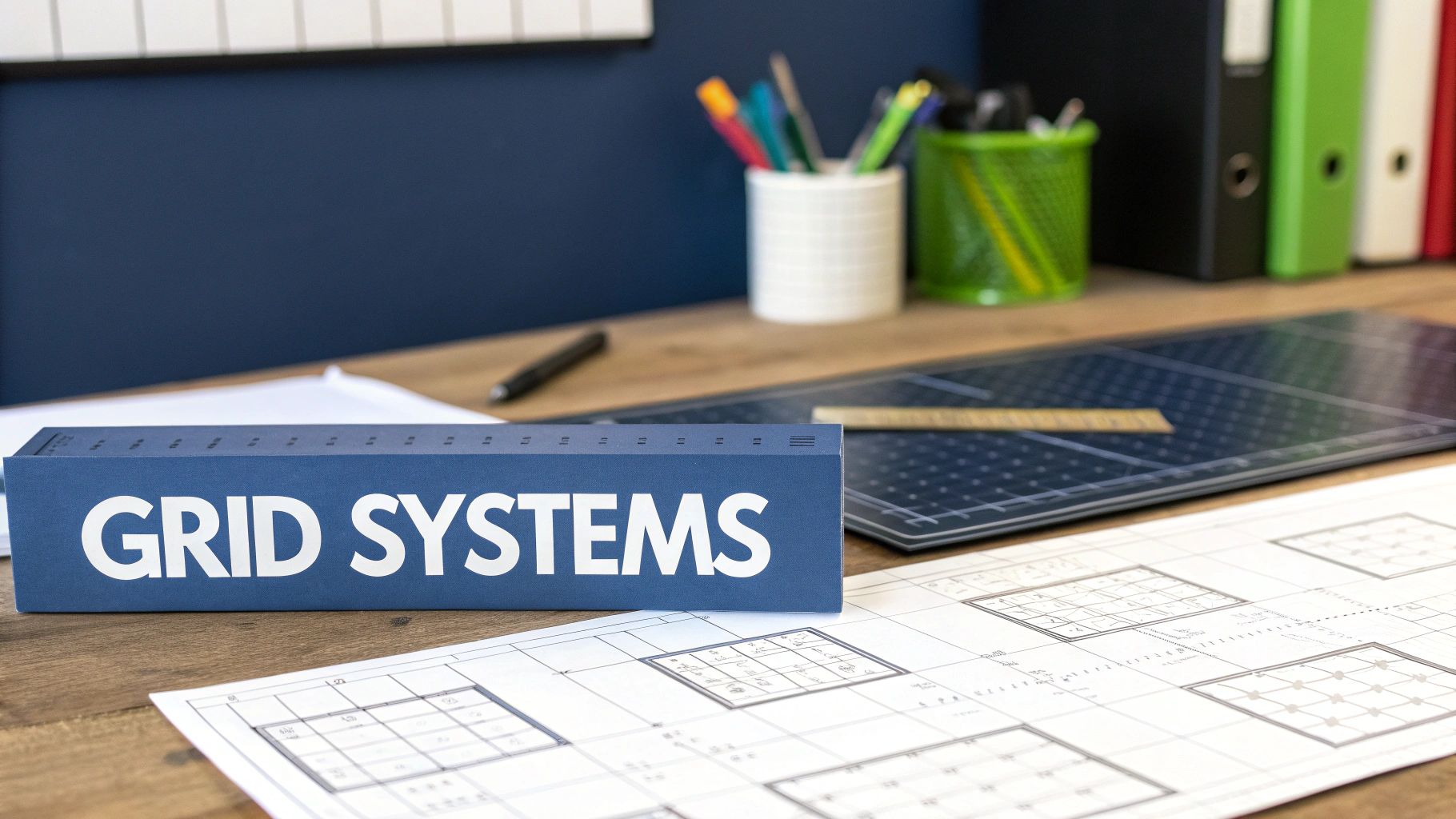
The bedrock of any great page is its underlying structure. It all starts with setting margins that feel generous—not cramped—and establishing a solid grid that brings a quiet sense of order to every page. Think of it as the invisible architectural frame for your words.
Establishing Your Margins and Grid
Margins are so much more than just blank space around the text. They're critical for readability. They keep your words from disappearing into the book’s gutter (the inner spine) and give the reader’s thumbs a place to rest without obscuring the text.
I’ve seen countless authors make their margins too tight, trying to cram more words onto a page to lower the printing cost. This almost always backfires, creating a dense, intimidating wall of text that’s a chore to read.
For a standard 6×9 inch trade paperback, here’s a professional starting point:
- Inside (Gutter) Margin: 0.75” to 0.875”
- Outside Margin: 0.625”
- Top Margin: 0.75” (often contains the running head)
- Bottom Margin: 0.75” (usually where the page number lives)
This setup creates a balanced, professional frame. With the margins in place, your grid system acts as the invisible scaffolding, ensuring every element—from chapter titles to images—aligns perfectly from cover to cover.
The smart use of white space is one of the most powerful tools a designer has. It's not 'empty' space; it's active space. It gives the reader's eyes a place to rest, improves comprehension, and lends the entire book a clean, modern feel.
Refining the Details: Widows and Orphans
Once the foundation is set, it’s time to hunt down the little details that scream “professional.” Topping that list is managing widows and orphans—those awkward, dangling lines that break a reader’s rhythm.
- An orphan is a single word or short line at the bottom of a paragraph that gets stranded all by itself at the top of the next page.
- A widow is the last line of a paragraph that gets bumped to the top of the next page, separated from its family.
In professional typography, both are considered major faux pas. Most design software has features to automatically prevent them, but you’ll inevitably need to step in and fix stubborn cases. This might mean gently adjusting the tracking (the letter spacing in a line) or even tweaking a sentence. It's meticulous work, but it’s absolutely essential for a polished book. Our comprehensive guide to book design and layout goes even deeper into handling these pro-level details.
Designing Elegant Chapter Openers
Finally, let's talk about your chapter openers. These pages are the major signposts in your reader's journey, and they’re a perfect opportunity to reinforce your book's unique style. They don't have to be complicated, but a thoughtful opener can pull a reader right into the next phase of the story.
You could introduce a large, stylized drop cap, create a unique treatment for the chapter title, or add a small graphic element that connects to your theme. Whatever you choose, the key is consistency. Apply that same design choice to every single chapter opener to build a cohesive, satisfying experience for your reader.
Weaving Visuals into Your Book Design
Images, charts, and illustrations are far more than just eye candy in a book. They're a powerful tool for breaking up long stretches of text, making complex ideas easier to grasp, and creating a truly memorable experience for your reader. But just dropping a photo onto the page won't cut it. To do it right, you need a mix of technical know-how and a good eye for placement.
Let's start with the technical side, because this is where many new designers stumble, especially with print. Every single image destined for print needs to be high resolution. The industry standard is a non-negotiable 300 DPI (dots per inch) at the size it will actually appear on the page. Anything lower will look blurry and pixelated, instantly cheapening the feel of your book.
You'll also need to make sure your images are in the right color mode. Digital screens use RGB, but professional printing presses use CMYK (Cyan, Magenta, Yellow, Key/Black). Converting all your visuals to CMYK beforehand is a critical step for accurate color reproduction.
Placing Visuals for Real Impact
Once your files are prepped and ready, the real fun begins: deciding where they should go. The goal here is to make the visuals feel like they belong with the text, not like they're fighting it for attention. A perfectly placed image guides the reader's eye and enhances the story you're telling.
Here are a few classic strategies I've used time and again:
-
Full-Bleed Spreads: This is a showstopper. When you have a stunning photograph or a critical piece of art, letting it run all the way to the edges of the page creates a dramatic, immersive pause for the reader. I find this works wonders for chapter openers or to highlight a pivotal moment.
-
Text Wrapping: This is your workhorse technique for integrating smaller images. The idea is to flow your main text around the visual. A good, clean text wrap lets you place an image right where it's most relevant without disrupting the reading flow. Just be sure to give it a little breathing room—a comfortable margin between the image and the words is key.
-
Centered and Anchored: For a more formal, academic feel, centering an image on the page is a great option. It works especially well for technical diagrams, historical photos, or portraits that need to be presented clearly and without distraction, often with a caption directly above or below.
Before you place any image, ask yourself this one simple question: "Does this add clarity or just clutter?" Every visual needs a job to do, whether that's explaining something, setting a mood, or providing crucial context. If it doesn't have a clear purpose, it’s probably just wasting space.
The careful dance between text and image isn't a new concept. For centuries, designers have used infographics and data visualizations to distill complex information into a digestible format. This requires a masterful blend of typography and page composition. If you're interested in the deep roots of this practice, you can explore the fascinating evolution of infographics in publishing on sandrarendgen.wordpress.com.
Preparing Flawless Files for Print and Digital
You’ve poured your heart into the creative work, and now comes the final, technical hurdle: preparing your masterpiece for its journey into the world. This is where your design meets the realities of production, whether that's a printing press or an e-reader screen.
Getting this last step wrong can be a painful and expensive lesson. Think costly printing errors, a book full of formatting glitches, or frustrated readers leaving bad reviews. It's not just about clicking "Save As."
You’re essentially creating two completely different products from a single design file. For a printed book, you're building a static, unchangeable object. For digital, you're crafting a flexible file that has to adapt to countless devices and user preferences. Each requires its own distinct approach.
Generating a Press-Ready PDF
When it comes to physical books, the gold standard is a press-ready PDF. This is not the same kind of PDF you'd email to a colleague. It's a high-resolution, data-rich file specifically engineered for commercial printing. I've seen many first-time authors stumble here, and it's an easy mistake to avoid.
Before you export, you absolutely have to dial in these settings:
- Bleed: This is a small safety margin, usually 0.125 inches, that extends your design past the final trim line of the page. It's a crucial detail that prevents a jarring white sliver from appearing if the printer’s cutting blade is off by even a hair.
- Crop Marks: These are tiny lines printed in the corners of your PDF. They act as a guide for the printer, showing them exactly where to trim the paper to achieve the book's final, intended size.
- Color Profile: All your visuals—especially the cover and any interior photos—must be converted to the CMYK color mode. Your screen uses RGB (light), but printers use CMYK (ink). Skipping this step can lead to disappointing and unexpected color shifts when your book comes off the press.
Your best friend before sending anything to a printer is the "pre-flight check." Most professional design software has a built-in pre-flight panel that scans your entire document for common problems—things like low-resolution images, missing fonts, or incorrect color profiles. Always run it. It will save you time and money.
Navigating the World of Digital EPUBs
For e-readers like Kindle or Kobo, you’ll be creating an EPUB file. The biggest mental shift here is that most e-books use a reflowable layout. This means the text and images don't have a fixed position; they dynamically adjust to fit the screen size and the reader’s personal font settings. It’s a world away from the fixed pages of a PDF.
Your main goal is to create a clean, well-structured document that reflows gracefully on any device. This comes down to ensuring your paragraph styles are consistently applied and your images are optimized for screens (using the RGB color mode and a reasonable file size).
Getting the technical details right for both print and digital is the final hurdle. For a deeper dive into creating perfectly structured files for both formats, our guide on how to format a book walks through all the essential steps.
Print vs Digital Export Checklist
Exporting for print and digital requires attention to different technical details. This table breaks down the key specifications you'll need for a press-ready PDF versus a reflowable EPUB.
| Specification | Print (Press-Ready PDF) | Digital (Reflowable EPUB) |
|---|---|---|
| Color Mode | CMYK (for ink-based printing) | RGB (for screen-based viewing) |
| Image Resolution | 300 DPI (dots per inch) minimum | 72-150 PPI (pixels per inch) is sufficient |
| Bleed | Required (0.125 inches typical) | Not applicable |
| Crop Marks | Required (guides for trimming) | Not applicable |
| Layout | Fixed (pages are static) | Reflowable (text adapts to screen) |
| Fonts | Embedded within the PDF file | Embedded or referenced, web-safe fonts preferred |
| File Format | PDF/X-1a or other press-quality PDF | .EPUB (industry standard) |
Think of the PDF as a precise architectural blueprint for a physical object, while the EPUB is more like a responsive website, designed to be flexible. Getting these settings right from the start ensures your book looks professional no matter how someone reads it.
Your Top Book Layout and Design Questions Answered
When you're ready to turn your manuscript into an actual book, the questions start piling up. It's totally normal. Over the years, I've heard just about everything from authors stepping into the design world for the first time. Let's tackle some of the most common ones I get asked.
How Long Does This Actually Take?
This is usually the first question, and the answer often catches people off guard. A professional book layout isn't something you can knock out in an afternoon.
For a pretty straightforward novel, I tell authors to set aside at least one to two weeks for the interior design process. And that's just for the inside! If your book is more complex—think non-fiction with lots of photos, charts, or custom formatting—you can easily see that timeline double. Good design takes time.
What's the Best Software for Book Layout?
I see a lot of manuscripts that have been meticulously formatted in Microsoft Word, but Word is for writing, not for professional layout. To get the control you need for a print-ready book, you have to use a dedicated design program.
The undisputed industry standard is Adobe InDesign. It gives you pinpoint control over every single element, from the typography down to the exact spacing between lines, which is essential for a flawless final product.
But I get it—InDesign can be a beast to learn and comes with a subscription. Luckily, there are some fantastic alternatives out there:
- Affinity Publisher: This is my top recommendation for a budget-friendly option. It's a one-time purchase and is incredibly powerful, matching many of InDesign's core features.
- Reedsy Book Editor: A great free, online tool that's perfect for authors who want a simple, guided process for creating clean print and ebook files.
- Vellum: If you're a Mac user, you've probably heard authors rave about Vellum. It’s known for creating gorgeous, professional-looking layouts for both print and digital with a very gentle learning curve.
If you're just starting out and feeling overwhelmed, looking at design templates for non-designers can be a huge help. They give you a solid foundation to build upon.
Can I Use My Print Design for My Ebook?
This is a big one, and the answer is always a hard no. The two formats are fundamentally different.
Print design is static. The layout is locked in place, and every page will look exactly the same no matter who is reading it. On the other hand, digital design for ebooks is reflowable. The text has to flow and adapt to countless screen sizes, orientations, and user-customized font settings.
Here's the best way to think about it: Your print-ready PDF is like a perfectly composed photograph—it's fixed and unchangeable. An ebook file (like an EPUB) is more like a responsive website; it's designed to be flexible and adapt to its environment. You absolutely need a separate design process for each.
What's the Real Cost of Professional Design?
And finally, the bottom-line question: "How much is this going to cost me?" The price tag can swing wildly depending on what your book needs.
For a simple fiction interior, you might see prices ranging from a few hundred dollars to over a thousand. But for a complex non-fiction book that’s packed with images, tables, footnotes, and custom formatting, the investment could be several thousand dollars. It's a real investment, but one that pays off by signaling quality and professionalism to your readers from the very first page.
At BarkerBooks, we live and breathe this stuff. We can take all the complexity of professional design off your plate and make sure your book is stunning in both print and digital. Transform your manuscript into a masterpiece with us.