
When you hear "book formatting," it might bring to mind tedious details like margins and fonts. But before you dive into any of that, you need a solid plan. Think of it less as a checklist and more as creating a blueprint for your book's professional life. The goal is to produce two very different final products: a fixed-layout PDF for your print version and a reflowable EPUB file for ebooks.
Your Blueprint for Professional Book Formatting
So, where do you start? The entire process really boils down to a few key decisions you make upfront. Get these right, and everything else falls into place. It’s like setting the DNA for your book.
First things first: decide where your book will live. Will it be a physical book, an ebook, or both? This single choice dictates your whole workflow. Print books need a static PDF where every element is locked in place. Ebooks, on the other hand, require a flexible, reflowable file that can adapt to a tiny phone screen or a large tablet. One of the most common rookie mistakes is trying to make one file work for both formats—it just doesn't work and the results often look amateurish.
Core Formatting Decisions
With your formats decided, the next big piece of the puzzle is your book's trim size. This isn't just a random measurement; it has a long history tied to reader experience and printing costs. Since the early 20th century, sizes like 6" x 9" for trade paperbacks and 5" x 8" for mass-market editions became industry standards. Why? They offer a great balance of readability and cost-effective printing.
Publisher data consistently shows that books sticking to these familiar sizes tend to perform better in sales and reader retention, simply because they feel right in a reader's hands. To see how these choices impact your final book, you can check out our guide on the complete formatting process at https://barkerbooks.com/how-to-format-a-book/.
A book's format is its first handshake with the reader. A sloppy layout suggests a sloppy story, while a professional design invites trust and immersion before the first word is even read.
Finally, you have to pick your tools. This choice depends heavily on your technical comfort level and budget.
- Author-Focused Software: Tools like Vellum and Atticus are built specifically for authors and are incredibly user-friendly. They make it simple to get a beautiful result.
- Industry Standard: For maximum control, professionals use Adobe InDesign. It has a steep learning curve but offers unmatched power and flexibility.
- The DIY Route: Even Microsoft Word can get the job done, but be prepared for a lot more manual tweaking to make it look truly professional.
Key Formatting Decisions at a Glance
Making these foundational choices can feel overwhelming, so I've put together a quick table to help you see the most critical differences between formatting for print and digital at a glance.
| Formatting Element | Considerations for Print (PDF) | Considerations for Ebook (EPUB/KDP) |
|---|---|---|
| Layout Type | Fixed layout; what you see is exactly what you get. | Reflowable text; readers can change the font and text size. |
| Trim Size | Crucial; determines page dimensions, printing costs, and feel. | Irrelevant; the "page" is simply the device screen. |
| File Type | High-resolution, print-ready PDF/X-1a is the gold standard. | An EPUB or a KDP-specific file format is required. |
| Page Numbers | Essential and must be styled correctly within the layout. | Not needed; handled automatically by the e-reader device. |
Thinking through these high-level decisions first will save you from headaches and wasted hours down the road. It ensures your book offers a seamless, professional experience for your readers, whether they're turning physical pages or swiping on a screen. The publishing world is always evolving, and understanding these fundamentals is key, as highlighted in this detailed report from publishers.org.
Getting the Inside of Your Book Just Right
Alright, you've got your strategy sorted. Now it's time to roll up our sleeves and get into the nitty-gritty: the page-by-page details that make a Word document feel like a real, professionally published book. The interior layout is where your story truly takes shape, and these small details send a powerful message to readers about the quality of your work.
The tools we have today have completely changed the game. Thanks to modern software, authors have an incredible amount of control over things like embedded fonts, precise margin settings, and sharp-looking chapter headings. And this isn't just about looking good—it's about sales. Data consistently shows that books with professional formatting can pull in 25-40% higher sales than those that look slapped together. Readers really do judge a book by its cover and its interior. If you want to keep a pulse on what’s working for authors, check out the great resources over at authormedia.com.
Setting Up Your Margins and Page Structure
Margins are far more than just empty space; they’re the frame that holds your words. For a print book, you're juggling four of them: top, bottom, inside, and outside. For a standard trade paperback, say a 6" x 9" book, a good baseline is to set the top, bottom, and outside margins to at least 0.5 inches.
The one you absolutely can't mess up is the inside margin, also known as the gutter margin. This is the space that gets pulled into the book's spine. Make it too tight, and your text will disappear into the binding, forcing readers to crack the spine just to read the words. Not a great experience. I always recommend a gutter between 0.75 and 1.0 inches. Most formatting programs have a "mirror margins" or "facing pages" option that handles this for you, automatically applying the wider gutter to the correct side of each page.
Ebooks are a different beast. Since the text is reflowable and adjusts to the screen size, traditional margins don't exist. The e-reader itself handles all that, so you can tick this step off your list when formatting your EPUB file.
Choosing the Right Typography
Your font choice is one of the biggest design decisions you'll make. The number one rule here is readability. This isn't the time to show off some wild, decorative font you found online.
-
Body Text: For the bulk of your book, a classic serif font is the way to go. Those little "feet" on the letters (the serifs) actually help guide the eye across the page, making for a smoother reading experience. You can't go wrong with Garamond, Baskerville, or Caslon. Keep the font size between 10 and 12 points.
-
Headings: Chapter titles and section breaks are where you can inject a bit more style. A clean sans-serif font (like Lato or Open Sans) can create a nice contrast with your serif body text. Another solid option is to simply use a bolder, larger version of your main font. This establishes a clean visual hierarchy that readers instantly understand.
-
Ebook Fonts: You can embed fonts in an ebook, but it's often a bit of a gamble. Many readers just override it with their e-reader's default font anyway. To play it safe and ensure a consistent look, stick with web-safe classics like Georgia or Palatino for your body text.
Pro Tip: Keep it simple. I’ve seen beautiful books that use just one font family. By using different weights (like regular, bold, and italic), you can create all the visual distinction you need. Never use more than two or three fonts in your entire book.
Mastering Paragraphs and Spacing
How you handle your paragraphs is an immediate giveaway of whether your book was formatted by a pro or an amateur. I see two mistakes all the time: putting a blank line between every paragraph and indenting the very first paragraph of a chapter.
Here are the professional conventions to follow:
- First-Line Indents: Every paragraph (except the one right after a chapter title or scene break) needs a first-line indent. Set this automatically in your software's paragraph styles to be between 0.3 and 0.5 inches. Please, don't just hit the tab key.
- No Extra Space: In novels and most nonfiction, you shouldn't have extra space between paragraphs. The indent is the only signal a reader needs to see that a new paragraph is starting.
- Line Spacing (Leading): This is the space between lines of text. In typography, it’s called "leading." You want it to be comfortable—not too cramped, not too airy. A good rule of thumb is to set your line spacing to 120% to 145% of your font size.
Finally, you need to watch out for "widows" and "orphans." An orphan is the first line of a paragraph sitting all by itself at the bottom of a page. A widow is the last line of a paragraph stranded alone at the top of a new page. Both look awkward and break the reader's flow. Thankfully, professional software can automatically find and fix these for you, keeping your text blocks looking clean and solid.
Choosing Your Book Formatting Software
The single biggest decision you’ll make on this journey is picking your book formatting software. This tool is your digital workshop, and getting this choice right from the start will save you a world of headaches later on. Your decision really comes down to a few key things: your budget, how tech-savvy you are, and what your specific book needs.
Think of it this way: you wouldn't bring a sledgehammer to hang a picture frame. In the same vein, you don’t need the industrial-strength power of a program like Adobe InDesign if you're just formatting a straightforward novel. Let’s walk through the pros and cons of the most common options so you can pick the right tool for the job.
The Author-Focused Tools
For most authors, especially those of us who aren't graphic designers by trade, specialized software is a godsend. Tools like Vellum and Atticus were built from the ground up for one reason: to help writers create beautiful books without a massive learning curve.
-
Vellum (Mac only): Vellum is famous for its stunning, pre-designed interior styles. You can import your finished manuscript from Word and have gorgeous ebook and print files ready in minutes. Its live preview feature is fantastic, showing you exactly how your pages will look on a Kindle, an iPad, or in print. The only real downsides are its Mac-only limitation and a one-time cost that can feel a bit steep.
-
Atticus (PC & Mac): As Vellum's main rival, Atticus delivers much of the same magic but works across both Windows and Mac. It’s a web-based platform that doubles as a word processor, meaning you can write and format all in one place. It’s a powerful all-in-one solution that’s constantly being updated with new features.
These programs are brilliant for creating professional-grade fiction and standard nonfiction. They automatically take care of the tedious stuff—like preventing widows and orphans, building a clickable table of contents, and spitting out perfectly formatted files for KDP and other retailers.
The real value of author-centric software isn't just the features—it's the peace of mind. You get to focus on your words, knowing the technical side of formatting is handled correctly every single time.
The Industry Standard Powerhouse
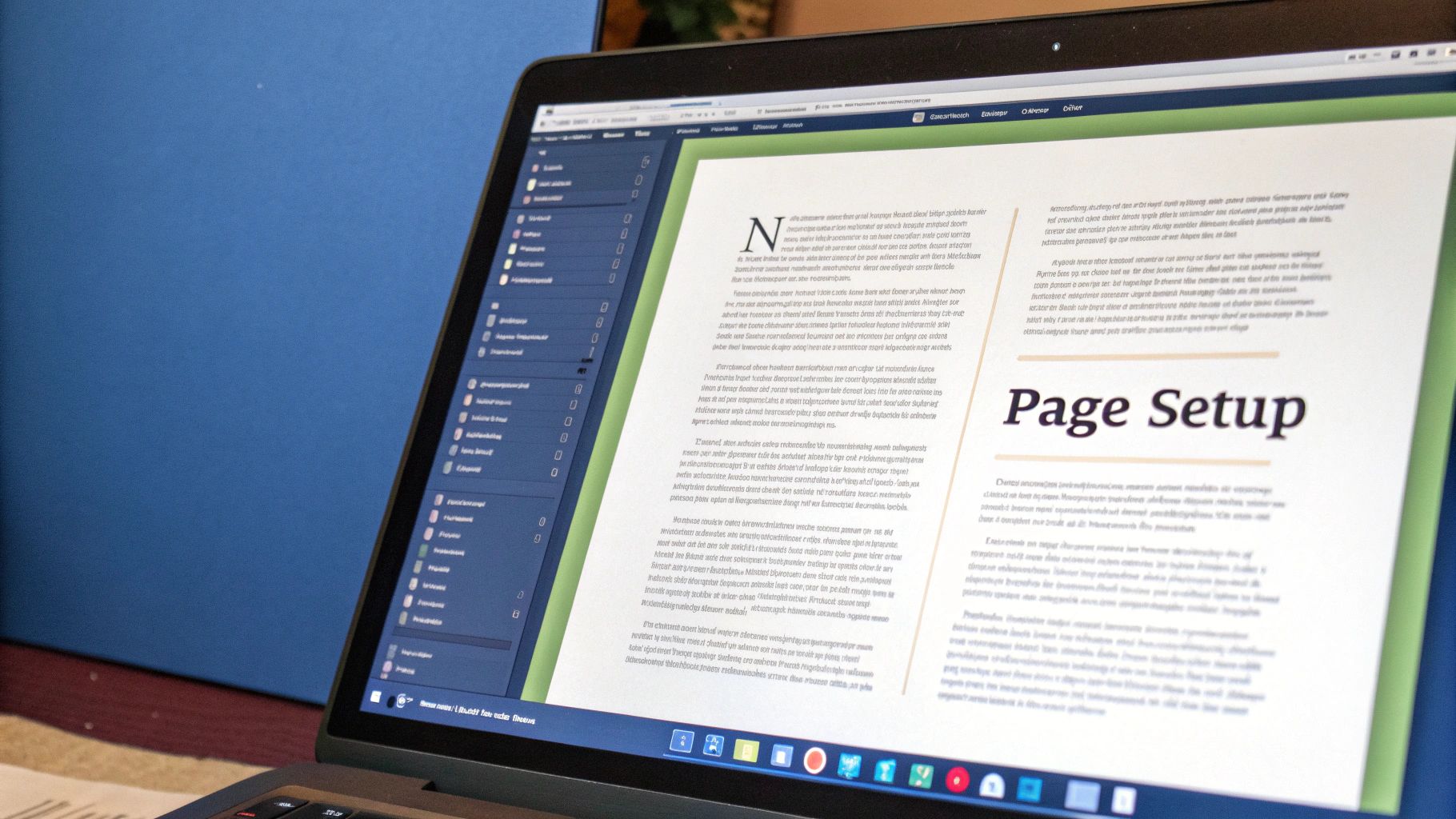
When you need absolute, pixel-perfect control over every single element on the page, nothing comes close to Adobe InDesign. This is what the pros use. If your book is a more complex project—think a cookbook with precise layouts, a children's picture book, or a textbook filled with charts and images—InDesign is the undisputed champion.
The screenshot above gives you a peek into the InDesign interface, with its robust system of panels for managing pages, text styles, and graphics. This level of control is what allows designers to create truly custom layouts that the more automated tools simply can't match.
But all that power comes with a price. InDesign has a notoriously steep learning curve and requires a monthly subscription to Adobe's Creative Cloud. For a simple novel, it's complete overkill.
The Do-It-Yourself Approach
So, can you just format your book in Microsoft Word? Technically, the answer is yes. But is it a good idea? Usually, no.
It's tempting to stick with a program you already know, but Word was built for business reports and résumés, not the specific typesetting needs of a book. Trying to wrestle a print-ready PDF out of Word often leads to maddening formatting shifts, font-embedding errors, and a final product that just looks a bit… amateur. It’s really only an option if your budget is zero and you're prepared to sink a lot of time into learning the nuances of styles, section breaks, and manual layout tweaks.
Book Formatting Software Comparison
To help you visualize the options, I've put together a quick comparison of the most popular tools. Think about where your project fits and what you're most comfortable with.
| Software | Best For | Cost | Learning Curve | Key Feature |
|---|---|---|---|---|
| Vellum | Fiction & standard nonfiction (Mac users) | ~$250 (one-time) | Very Low | Beautiful pre-made templates & live preview |
| Atticus | Fiction & standard nonfiction (PC/Mac) | ~$150 (one-time) | Low | All-in-one writing and formatting platform |
| Adobe InDesign | Complex layouts (cookbooks, design books) | ~$23/month (subscription) | Very High | Total creative control over every element |
| Microsoft Word | Zero-budget projects (with a time investment) | Included with Office 365 | High (for pro results) | Widely available and familiar interface |
Ultimately, there's no single "best" choice—only the best choice for you and your book.
Before you even get to formatting, streamlining your writing process can make a huge difference. Exploring tools like dictation software for writers can help you get your first draft done faster, which is a critical step before you start thinking about layout. Your final choice of formatting software should empower you, not frustrate you, ensuring your book’s appearance is just as professional as the words inside.
Print vs. Ebook Formatting: Why One Size Doesn't Fit All
One of the most common—and expensive—mistakes I see new authors make is assuming they can format their book once and use that single file for both print and digital. The truth is, they're two entirely different animals. Each requires its own unique approach, file type, and set of rules.
Getting this right is the secret to producing a book that looks professional, no matter where someone buys it.
The Fixed World of Print Formatting
Think of a print book as a static, unchangeable object. Once the ink is on the paper, that’s it. Every single element, from the page size and margins to where an image sits, is permanently locked into a fixed layout.
This is why print-on-demand (POD) services like KDP Print and IngramSpark demand a very specific file: a high-resolution, print-ready PDF. It's the final, perfect blueprint for the printer.
Crafting the Perfect Print-Ready PDF
Making a print-ready PDF is much more involved than just clicking "Save As." Here’s what you absolutely must get right:
- Fixed Layout: Every page is designed like a self-contained image. The text can't shift, and images won't move. What you see on your screen is exactly what the reader will hold in their hands.
- CMYK Color: If your book has any color inside (or on the cover), the files must be converted to the CMYK color profile. Computer screens use RGB, and if you send those files to a printer, your colors will come out looking muddy and wrong.
- Bleed Settings: For any image that runs right to the edge of the page, you have to add a "bleed." This is an extra 0.125 inches of image that extends past the trim line, ensuring no ugly white slivers appear if the printer's blade is off by a hair.
- High-Resolution Images: To avoid blurry or pixelated pictures, all your images must be at least 300 DPI (dots per inch). This is non-negotiable for a crisp, professional look.
The Fluid World of Reflowable Ebooks
Ebooks completely discard the idea of a fixed layout. The magic of an ebook is its reflowable text. This is a huge deal because it puts the reader in control. They can change the font, blow up the text size, and adjust margins on their Kindle or e-reader.
This infographic lays out the standard front and back matter you'll need to organize for both formats before you even get to your first chapter.
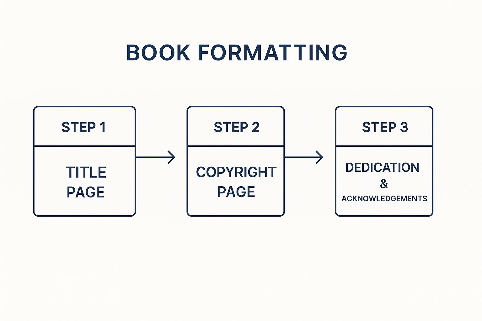
These early pages, like your title and copyright, are the structural foundation for the entire reading experience.
Because of this reader-driven flexibility, trying to force a rigid, PDF-style design onto an ebook creates a clunky and frustrating mess. Your goal shifts from controlling the design to building a clean, adaptable file—usually an EPUB. For a deeper look at the digital side, you can learn more about how to publish an ebook and its specific hurdles.
Your job with an ebook isn't to control the design. It's to provide a clean, well-structured foundation that lets the e-reader do its job effectively.
The priorities for ebook formatting are a world away from print:
- Optimized Images: Forget high resolution. Ebook images need to load fast. Big images bloat your file size, which can lead to slow performance on e-readers and even extra delivery fees from Amazon. Aim for 72 DPI and keep the file sizes small.
- Embedded Fonts: You can embed custom fonts, but it’s often more trouble than it's worth. Many readers simply use their e-reader's default font, which will override your fancy choice anyway. Sticking to standard, device-friendly fonts is usually the safest bet.
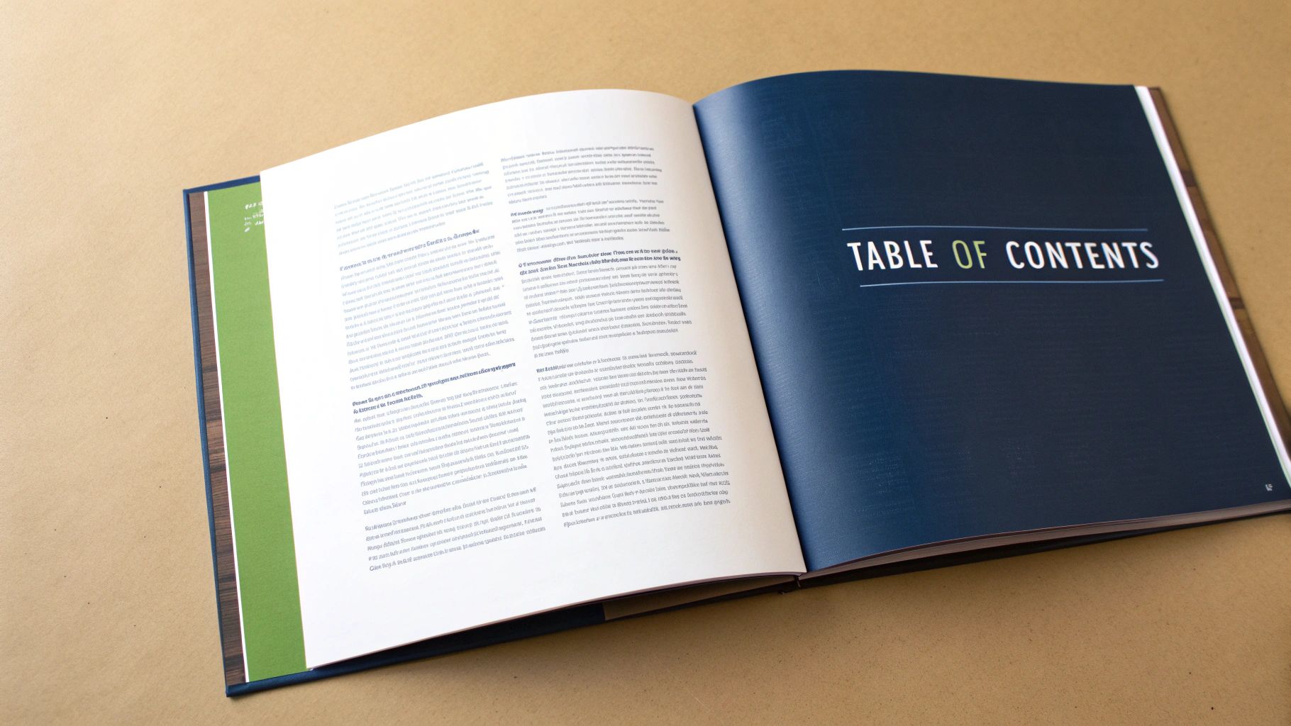
- A Clickable Table of Contents: This is essential. A dynamic, clickable Table of Contents (ToC) allows readers to jump between chapters with a single tap—a critical feature for a good digital reading experience.
By mastering these two separate workflows, you ensure your book looks polished and reads beautifully, whether it's a paperback in someone's hands or a file on their screen.
Finalizing Your Files for Distribution
You’ve done the hard work. You've wrestled with margins, picked the perfect fonts, and meticulously crafted an interior layout you can be proud of. But before you can hit that "publish" button, there's one last, crucial step: the technical pre-flight check.
This is where you move from designer to technician. It's about ensuring your beautifully formatted files are also technically sound for platforms like KDP and IngramSpark. Think of it as your final quality control pass, catching the sneaky errors that automated tools often miss—the kind that can get a book rejected or create a terrible reading experience. Getting this right is the key to a smooth, headache-free launch.
Preparing Your Print-Ready PDF
When it comes to your print book, the industry standard is a file format called PDF/X-1a. This is not your average, everyday PDF. It’s a specific, self-contained format designed to lock in all your hard work and prevent common printing nightmares.
Essentially, it embeds your fonts, flattens your images, and sets the correct color profiles. This is non-negotiable for print. Most professional design software, like Adobe InDesign or Affinity Publisher, will have an export preset specifically for PDF/X-1a. Use it. It's the best way to guarantee that what you see on your screen is exactly what rolls off the printer, with no surprise font substitutions or weird color shifts.
A correctly generated PDF/X-1a file is your insurance policy against printing mistakes. It locks in all your design choices, from font embedding to image resolution, creating a universal blueprint that any professional printer can use without issue.
Formatting isn't just about making things look good; it's about meeting the technical demands of global distribution. Print-on-demand (POD) technology relies on precise file specifications. By 2025, POD and ebook formats are projected to make up roughly 60% of new book output globally, which shows just how vital it is to get your digital files right from the start.
Validating Your Ebook for a Flawless Launch
For your ebook, the goal is to produce a clean, valid EPUB file. At its core, an EPUB is just a little self-contained website that uses HTML and CSS to display your book. This means a single typo in the code can make it fail validation or look like a complete mess on an e-reader.
Thankfully, you don't need to be a coding whiz to check your work. There are free tools that do the heavy lifting for you:
- The Kindle Previewer: Since Amazon is the biggest market, their official software is a must-use. It doesn't just show you how your book will look on different Kindle devices; it also automatically checks for common errors when you import your EPUB.
- EPUBCheck by the W3C: This is the official industry validator. You can use their online tool to upload your EPUB and get a detailed report on any code issues. Fixing these ensures your book will work reliably on all platforms, not just Amazon's.
Once your files are formatted, a thorough final check is essential. You can find some great tips for optimizing your proofing workflow to help you catch any last-minute problems before they get to your readers.
Embedding Your Book's Metadata
Finally, don't forget your metadata. This is all the key information—title, author name, publisher—embedded directly into the book file itself. While you'll enter this again when you upload your book to retailers, embedding it in the file is a mark of professionalism that improves discoverability.
Most formatting software makes this easy to edit. You'll also want to embed your ISBN here. Remember, each format of your book (paperback, ebook, hardcover) needs its own unique ISBN. If you need a refresher on this, our guide on https://barkerbooks.com/how-to-get-an-isbn-for-my-book/ walks you through it. Taking a few extra moments to get this right is a small step that pays off.
Answering Your Top Book Formatting Questions
Once you get into the weeds of formatting your book, a few specific questions always seem to pop up. These are the nitty-gritty details that can trip up even seasoned authors, but getting them right is what separates a professional-looking book from an amateur one. Let's clear up some of the most common hangups.
What Is the Best Font to Use for a Book?
This is the big one, isn't it? The best advice I can give is to prioritize readability over novelty. You want your reader to get lost in the story, not distracted by a quirky font.
For print books, you can't go wrong with a classic serif font. Those little "feet" on the letters, called serifs, genuinely make a difference. They guide the reader's eye across the page, which really helps reduce fatigue during long reading sessions. Stick with the industry workhorses:
- Garamond: An elegant and timeless choice, perfect for literary fiction.
- Caslon: Known for its sturdiness and fantastic readability at any size.
- Baskerville: A clean, sharp font that feels both classic and modern.
Ebooks are a slightly different ballgame. While serif fonts designed for screens (like Georgia or Palatino) are still great, you can also get a beautiful result with a high-quality sans-serif font like Verdana. Just be sure to avoid overly decorative or script fonts for your main body text. A great pro tip is to use a distinct, complementary font for your chapter titles and headings. It creates a subtle, professional hierarchy that readers appreciate.
Do I Need a Different ISBN for My Ebook and Print Book?
Yes, 100% yes. This is one of the non-negotiable rules of the publishing world. Every single version of your book—the paperback, hardcover, EPUB, and audiobook—is its own unique product. That means each one needs its own unique International Standard Book Number (ISBN).
Think of it this way: if a store sold a movie on both DVD and Blu-ray, each format would have its own barcode. Your ISBN is your book’s barcode.
Your ISBN is your book's unique fingerprint in the global marketplace. Assigning a separate one to each format ensures everything is tracked correctly by distributors, retailers, and libraries. It's a key part of making your book a legitimate, professional product.
A word of caution: if you use a "free" ISBN from a platform like KDP, they are often listed as the publisher. This can lock you into their platform for that specific format. For true independence and the freedom to sell your book anywhere, your best bet is to buy your own block of ISBNs from your country's official agency, like Bowker in the US.
What Are Widows and Orphans in Typesetting?
These are the two formatting gremlins that scream "amateur" to a trained eye. They're essentially lonely, awkward lines of text that get separated from the rest of their paragraph.
- An orphan is the first line of a new paragraph stranded all by itself at the bottom of a page.
- A widow is the last line of a paragraph left all alone at the top of a new page.
Both of these are jarring for the reader. They break the flow and make your pages look unbalanced. Thankfully, you don’t have to hunt them down manually. Professional formatting software like Adobe InDesign, Vellum, or Atticus is built to prevent these automatically by making tiny, invisible adjustments to the page's spacing. This is one of the biggest reasons to use dedicated software over a simple word processor.
Can I Just Upload a Word Document to KDP?
Technically, yes, Amazon KDP lets you upload a Microsoft Word file. But should you? Absolutely not. I strongly advise against it if you care about a polished final product.
The automated conversion process is a gamble, and the odds aren't in your favor. It’s notorious for causing a mess of problems: spacing gets mangled, fonts change unexpectedly, images break, and paragraph indents go haywire. You essentially hand over control and hope for the best, which often results in a book that looks sloppy and rushed.
For a predictable and professional outcome, always convert your manuscript into a purpose-built file first. For your print book, create a high-resolution, print-ready PDF. For your ebook, generate a clean, well-structured EPUB file. This ensures that what you see on your screen is exactly what the reader will see in their hands or on their device.
Of course, before you even get to formatting, you have to write the book. These days, many authors also explore how AI tools can assist with writing your manuscript to help with the initial creation process.
Ready to turn your manuscript into a professionally published book that stands out on shelves worldwide? The team at BarkerBooks has helped over 7,500 authors achieve their publishing dreams. From expert editing and stunning cover design to global distribution and marketing, we handle every detail so you can focus on what you do best—writing. Visit us at BarkerBooks to see how we can bring your story to life.